7 facts about the company logo
7 facts about the company logo
Graphic designer Dmitry Verovski with over 10 years of experience spoke about his experience in developing logos for customers and how to approach the process of discussing future work.
The customer’s logo is a special story. I have ordered them dozens, dozens of times. I made about a hundred of them. That’s not a lot, the guys who specialize in logos number in the thousands.
Customers have very different approaches to ordering a logo. For some, this is nothing more than a technical challenge. Others are in search of the perfect sign filled with great meaning. And about five years ago, one could meet those who did not really understand what it was, but seemed to be necessary, because everyone has it. Once a client for about 20 minutes could not explain to me what he wanted. He called the logo a “picture”, then a “label”, then “an inscription that we will put everywhere.”
In this article I want to share some thoughts about the logo, its expediency and purpose.

A logo is a quality mark
The main thing to understand about logos is that a logo is a quality mark. This is how it should be treated. If I sell a product, I need a personalized quality mark on the product. If I sell a service, a personalized mark of the quality of the service. What is the point of putting the customer’s logo on a box with tasteless pizza, which was also brought cold and an hour later?
The properties of the goods are instantly transferred to the graphic sign. It is for this reason that there is a mark-up on brands. Not because a branded product is much better than a know-name. And because buying a brand, we are confident that everything will be fine. The degree of this confidence is equal to the price of the mark-up. Although misfires happen to everyone. Unknown logo = suspicious unverified product.
Entrepreneurs often forget about the main thing. The quality of the product is primary, the logo is decimal. The customer’s logo inherits the quality of the product, and not vice versa. You can cheat with a quality wrapper only once.
Companies are ready to sue for using or mentioning their brand without asking. The person from the comments will immediately ask: “And why can’t they sit? Well this is free advertising. ” No, this is not free advertising, this is a free damage to the quality mark, which has been injected with thousands, if not millions, of dollars.
A trademark is serious. It is easy to get dirty, difficult to wash.
Text writing is not enough
In the middle of the last century, Paul Rand came up with a blue lettering in a yellow oval. This is how the IKEA logo appeared. Text writing is not enough for the modern client.
If we have a shoe store, the client asks to show the shoes. If it’s building, think of something with houses, hammers and roofs. If we have useful products, show in the logo how useful they are.

Yes, ideally a graphic sign should hint at the activities of the company. But let’s do a little experiment: close our eyes and remember at least a dozen strong brands.
I can’t remember lemonade rivers in Coca Cola, but assembly lines in Samsung. No phone or monitor is visible in the Apple logo. The Ebey and Amazon logos do not have a hint of purchases, baskets, goods, packaging. The absence of direct associations in the logo does not in any way prevent companies from working and earning.
From complex to simple
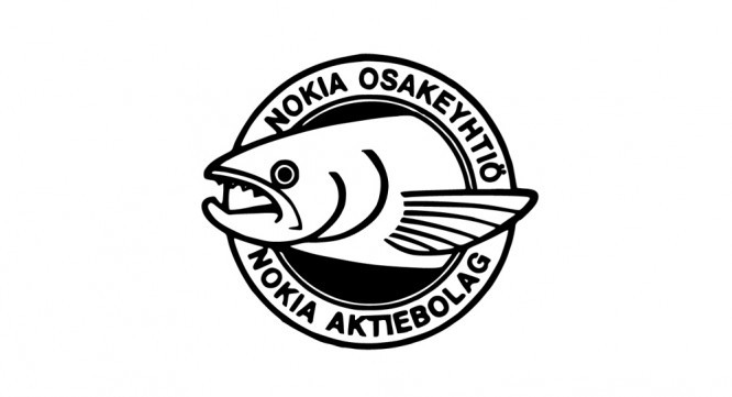
Why do the most famous companies have a logo either only of text writing, or of very simple geometric shapes? It’s simple, serious players play long. Once upon a time, there were ears of rice in the Samsung logo (the company sold rice), and in the Nokia logo there was a fish head.
As time went on, the company changed its field of activity and got rid of any graphic associations in the logo. Any niche company comes to universalizing its trademark.
The logo gets rid of graphic clutter and visual clarification. The main thing remains – the text name. Similarly, the customer’s logo, at first it can be complex and pompous, but the more significant the company, the simpler the logo.

Perception and memorability
What is the main property of a plumber? What would he look like a plumber, or what would he leave his phone number?
A customer ordered takeaway from a restaurant with a disgusting logo. The food was delivered on time and the quality of the food is beyond praise. A month later, the client came across the restaurant’s logo in the advertisement and remembered the order that pleased him. The logo will be a visual anchor. We remember our emotions, so the main thing is the quality of the service.
And I’m not suggesting at all about making disgusting logos. But sometimes you just need to break all the rules. There are no computers in the Apple logo, which did not prevent these computers from successfully selling. Sometimes, in order to stand out from a dozen stores and trading floors, you just need to randomly scatter letters, and not rack your brains over meanings and associations. Sometimes, to sell computers, you can just draw a rainbow apple. Or do not draw anything. Start as it is, and think about the logo after the first sales.

Wow logo effect
Some customers asked me to make a logo “like Apple” (substitute any other significant brand). So that everything is simple and ingenious. But when you do something like that, they say, “It’s too simple, too clumsy.” I told them: “But now, you have a company of Malinka, and in the sign is a raspberry. It all fits. ” “No no, this is too straightforward …”
A month later, instead of a capacious Apple-like logo, such a customer has a pile of clip-arts. I thought for a long time and finally understood the reason.
In fact, the customer feels emotions not for Apple’s logo, but for its products. The logo only inherits these emotions (yes, I know that this thought has already passed a couple of paragraphs above).
I could have made an arbitrarily similar minimalistic sign in the spirit of Apple, but the client would never skip a beat. The sign, although similar, is devoid of an emotional connection. Well, there is no wow effect and that’s it.
It is important to understand that the customer’s logo exists primarily for the customers, not the customer.
No logo needed
I happened to work in a distribution company that was involved in the rental and sale of films. For a long time I tried to convince the director that we simply cannot live without a logo. The director regularly avoided answering directly, but in one of these conversations he told me: “That’s why we need a logo? People don’t care about our logo. The distributor’s logo is nothing more than a whim of the owner. People buy movies, and who brought it to the market does not matter to them. “
And he was right. It would be possible to write nothing at all except the legal address. A distributor’s logo does not guarantee that one movie will be as good as another.
Ultimately, a logo won’t do a hell of a lot of work for the client. Will not move the business forward, will not sell the product for the client. Let’s be honest, buyers pay a lot more attention to the price tag than to the logo.
Business first, then logo
Business is primary, the logo is decimal. Sometimes you just need to get up and running quickly to get started. The logo can be completed retroactively. I know a lot of situations when a novice entrepreneur on duty and capriciously chooses a name for himself, then chooses a logo. Treats his choice as if he were choosing a wife for life. The matter did not move.
Other clients “wrote” themselves a logo on their own, asking only to refine and correct it. The first are still thinking about the name. The second are busy with business. What is more important business or name? As you call the ship so it will float – just a beautiful common phrase.
Another client is constantly dissatisfied with their logo. One, second and third rebranding. A lot of money is thrown away, and the result is looped into the Mobius strip and goes through the fifth circle.
Findings?
The customer’s logo should be simple and memorable. The logo is your quality mark.
The logo won’t do the job for you. Buy a good product, not a good logo. If your Samsung monitor is performing poorly, buy a Dell monitor next time. Cash injections and brand advertising have a short-term effect.
The logo is not a girl, you do not need to choose it for half a year.
A logo is not clip art. It should not contain an oil painting and describe your entire business in a nutshell.
Sometimes it’s worth breaking the rules. The key value of a logo is recognition and memorability. The pursuit of meanings is exaggerated. Nobody cares about the hidden meanings that are detailed in the brand book. The client does not read the brand book.
…

