6 logo design trends in 2016
6 logo design trends in 2016
Translation of the article “2016 Logo Design Trends Forecast” published on the blog justcreative, which predicts what the logo industry will face in 2016.
The art and science of logo design is in constant flux with the rise of digital communication. The ways of reaching out to the target audience are growing incredibly quickly, and the quality of communication has become more exceptional, personal.
Considering all that is happening, the art of creating logos has not been left out. It is changing as quickly as how fast digital communication is changing, which in turn changes with the speed of technology development.
Fortunately, there are many people who are dedicated to scrutinizing these changes, creating trend models and predicting future trends in the art of logo design.
Bill Garner of LogoLounge is perhaps one of the main reliable sources of such predictions. His observant eye and attention to detail, as well as his “sensitivity” or “radar” (whichever you prefer), allows him to notice future trends in the embryo stage and communicate this to us.
So what awaits us in the near future? Let’s take a look at 6 major logo trends that are going to be key this year.
1. Flat
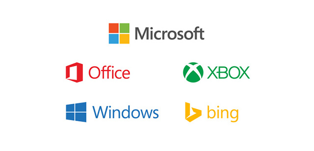
Flat design continues to dominate, not only because it looks clean and aesthetically pleasing, but also because web browsers express their love for SVG in their superior rendering. Also, don’t forget about the download speed. Patterns, textures, shadows and gradients will again give way to minimalism. Well, companies will continue to simplify their current identity (who hasn’t done it yet).
2.Handwritten logos (Handmade / handwriting)
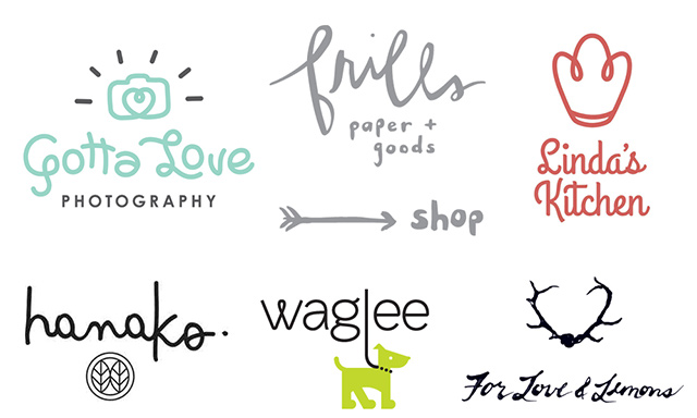
Handwritten logos speak of sincerity. They seem to somehow convey, show us the effort, the love, the personality with which they were created. This trend has been ramming the ground for several years now and is not new. A small sketch of an arrow, two or three letters connected together with the help of some additional element … Some even combine a machine font and a drawn element in themselves, but this still does not “digitize” them. The number of companies choosing this particular trend is not decreasing, which is why it remains on our list today.
By the way, it is worth adding that now typography is not only the font and composition that you choose when creating a logo. It is an integral decorative element of the logo.
3. Dynamic logo (Dynamic logo)
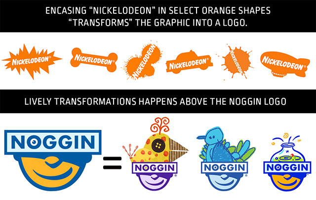
Dynamic, kinetic, metamorphic – the very ones that change, but remain the same attractive. Perhaps because this trend offers freshness, or perhaps because deciding what is attractive becomes more personal.
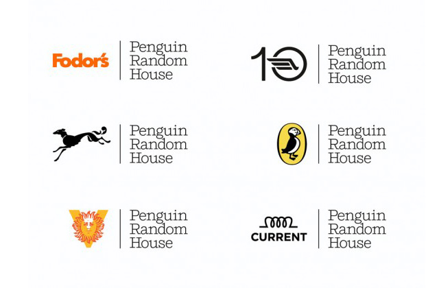
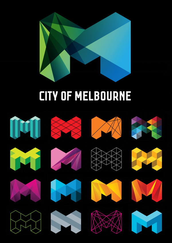
Dynamic logos subconsciously tell us about the direction of the company that has chosen this type, about the rhythm of its movement, about the mood. This is not only constant changes in shape, color, accent, it is a wonderful way of communication. True, it is worth noting the specifics of the organizations that have chosen this type.
Thus, if you are creating a logo for a flower shop sharing space with a grocery store, then this option may not be the best for you.
4. Negative space
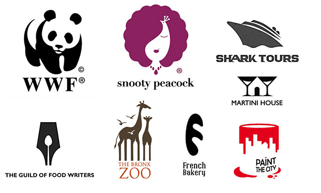
“Negative space” will continue to amaze us. Design is what you first see, but as soon as the design speaks to you, you know what it is about. This is how it works. If your design is able to convey more than meets the eye, then it becomes much more special. For this reason, negative space will continue to exist in order to attract more people who want to explore the depth of this direction in design. And there are much more enthusiasts, seekers of “hitchhikers” than you might think.
5. Letter stacking
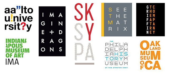
Letterstacking in modern design is perhaps one of the pioneers. Nevertheless, this trend is not losing its influence. It is an example of complex creative solutions – designers are faced with the task of presenting a long text in the shortest possible form, in a tiny space, endowing it with individuality in order to comply with all the principles in creating a logo, and also make it readable. For some organizations, letterstacking has proven to be a win-win option, which is why it remains relevant to this day.
6. Monoline

Monoline is a representative of a certain “purity” or “sterility”. The principle of this type is to create something with constant line width, something akin to “wire”. At first glance, it may seem that, due to the complexity and confusion of execution, this trend goes against the trend of simplification.
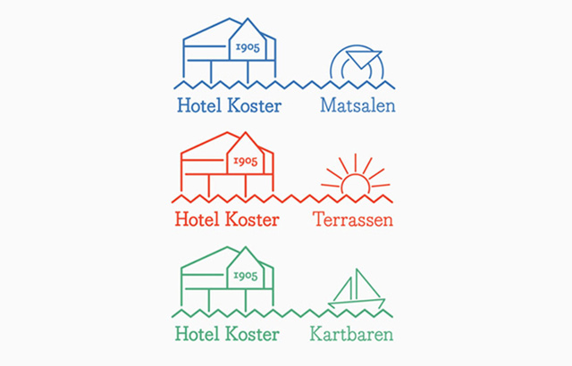
However, under a closer look, Monoline will reveal its ability to represent the clarity, purity and sincerity of the creations created with it, making even some references to the manual method of drawing drawings on paper, leather, burning on wood and engraving. This explains the presence of monoline in the forecast list.
Translated by: Tommy Jhordan
…

