
5 trends in the world of floral logos
5 trends in the world of floral logos
Floral logos are always more than just an advertisement for floristic services.
Such works inevitably come with the promise of conveying a certain mood and atmosphere typical for celebrations, be it a wedding, prom or funeral.
Let’s take a look at some of the trends in floral logo design in order to find out which media are best suited for specific situations.
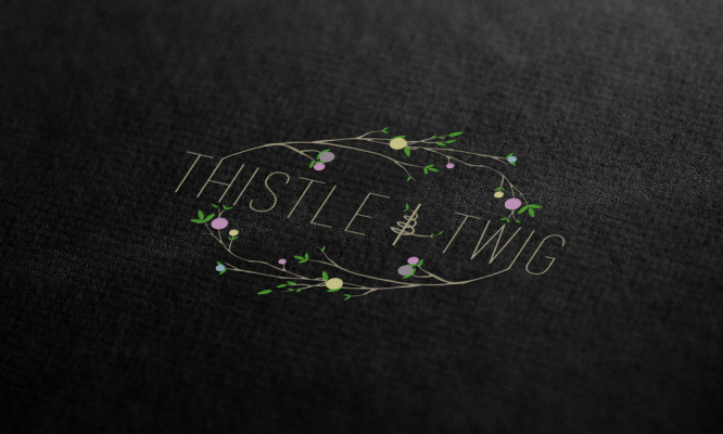
Circular logo

Logos based directly on the circle, on the one hand, refer us to the emblems of educational, sports institutions and corporate brands. The use of such a solution is typical for cases when it is necessary to emphasize a direct associative relationship between the range of services provided and feelings of unity, love, friendship.
On the other hand, the circular format can serve as a hint for more specific matters. For example, such a logo easily correlates with the image of the ring and, accordingly, the idea of a family union. In addition, it symbolizes femininity in general.
wild nature
Some florists specialize in the composition of wildflowers, or at least strive to achieve the appropriate effect. In this case, logos are often presented as very memorable and iconic.
The key goal of such images is to attract a very specific audience – people who prefer naturalness, as well as those who are alien to the traditional approach and classics in the general sense of the word.
Line drawing
Logos made in this style are often perceived as attractive and even luxurious than any other. At the same time, the color scheme does not imply sharp contrasts and, as a rule, is limited to one or two shades.
The management of a company using such a logo can be characterized as free-thinkers who prefer the beaten paths of paving new ones, creating their own environment. Such a format is more likely to attract clients who gravitate towards simplicity and elegance.
Unique fonts
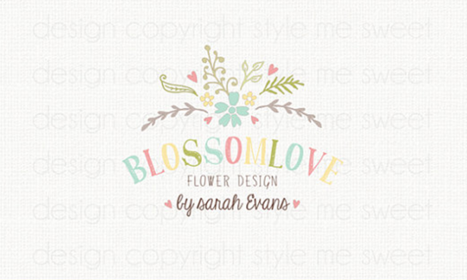
Other representatives of the sphere within the framework of logo design do not focus on the image, but on the text, in particular, unique, author’s fonts. In some cases, such logos look more energetic, dynamic and effective due to the activity on two fronts at once: with the help of the word itself and its specific visual design.
Iconic logos
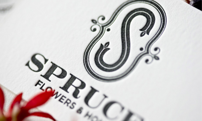
Such floral logos, in turn, are subdivided into single and multi-layered. The first type assumes the use of a single style within the framework of text design, the second – several, mostly no more than two. One-layer iconic logos adhere to a format close to primitivism and therefore are well remembered: there is nothing superfluous here, the image itself is executed schematically.
Multilayers are associated with a more delicate work of the designer, aimed at finding the optimal combination of elements. Most of these logos include the brand name in the header and the slogan or descriptive words below it.
Source: 99designs
Translated by: Denis Strigun
…

