
5 rules for perfecting a logo from Ian Paget
5 rules for perfecting a logo from Ian Paget
Ian Padget is a UK-based graphic designer and founder of the Logo Geek mini-studio, which specializes in developing logos and brand identity.
As an expert at LogoLounge, the largest archive of logos from around the world, Ian participates in the selection of works for the publication of the Logo Lounge Book, a collection of exemplary show cases that the design community uses to track logo design trends.
Below is a translation of 5 rules that will help you improve any logo.

I have been evaluating the logos for Logo Lounge Book 9 in recent weeks (about 5,000 in total). There are still 1000 logos to come, but I decided to take a break and write to a blog.
There are a lot of great logos, but from time to time there are almost perfect copies, with a well-thought-out idea, which have to lower their marks due to carelessness in execution. It is always a shame when the potential of a logo remains untapped due to the fact that the designer has not completed the work.
To help designers avoid common mistakes, I’ve put together 5 rules for improving your logo design.
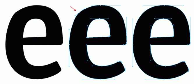
Look for the “perfect line”
Sometimes a logo is spoiled by a tiny error in the curves: part of the line has an irregular bend, a bulge or depression appears, which should not be.
Logo Creed by Bill Gardner (co-founder of LogoLounge) uses the term “sweet line” to describe the ideal curve:
“The hallmark of a logo’s quality is that the designer has cared enough to produce a sweet line. If something is wrong with them, consumers may not understand what exactly, but they will still notice. This distracts attention and reduces the effectiveness of the logo. “
It is worth taking the time to make the form flawless, any flaw will be noticed – consciously or unconsciously. In most cases, using fewer anchor points will solve the problem, but it makes sense to learn all the intricacies of working with the tool: read the Tut + (Illustrators Pen Tool: The Comprehensive Guide) or play Bezier Game, it’s fun.
Use consistent shapes, angles, line weights
Be consistent. If your logo has corners, use the same degree for consistency. If different lines have to be of the same thickness, make sure that this is indeed the case. A consistent, consistent design looks more attractive, so it makes sense to take the time to check everything.
When I design a logo, I experiment with composition and shapes until I’m satisfied with the result. This usually means that when things add up, there is a chance that the parameters, which should be agreed, are slightly off. In this case, I redraw the logo from scratch to make sure the final layout is perfect.
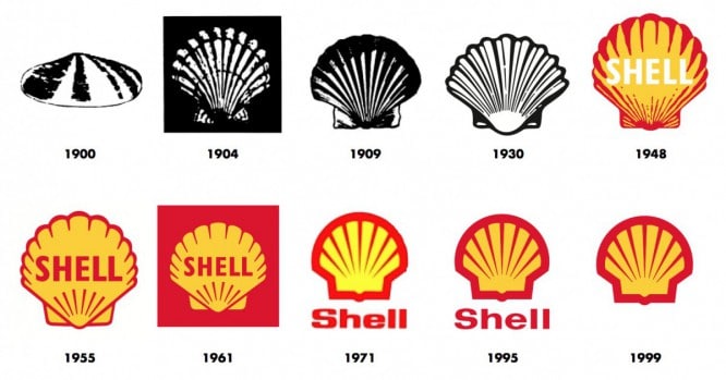
Simplify, simplify, simplify
A corporate logo should be versatile and flexible, and a versatile logo is almost always simple. Also, if you look at the evolution of well-known logos, you will see that the brand identity only gets stronger with simplification. With Shell as an example, you can see that today’s logo is as simple and recognizable as ever.
Think about how you can simplify your logo idea by cutting out the clutter. This will help strengthen the identity, make the logo more flexible and lengthen its lifespan.
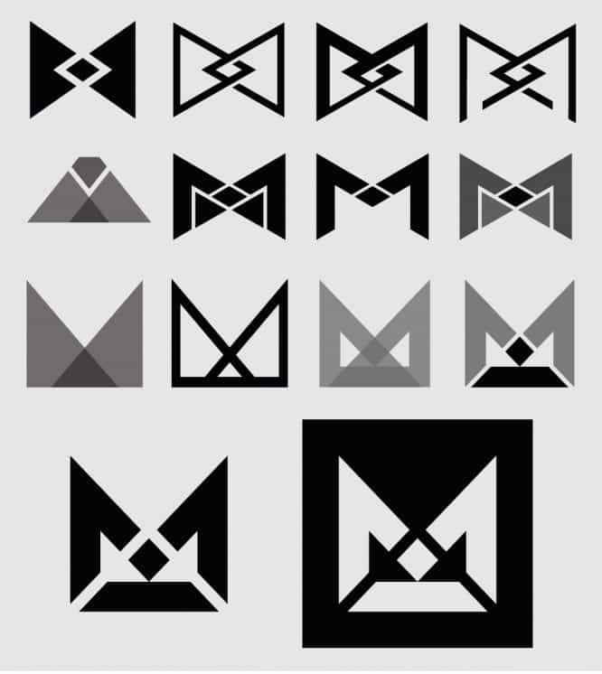
Experiment with logo variations and test them
You came up with an idea for a great logo, sketched a layout and are about to present it to a client. Ask yourself – is it possible to strengthen the message? Can the design be simplified? Will the composition look better if you rearrange it? Wouldn’t other colors be more appropriate? Maybe you should try lines with different widths?
The purpose of these questions is to understand how you can improve your logo design. Every time I do a test like this, I always find a way to improve on the original, resulting in a more elaborate final result that I can be proud of.
You can consider this process using the example of a logo that I made for Minternet. The original concept consisted of two intersecting triangles creating a diamond-like, monogram-like and M-like shape at the same time. Through a series of tests and experiments, I came to a much stronger solution.
Use a grid for final refinement
Finally, check the distances and proportions by overlaying simple geometric shapes as guides and working with the mesh. Try to achieve clear logic behind each element. This will give you extra confidence when presenting your logo to a client, as you will be able to justify all of your decisions.
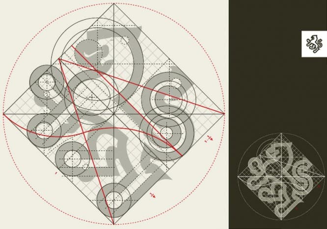
An example of quality work can be seen in the illustration. I would also recommend checking out some great examples of logo guidelines on Abduzeedo.
The original article can be read here…
Translation: wtpack.ru
…

