8 differences between print and web design
8 differences between print and web design
Print design and web design are two sides of the same coin. But let’s take a look at their key differences.
There are so many obvious similarities between print designers and web designers. However, there are many differences that people often overlook. These days, the boundaries between print and web design are increasingly blurring, and print design techniques are playing a leading role in web design trends. The article, of course, does not claim to be “the ultimate truth”, but highlights the most important differences in the areas.
1. Method of exposure: how people see design

One of the most significant differences is how people use design. It’s one thing to hold something physical in your hands: a paper magazine or a book – and quite another to interact with an interactive site in a virtual space. There are symbiosis, such as electronic magazines, which look exactly like their printed counterparts, but are readable from a monitor. But this is rather an exception, but: print and web design have clear boundaries. And where people see the final design significantly influences the decisions of its creator.
2. Feelings: how design interacts with feelings
Both types – print and web design – are a shell, a look. And, regardless of the quality of the final product, they must make a good impression on the consumer. Printed products (in addition to good visuals) have the advantage of tactile effects: texture, shape and even print effects such as embossing or silk-screening. While web design uses it to grab attention and diversify reading, audio, video and other interactive elements.

You have probably also noticed: many bibliophiles love the sensations of a book in their hands – weight, smell, texture or even rustling … These are qualities that cannot be realized in electronic form. In contrast, e-books have advantages that cannot be carried over to print. Children’s books are full of animated illustrations, and electronic versions of scientific literature include links to external sources. Again, each approach has its own advantages.
3. Content form: statics and dynamics
Most sites are built to be constantly changing. For example, news sites, they look different every day: on the main page every day there will be different pictures and different text. The web design can be modified, changed or redone at any time. The appearance of a book or magazine, once passed through the printer, remains unchanged (unless a decision is made to change the design and print it again).
Unlike print designers who think it’s done when they send their work to the printer, web designers need to look forward to long-term projects. Many interactive elements (such as buttons, mouseover effects, forms and polls) need constant designer attention. All of these elements must work correctly and always adhere to the same style. There is no easier way to lose your audience than to miss a design element that does not work the way the user expects it to. Web design differs from print primarily in this interactive component, which requires effort from the user: clicking, entering information or uploading files.
4. Usability: meeting the needs of the user
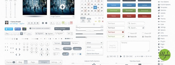
When the design was placed only on the surface of the paper, the user’s actions were limited only to turning the pages. But in the virtual space, not everything is so commonplace. A site visitor can interact with an unlimited number of templates, in each of which he wants to find the content he is looking for in the simplest way possible. That is why a variety of menus have appeared, which have become a kind of navigation item. For convenience, they should be in the expected location so that the user can easily find them.
With the growth in the number of devices with Internet access, the need for the correct display of sites on screens of different sizes has increased. Which puts us in front of the need to use responsive or responsive design. Moreover, web designers need to think over not only the appearance of the product, but also how the design will change when zooming, scrolling, and other interactions.
5. Layout: how to tidy up the content
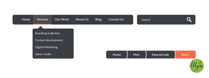
Web and print design has many elements, but each of them has its own requirements for the structure – the location in the layout of such elements as: text, images, shapes, lines, color. In a printed product, these requirements are dictated by technical constraints, while web designers have almost unlimited possibilities in structuring information.
However, the web has its own limitations in the form of rebuilding the layout depending on the size of the device.
6. Resolution: DPI and PPI
It is very important to understand the differences between these two basic concepts. After all, it is the resolution that determines the quality of photographs and other images in the final design.
You’ve probably heard the abbreviations DPI (dots per inch) and PPI (pixels per inch). Often people mistakenly consider them – synonyms, which is fundamentally wrong.
DPI originates from the printing process and literally describes the density of ink dots on one inch of the printed surface. In turn, PPI stands for the number of pixels placed on one inch of the screen. The more pixels per inch, the sharper and better the image we see. DPI, unlike PPI, does not imply a change in the size of the image when printing, but only affects the print quality of images.

The standard for web design is 72 pixels per inch. This is due to the fact that many devices up to now had a preset value. But this will change in the near future, because devices with a much higher pixel density are already coming out.
7. Color: RGB and CMYK
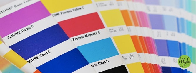
The image on paper is always different from what we see on the monitor. And this is due to the fact that the colors on paper and on the screen appear from different color spaces. CMYK is used for color in print, RGB for the web. If you are using both spaces for the same project, then the easiest way to make them uniform is to use the PANTONE matching system to move from one space to another. With its help, the equivalent colors of a web design can be matched for printing on paper or other surface. PANTONE helps clients, designers and printers work as a team to ensure that the final product looks exactly the way it was intended.
CMYK color space – Based on the 4 primary colors used in printers: Cyan, Magenta, Yellow, and Key (Key color, or just black). The encoding of this space is very simple and is equivalent to the presence of one of the four colors as a percentage, 70/10/0/0 means that the resulting color will have 70% cyan and 10% magenta, and the values of yellow and black are 0%.
RGB color space – Based on the three colors you see when looking at any monitor: red, green, blue. Getting the same color on different monitors is difficult, as there are many different screens with different characteristics. Ideally, each monitor should be calibrated (both Mac and Windows have system utilities for this). Colors are encoded in RGB using three sets of numbers, the value of each of which can vary from 0 to 255. These values determine the amount of red, green and blue so that the color is interpreted by the brain correctly, as the designer wants. To get the same color that we took from the CMYK space, you need to select the following parameters: 85/172/238, where the blue value is 238, which is the dominant one.
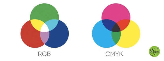
Due to the fact that a wider range of colors is located in the RGB space than in CMYK, some designers, thinking that they are achieving a greater color gamut, make their layouts in RGB, and convert to CMYK before printing, but all these actions do not make any sense.
8. Control: changes in the project
Web designers tend to have a limited role in a project. We can say that they create the initial version of the design, and the user himself reshapes it using different screens, interacting with the interface, or even changing the fonts and their sizes in the browser settings.
In the printed product, however, everything is different: the designer has full control over the project until the moment of printing. The user cannot influence the design, so printers need to make informed decisions about the final appearance of the product – after all, after the printer you can’t make any changes. At the same time, the web designer has more ongoing control over the project and can make edits or even redesign the design as it is used.

No matter how different the approach to the described types of design may be, they remain two sides of the same coin. It is unlikely that any company can do without this or that design. This is why it is important to understand the basic pillars of web or print design.
If your company needs the development of design of printed products – order it on the website shubalab.com, and we will solve this issue. All readers of our articles on Spark.ru will get a 15% discount on printed design. To obtain it, use the words “Spark Printed Materials” in the order comments. We are waiting for your feedback and letters!
Source: spark.ru
…

