5 effective color techniques for a designer
5 effective color techniques for a designer
Helpful tips to help you avoid disappointment or disappointment for your customers.
Think about flowers and how they make you feel!
1. Learn the color groups
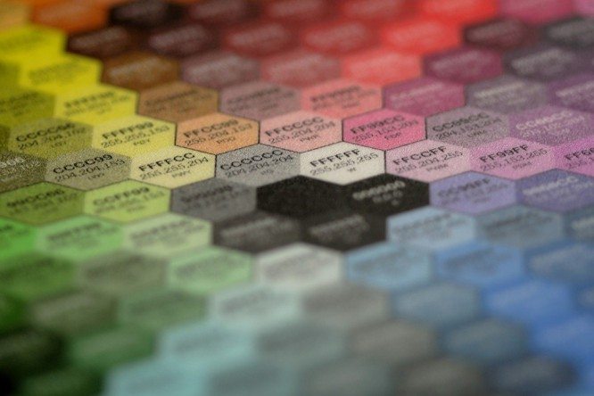
Red, orange and yellow are warm colors:
- Red is associated with love, strength, passion and excitement.
- Orange is associated with joy, happiness, and warning.
- Yellow is associated with pleasure, energy and childlike innocence.
Think about how you use these colors in an advertising campaign, logo design or website design, and what associations these or those shades cause. For example, you can use yellow in a logo design for a florist, beating the warmth of yellows or the passion of reds. Think about the feelings of a baby yellow rubber duck or the awakening sensation of a peeling orange. All these feelings are associated with warm colors.
Green, blue and purple are cool colors:
- Green is associated with eco-movement, freshness and nature.
- Blue – with calmness, stability, devotion.
- Purple is associated with power, luxury and spirituality.
The blue color will evoke a calm state of relaxation on the seashore. Green would be a great choice when designing a logo for a solar panel company. The purple logo will suit a prestigious restaurant or hotel and will attract customers looking for premium services.
With neutral colors, everything is more difficult and at the same time easier. For businesses where the product is the star, neutral colors are ideal. Against their background, any design elements will look bright and pronounced. Such shades may seem boring or unemotional, but this is a misconception.
Neutral colors – black, white, gray, brown and beige:
- Black is associated with sophistication, elegance and wealth.
- White – with innocence, purity and freshness.
- Brown is associated with nature, utility and earthiness.
- Beige – with comfort, tradition and tranquility.
- Manufacturability, innovation and neutrality are associated with gray.
A manufacturer of luxury treats can choose black for their logo and website. Refined details look great against a black background, which is why such a background is often used in jewelry design. For the same reasons, an IT company will do well with a gray color that can highlight their application or device. Remember, however, that each color also has negative associations, so the same work will make different impressions on different people.

2. Learn to combine colors
- Combining colors is a separate story that requires deep study. However, a few tips will help you get started.
- Similar color schemes are composed of colors from the same group, varying between colors and combinations. Warm shades are combined with warm, cold with cold, neutral with neutral. It looks good because the colors don’t compete with each other, but depending on the combination, they can be too pale or too bright.
- Contrasting color schemes are made up of colors from different groups. For example, they combine neutral colors with warm, neutral with cold or warm with cold. The effect can be strong and dramatic, but it can sometimes look too harsh to the eye.
- Monochrome color schemes are composed of different shades of the same color. They are used to create a harmonious color scheme that doesn’t detract from the main message of the design.
3. Learn to love free space
With the right design, free space can be a workhorse that will drive the visitor around the site. Air will make the site easier to understand and present information to the attention of the visitor, preventing it from getting lost among the many elements.
In this case, the term “negative space” is also used. Smashing Magazine notes that negative space reduces distractions by 20% and makes text significantly more readable.
4. Simpler is better
In the early days of web design, the more stuffed the site was, the better it was considered. We used texture buttons, background patterns, unusual cursors, and animated elements. Why is the fashion for these things gone?
The fact is that not knowing where the main entrance is, it is quite difficult for you to decide exactly how to get into the building. Simplicity in design is a guarantee that your visitor will be able to easily navigate on your site, no matter which page his visit starts from.
Also, given the skyrocketing mobile traffic, try to keep your design simple enough to be mobile readable. Research shows that 58% of Americans use smartphones to access the Internet, and the remaining 42% are PC and tablet users.
5. Remember the goldfish
There is a great variety of information on the Internet. This caused the average attention span on the site to drop to eight seconds – two seconds less than the aquarium goldfish. Your task is to create a resource that will load quickly on any platform, be remembered, and at the same time present information clearly and understandably. This will help your visitors view the entire resource.
Author of the article script-tutorials
Translation – Duty
…


