5 basics of a future logo
5 basics of a future logo
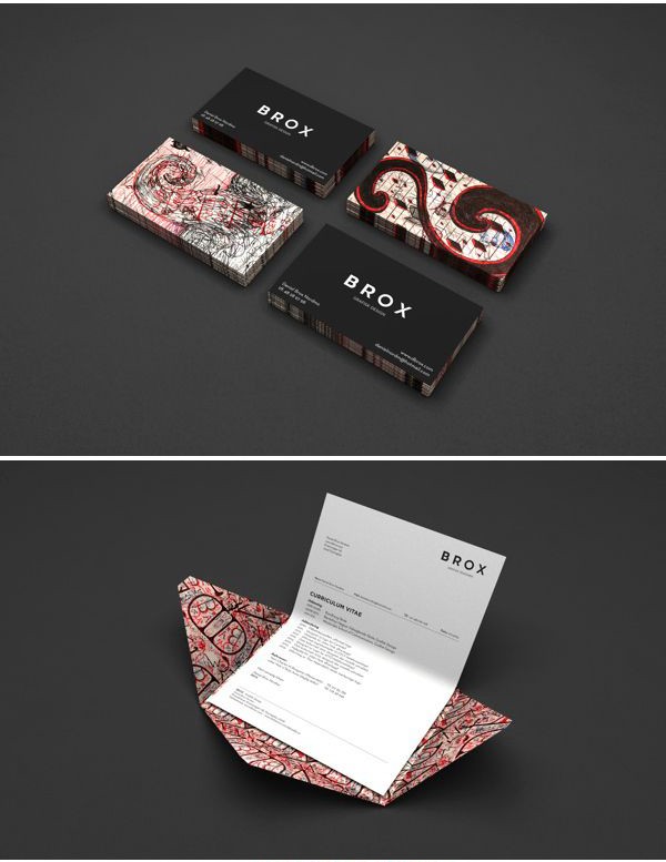
At the turn of the 20th century, wealthy people used business cards as an easy way to establish social connections. They were discreetly elegant and spoke a lot with just the name of the owner and appearance.
Logos have the same mission: they are a kind of company signature that tells the story of a brand with a couple of words and an image. And while a logo is just the tip of a branding iceberg, it is still a business card and reflects the core values of your business. An awful lot for one little icon, right?
How do you approach logo design so that it properly expresses the essence of the company? Below are some basic things to consider when it comes to designing a corporate identity.
1. Voice
Before you start working on a logo, you need to define the voice of your brand – its character, personality. Before a logo can adequately reflect your brand, speak on behalf of your company, you yourself must have a clear idea of who and what it is.
Is your company a high energy company? Modern? Traditional? How would she like to be different from competitors? This is what you must state for yourself very clearly and honestly before starting to develop a brand name. Here is an English-language but quick and effective test of “brand personality” to help you get started.




2. Color
It just seems like a simple choice, but in fact, color is a very difficult question. Did you know that colors can trigger certain emotional responses? Blue can be soothing, yellow can be happy, orange is inspiring, and red is powerful and cocky. There is a whole science of how we react to colors, but that doesn’t mean you have to be a psychologist to choose the colors of your logo. If you have the right sense of the “personality” of your brand, then most likely the choice of color will be intuitive and obvious.
It is also important to remember that the logo must be legible even when reproduced at a very small size. Thus, using, for example, a yellow font can give your company a cheerful and upbeat aura, but make it completely unreadable.



3. Typography
Unlike the days of business cards, today we have thousands of creative and original fonts that can perfectly express your personality. As with color, writing can convey the emotion and energy of a brand. For example, bold print can create a sense of confidence or strength, an oblique sans serif – pressure and energy; handwritten thin font – the mood of tenderness and lyricism.
While hunting for your perfect spelling, you might get lost in massive typeface libraries. To avoid this and not chase the phantom, you should remember that the font of your logo should be not only “speaking”, but also readable. Yes, again there are too many factors for one small font, but, as the practice of successful logos shows, this is quite real. For more details on the aspects of choosing a font, we wrote in the article “How to choose the right font for your design.”
4. Symbols and images
In 1886, the poet Jean Moréas invented the term and concept of “symbolism,” thereby establishing the superiority of subjectivity over realism. This led to a revolution in the world of art, including the fine arts: artists stopped painting what they saw and began to paint what they felt…
The tick in the Nike logo (one of the best examples), which, according to the designer’s idea, personifies the wing of the goddess Nike, for an uninformed viewer looks like movement, dust under the runner’s foot – and this dynamic is understandable and expressive. The Toyota logo refers to both the “T” and the wheels. WWF uses the acronym and silhouette of a panda – and everyone just loves pandas! The perfect symbol will tell your brand story with a single image.


5. Attractiveness
You have already chosen the perfect color, font, and symbol for your logo, but it must be assembled in a way that is attractive to your target audience. For example, some people found the London Olympics logo offensive, some even boycotted the games; and to others, on the contrary, he showed that Great Britain is a dynamic and progressive country, since it used trendy colors and a bold layout.
You want your logo elements to be compiled to highlight your personality: your unique qualities. However, expressive means must be chosen in such a way that the target audience can correctly read the subtext. You may need to test your logo in a focus group to see if the majority sees what you wanted to say in your sign.

While your logo is just the tip of the branding iceberg, it should clearly convey the depth of your company’s philosophy and character. Choose carefully and wisely for a strong and viable brand identity.
Source: godesigner.ru
…

