
6 Tips for Effective Icon Design
6 Tips for Effective Icon Design
The team of the online service for quickly creating vector icons Iconsflow has put together 6 tips for creating icons: from sketching to choosing the style of future icons.
In this article, we’ll cover simple yet effective tips to help you when designing your icons.
We will also share links to useful tools for creating a professional icon set.

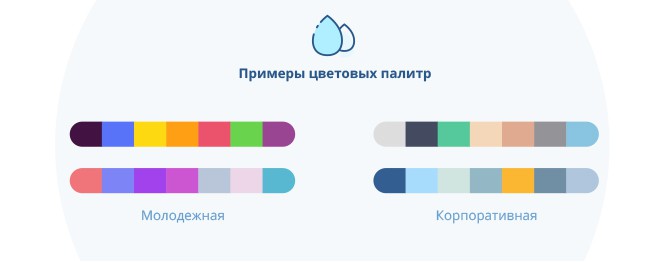
1. Audience
It is very important to keep cultural differences in mind when creating icons, as colors, images and symbols may differ from country to country. For example, in Japan, black is the color of joy. Another important point is to take into account the age of the target audience. Flashy and bold icons are suitable for a young audience, but corporate icons should be in classic or pastel colors.
2. Simplicity is always relevant
Icons should convey a very clear message to users. Stylish and simple icons will help them understand the content. Avoid using a lot of elements in your icon design, this can confuse users.

3. Icon style
Before diving into the design process, make sure you choose the right icon style. Over the past couple of years, we’ve seen rapid changes in software and app interface designs, from sophisticated to flat and minimalist styles. Therefore, before you start, decide which style of icons is right for you: outline, compact or flat.

4. Services for creating icons
In order to become a successful designer, you need to work efficiently. Icon websites will improve your workflow, save time, and give you more space to experiment with new solutions. These helpful tools come in handy when you need to redesign, resize, or make last-minute edits to your icon set.
Here are some of the icon maker sites:
Iconsflow.com
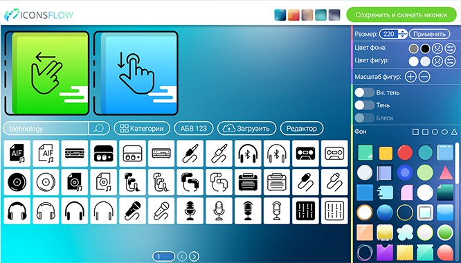
It is an online editor with many up-to-date icon styles, many of which are available for free to anyone. With this service, you can start creating designs without knowing Photoshop or Illustrator.
Let’s list some amazing features of this online editor:
– SVG (vector), ICO and PNG export;
– the ability to personalize icons;
– loading your icons;
– built-in vector editor, etc.
Flaticons.net
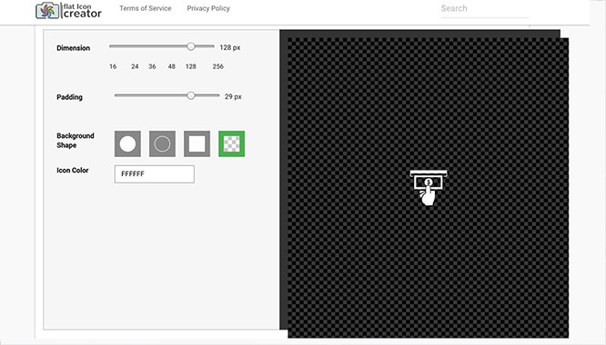
FlatIcons helps you personalize, size and color. You can create icons up to 128 px and download them in PNG format.
5. Outline
We all make a common mistake when it comes to design – sticking to the original idea. But at the end of the icon creation process, it often happens that the initial idea is not as good as it was at the beginning and you have to make a lot of edits.
Therefore, redrawing an icon from a sketch is much easier than creating it from scratch in an editor.
Brainstorming and sketching is the best way to create different icon designs.

6. Creativity and functionality
When people visit your site or open an app, you want them to find your service useful and come back for more. Therefore, your design should be creative but functional. Ask yourself what will make your user’s life easier.
Our advice is to create clear, simple and visible icons. Excessive creativity sometimes disorientates and destroys the whole experience.

That’s all!
We hope you’ve learned something new about iconography to help you create professional and user-friendly icons.
Credits: Iconsflow Team
…
