
What is identity: 10 basic rules for creating a corporate identity
What is identity: 10 basic rules for creating a corporate identity
Identity (also called “corporate” or “corporate style”, “brand ID” or “corporate ID”, as it is convenient for anyone) is a visual component of a brand, designed to increase its recognition and create an impression of integrity.
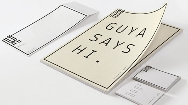
Identity includes everything related to brand visualization, from the logo to literally every piece of paper used by the company.

A uniform corporate identity inspires confidence in the consumer and gives the impression of a strong and prosperous company. Identity significantly reduces the amount of time and money that will subsequently have to be spent on advertising, since a holistic visual style of the company has already been drawn up, which does not require changes. A well-thought-out corporate identity is one of the strongest tools in the competition for a place in the sun.
Creation of an identity implies the development of a logo, slogan, selection of suitable fonts and colors for official company documentation and for promotional products, development of attributes (business cards, envelopes, boxes, etc.)
Of course, the starting point in creating an identity is the logo. And, of course, logo design is probably the most time consuming process. So let’s dwell on it.
How to create a good logo
one. Suppose you have already listened to your client and the terms of reference are in your hands. To begin with, it is worth examining the logos of competing firms in this market segment. This is necessary in order to understand what techniques have already been used, and to do something completely different from what already exists (we remember that identity is not just that, but a tool in the fight against competitors). Most often, there are two or three main competitors, so we must also take into account the colors, because we do not want to get lost against the background of the rest.
2. Immerse yourself in your client’s field of activity. This is the only way you can understand in which direction you need to move. Study whatever you find on your topic. And be sure to write down any ideas that come up in the process. At this stage, you should ask the customer to provide you with a specialist who can answer your questions and help you figure out the nuances.
3. Define the main criteria that will not allow you to deviate from the course and make a logo that is not suitable for this field. Write a list of such criteria and show it to the customer so that he will tell you if you are moving in the right direction and correct it if necessary.
four. Now you can search for ideas based on the materials you already have. Draw different options and choose the best. In the course of the creative process, you will definitely be left with several options with which to work.
five. The work has already been practically completed. Now you need to analyze the received options and select the best ones. Do not show the customer too many options, as he may get lost and choose not the best one. Show the preliminary results to your colleagues so that they can evaluate the construction of the logo and its originality.
6. You just have to finalize the remaining options and show them to the customer. The main thing is to be able to stop in time during the revision, as very often the designer can spoil the logo with too many “revisions”.
Stamps and cliches
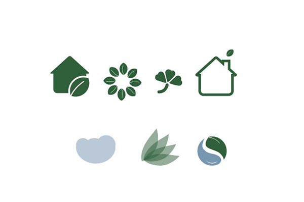
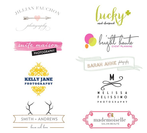
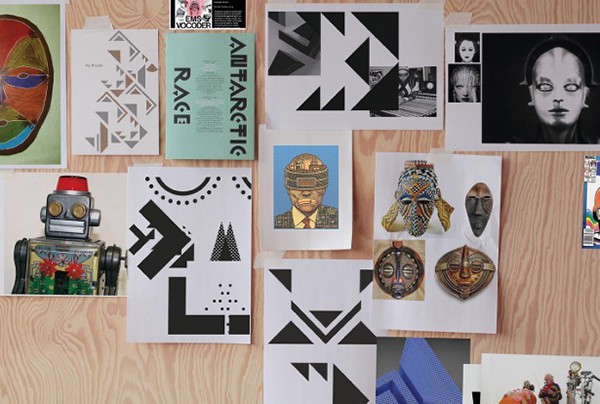
We think you can think of a few examples of logos that are already painful to look at. This includes a tooth, apple, or smile on a dental clinic logo; a leaf, tree or globe on the logo of an environmental organization; paws-dogs-cats-birds on the logo of any organization related to work with animals. The list is almost endless. And all this is already sick. The only exception can be the original filed already existing clichés, so trying to draw a “cat from behind” is an option.
Ditch the first-level associations immediately. Practice developing your imagination by doing exercises like these:
- Draw light without using rays, bulbs, sun or any light sources
- Draw the consistency
- Draw happiness without depicting people and smiles
You can come up with such tasks for yourself. The main goal is to learn to think outside the framework of stereotypes and clichés.
Fashion
The temptation to create a logo that is fashionable by modern standards is very great. But it is worth remembering that identity is something that must literally pass through time and only be modified to meet the requirements of the modern world.
Now, as promised, 10 tips to help you get the hang of your identity. They a little overlap with the above-mentioned stages of creating a logo, but it never hurts to repeat the material covered. At first glance, it may seem that this is very difficult, but following the tips below, you can figure out how to proceed.
1. Develop a strategy right away
Before starting work on the identity, make a list of criteria and patterns that will determine the future corporate identity, and agree with the customer to avoid future misunderstandings.
2. Work with the brief
The brief was given to us for a reason. You should not rely entirely on your intuition and ability to telepathically find out how the client sees the future logo (although he himself does not yet know how he wants to see it). Study the brief given to you with due care to create a good identity.
3. Do your own research
Understand a brand – its history, function, and personality. Extract every nuance and try to create an identity that reflects the brand as accurately and original as possible. Look for inspiration by looking at competitors’ branding.
4. Ask the customer what he expects
No, of course, such a head-on question will make the customer confused, so ask him to do his own research, during which he will have to draw up the fundamental criteria. It will be easier for you to start from them, and you will also understand what they want to get from you.
5. Don’t focus on the logo
A logo is a pin that holds all the identity together and makes it recognizable. Therefore, one way or another, the entire corporate identity needs to be built around it. But do not completely focus on the logo, be able to see the whole picture as a whole. Try to create a holistic identity, remembering to keep track of how its smaller elements behave.
6. Research your competitors
As we said before, look at what has already been done before you and try to do something different. Consider everything: colors, sizes, shapes.
7. Don’t ignore the client
No matter how experienced you are, the customer still knows their product better than anyone. Listen to the wishes of the customer and do not try to “go flying”, coming up with something that in the end he will not like, and both of you will be unhappy.
8. Learn self-control
We all know about customers from nightmares, who themselves cannot understand what they want, and as a result torment the poor designer with their corrections. Try to make a limited number of details, colors and fonts. As we said, a large number of options make the client get lost. Therefore, make it easier for yourself and him by limiting the choice and providing the best options. Also remember that a simple identity can stay relevant as it passes through time.
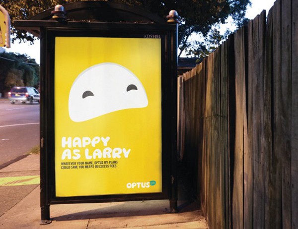
9. Highlight brand features
Each brand has its own flavor. Sometimes it is difficult to notice it, but it is definitely there. Try to find it and express it in your identity.
10. Don’t forget your target audience
Remember that you are creating a corporate identity, that is, the face of the company. And if this “face” is unacceptable for the target audience of the company, then you risk spoiling the image of your client. Even if you and your customer like the option you came up with, always think about how the public will react to it.
Source: lopart.by
Cover photo: ShutterStock
…
