5 basic rules for creating a website design
5 basic rules for creating a website design
The Montless team of remote developers and designers have compiled a list of 5 basic rules for creating a website design.
Sites in which the user is simply lost in the interface most often scare away visitors. This can be avoided by following the generally accepted principles that are described in this article.
Well-designed sites give the user confidence in your site, they are easy to use, and therefore visitors stay on the site longer than usual and visit it in the future.
Here are the basic principles that will preserve the quality of the design while making the interface more user-friendly.

1. Rules are made to be broken
We are always encouraged to abide by the rules, assuring that they will make our designs better and more beautiful. Yes, it is, but just as there are no identical paintings, there are no identical designs, so you can break the rules from time to time. So you defuse tension, make the design more diverse, emphasize the contrast in some elements and groups of elements.
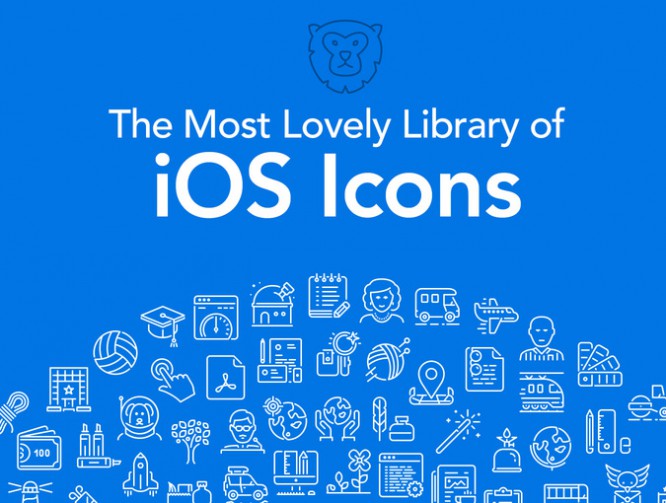
2. Use icons where needed
There are design elements that make it immediately clear what a particular block is about. For example: Magnifier – Search, Floppy – Save, Home – Home. Such elements help to make the site more understandable and user-friendly. But it is worth placing the icon to save, for example, in a search, as the user will immediately be puzzled.
3. Color is not a decoration, but a design element
It builds the order between elements, especially on the screens of phones and tablets. It is the combination of colors that affects the perception of the site as a whole. Therefore, if you use photographs in design, then they and the color scheme of the site should have a single atmosphere.
4. Use fonts correctly
There are several thousand fonts out there, so it’s tempting to mix and match fonts in your layouts. But it’s best not to combine more than three fonts on one site. Use one font for headings, another for the body, and one for other purposes. Sans-serif fonts work best for the main body of the site, but for headings, you can think of a more interesting combination.
5. Ask other people for help
So, you have all the basic design elements, with icons and pictures, with the right combination of colors and fonts. What’s next? – Getting help from others.
Show your work to people who work in this field themselves. Ask for professional constructive criticism. This will help you see all the design flaws, as well as mistakes that you might have made.
Use dedicated portfolio sites like Behance and Dribbble to showcase your work. This way you can introduce yourself to other designers and get criticism, feedback and advice on your work.
Authors of the article: Alexander Nikitin, Konstantin Shcherbina
Edited article: Alena Ivakhnenko
Source: Spark
Cover photo and article: ShutterStock
…


