4 reasons to start your design in black and white
4 reasons to start your design in black and white
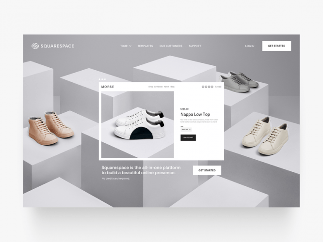
Using only shades of gray (before adding other colors to your design) helps you think clearly and prioritize correctly when it comes to UX design.
1. You start focusing on position and padding
Having started your design in black and white, it is worth considering the fact that most of the time will be spent on figuring out how to group and correctly arrange elements on the screen. You involuntarily begin to think about such seemingly imperceptible, but more and more important aspects of design such as readability (line height, paragraphs and typography), then the so-called Call-To-Action buttons and scannability – grouping of elements, indents, become the focus of attention.

2. Your customers start asking the right questions
Good design takes time. Many designers in the early stages are afraid to show the unfinished version to their clients / users in order to immediately get feedback, which, by the way, is very important, because it helps not to be sprayed and not to waste time on many unnecessary things. The problem is also that many clients are completely unaware of what they themselves want or are simply unable to provide constructive feedback. And showing them an early version (which perhaps looks more like a high-fid version using pen and paper) will already give them an understanding of the whole process, and also give them the opportunity to ask questions as accurately as possible.
It is better to have a conversation from the category: “Which color is better for this button” than “Why did you choose yellow for this button.”
…
3. Your design is clean
Creating a simple and clean design is not an easy task. Using only black and white colors in your arsenal, all your attention will be focused on usability, padding, size, arrangement of elements and their interaction. The first version of the design should only contain different shades of black and white to reflect the hierarchy and weight of elements on the screen.

4. A sequence is created
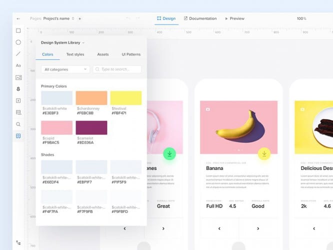
It is best to use no more than three colors in your design. The more colors you add, the easier it will be to confuse the user or distract them to completely unimportant parts of the interface. Plus, when you have one brand color and selectively use it in black and white designs, the user’s attention is naturally drawn to these “colored” elements.

Therefore, the next time you open Sketch or Illustrator or any other design application, forget about the color palette at least until you have a finished design in black and white.
Source: pollskill
…


