
10 techniques for creating awesome presentations
10 techniques for creating awesome presentations
Have you ever seen awful PowerPoint presentations with colorful slides and gaudy pictures? In this article, Grigory Art, CEO of Artrange Digital, will tell you how to avoid this and share his 10 techniques for creating presentations. These techniques are based on his international experience in creating business presentations for companies such as TEDx, Sberbank, Beeline, Rostelecom, VTB and other companies from the USA, India, Australia, China, Germany.
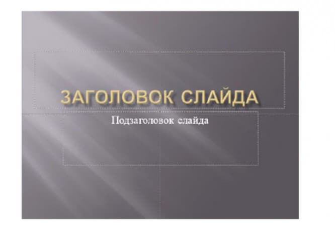
1. Don’t use PowerPoint templates in your presentation.
I want to disappoint you, but PowerPoint has no design templates. Often, these templates are no longer in vogue and will immediately be perceived by your audience as a “low-quality product”.
I suggest 2 solutions:
1. Don’t use templates at all. Combine your slides with a single color scheme and make the format and position of the headings the same on all slides except the first and last.

2. Create your own templates if you plan to use and edit this presentation in the future. To do this, we need to go to the View -> Slide Master tab. This is a secret room, which not everyone knows about, as practice shows 🙂
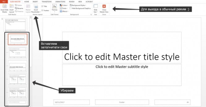
In this section, we can create our own template!
I usually delete all the default master slides in the left tab and build my own from scratch. All you need to do here is add fillers and style them.
Then we exit this mode (there is a red cross on the top right) and try to apply master slides – Right Mouse Button -> slide layouts.
You now have your own template.
2. Use 3-5 basic colors when creating presentations.
Please do not use more than 5 different colors when creating your presentation. Moreover, use only 3 base colors, as the other 2 are usually shades of the primary colors.
How to choose a color palette.
- One of three shades should be highlighted for the background. Decide right away – it will be a presentation with a light or dark background. If you’re an advanced designer you can try alternating, but I’m skipping those experiments in this article.
- Next, choose a color for the text. It should be as contrasting as possible in relation to the background color. Ideal and common option: white background – black text. But this option is inferior in terms of creativity 🙂
So let’s take a look at a few examples. Maybe I can give you some ideas: withGray background, light blue body text, and dark gray accent.
White background, black text, blue accent. 3 Colors. Interspersed with dark backgrounds and white text.

Dark background, white text, accent green. It also uses shades of light green and alternates between a dark and light background.
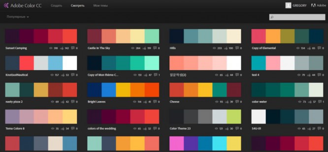
If you still could not decide on the color palette or you do not have a brand book of the company / project, then I suggest you the following resource color.adobe.com
Here you can choose a color palette based on the image, as well as in the “Explore” tab, see the decisions of other users and even find out the number of views and likes 🙂
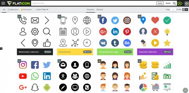
3. Ditch 3D icons from search engines – go for linear and flat icons.
Unfortunately, I still often see slides that use bulky, low-quality icons. Now this is an outdated topic and looks very ugly. And some do not use icons at all, which is also bad, because visualization is important in the presentation, and not just solid text. Purpose of icons : replace unnecessary text and speed up the memorization and assimilation of information. My advice to you : when creating your presentation, use the icons from this resource – flaticon.com
Icons from flaticon will make your presentation more modern and concise.
There is a section “Packs“, Where you can find icons of the same style on a specific topic from one designer. I advise in this way to comprehensively select icons so that everyone is in the same style.
Subconsciously, we feel every detail in the presentation, down to the thickness of the line for the icons, and if this thickness is different between the icons, then the presentation immediately ceases to be in harmony, and subconsciously we no longer perceive it as high-quality.
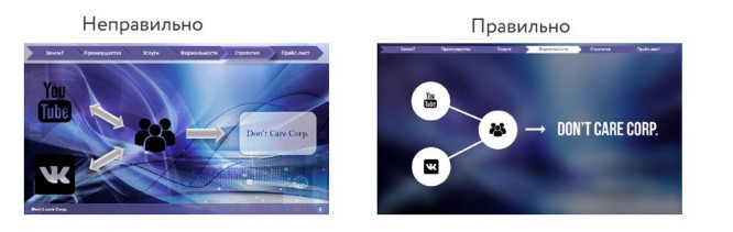
Also, when working with icons, I want to note such a tendency among people as “Blindness syndrome”… This is when everything in the presentation is done in large sizes – “so that everyone can see”. If you make everything huge, it will significantly lower the quality of your presentations, and after all icons look good only at small sizes. Let’s take an example:
4. Each slide is a picture and needs a frame. Or not needed?
When creating your presentation, keep the box around the edges of the slide. Moreover, large frames are in fashion now. Important: the distance from the borders to the contents of the slide must be the same on all sides. Example:
What can happen? It may turn out that the content that you planned to post does not fit on one slide, and that’s good! You don’t have to try to squeeze everything into one page. Better split into two slides with one heading.
One slide, one message.
Why make everything large – the slide needs air.
5. Give up bad habits. Knotted with serif fonts.
If you are not an avid designer and are not experimenting with fonts, then my advice is not to use serif fonts.
I offer you the following list of fonts:
System fonts:
- Arial
- Arial narrow
- Arial Black (titles only)
- Calibri
Third party fonts:
- Bebas (titles only)
- Raleway
- Roboto
- Helvetica
- Circe
- Open sans
- Gotham pro
How to combine fonts when creating a presentation?
If you have never touched upon the topic of font combinations before, then I advise you to use only one font group when creating a presentation and change only its type. For example, make the title Arial Black, and for regular text Arial, or another option from third-party fonts – the title Raleway Bold, and the body text Raleway Regular.
If you still decide experiment, then you can try the following combinations:
Bebas Bold – title
Raleway Regular – Plain Text
For the rest of the combinations, I prefer to select one font and change only its type. This is more correct.
And here is a couple linkswhich I personally use to download fonts:
- Google fonts
- Font Squirrel
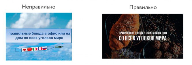
6. When creating your presentation, use only high quality images.
This is generally a sore subject. Especially here in Russia. If anyone has read Artemy Lebedev’s book “Manhood”, then there he clearly notes how, in connection with the fall of design culture after the collapse of the USSR, our population’s taste for high-quality design has been distorted in parallel. Perhaps you are reading now and will never appreciate the works that I glorify here. And this is not because you are a bad person, but because our environment did not allow you to develop good design taste.
I can only give advice something that has worked great in our studio for several years and is appreciated internationally:
- Do not use images from search engines as background images unless necessary.
- Download images only from specialized sites where photographers publish their work
- Use high resolution images as background – for me it is at least 1000 pixels in height and width
- Don’t use stock images with forced smiles and white backgrounds. It looks unnatural.
- You can use the following resources as sources: flickr, unsplash, everypixel
7. Don’t use outlines. Either thick or nothing.
Now let’s dive a little deeper into the design.
You may notice that when you draw a shape in PowerPoint, it may turn out blue and with a light blue outline. Important: remove these outlines immediately. They will only emphasize that you are not in trend and did not want to bother with the presentation design.
This begs the question: are contours now out of fashion altogether?
Answer: no, they just mutated into large frames :).
Here are some of the contours you can still use:
Otherwise, yes, the contours have gone out of fashion like the once white wigs.
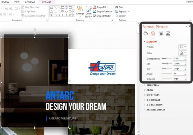
8. Don’t use shadows. Either big and blurry, or none.
Shadows certainly haven’t gone out of style, but contours have. But they turned into something exclusive and expensive. Like a Patek Philippe watch. You either buy an original or a Chinese counterfeit and everyone understands that it is a Chinese counterfeit.
The moral of the story is this: if you can create trending shadows, great! If not, then please cancel them everywhere in the “Format“.
Shadows come standard in PowerPoint (especially in earlier versions). And I can tell you for sure that such shadows need to be removed immediately from the template.
Let’s take a look at some examples: Bad shadows from PowerPoint
Nice shadow from Dribbble

Nice shadow from PowerPoint

I attach you even the settingsif you still want to use shadows. But use this power wisely and do not put such a shadow on all the shapes in a row, so that they do not fill the entire background.
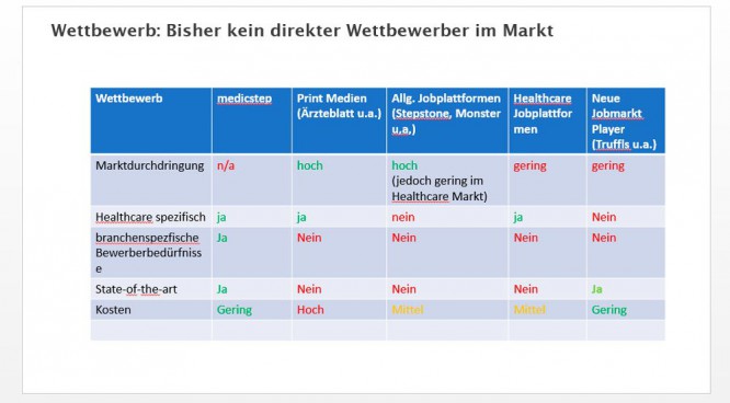
9. How to make tables and charts beautiful? Remove all unnecessary.
Here, in fact, the rules overlap, but I noticed that for some, when it comes to tables and charts, they seem to forget everything: about the rule of colors, outlines, shadows, frames, and the like.
However, I have already described all the errors to you. It remains only not to commit them. 🙂
Let’s see in practice:
Here is a smoker table:
But a healthy person:
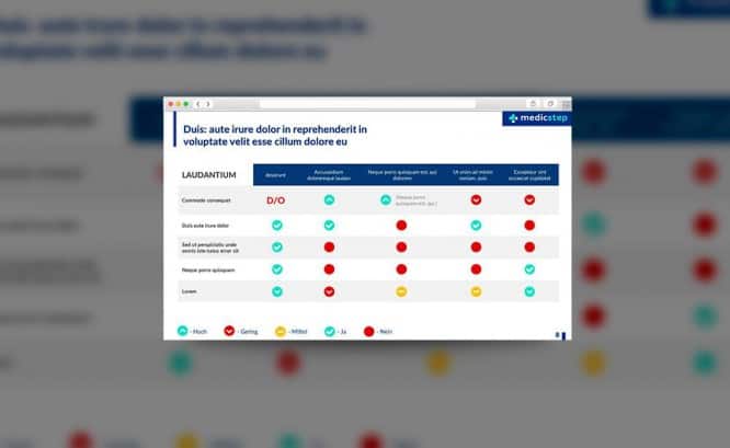
What is the difference? One is heavy and cumbersome, the other is clean and concise. Note:
- There is white space between the border of the cell and the content.
- Of course there are no contours
- No extra shadows
- Some fields are not filled at all
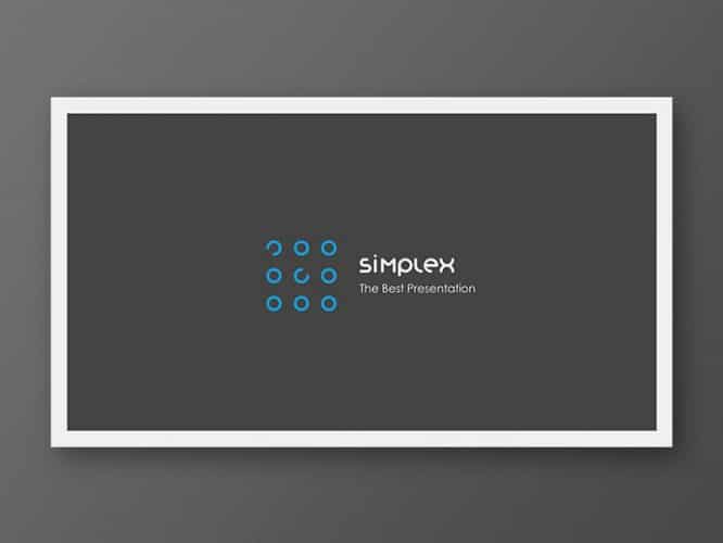
10. The slide is your canvas. Be creative. Imagine you have a brush in your hand.
If presentations were created in Paint, then the slides would look much more creative. I say this to the fact that often we ourselves drive ourselves into PowerPoint template frames, although there, too, you can create unique works of art.
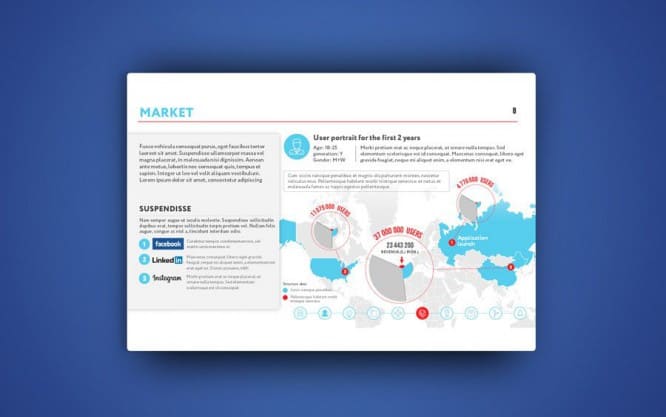
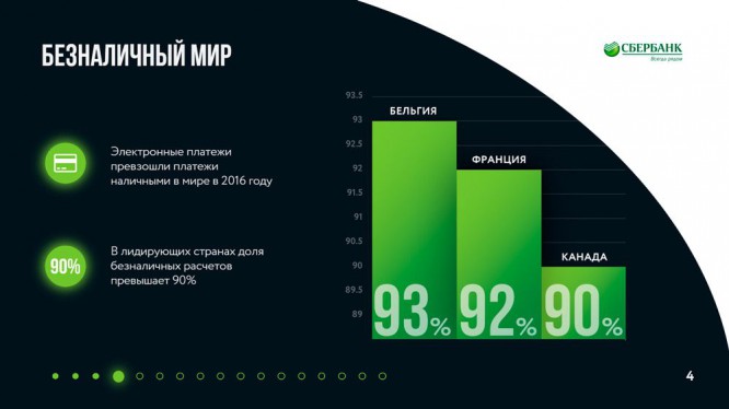
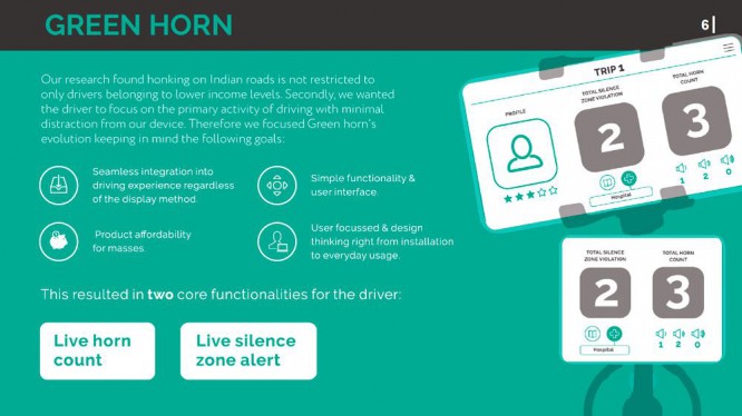
Let’s look at some examples of slides created in PowerPoint:


I wish you to create only high-quality presentations for your projects!
Source: SPARK
…
