31 logo design tips
31 logo design tips
A selection of 31 logo design tips from the book Logo and Corporate Identity. Designer Guide “(review).
1. Interview with a client
As soon as you take on any project, ask the client questions. Many questions. You must have a comprehensive understanding of what the customer wants, who their competitors are, what happened to their previous brand. There is nothing worse than finding out in the final stages of work that your client has a competitor who uses a similar brand, or that your logo style simply does not align with the client’s goals.
2. Think clearly
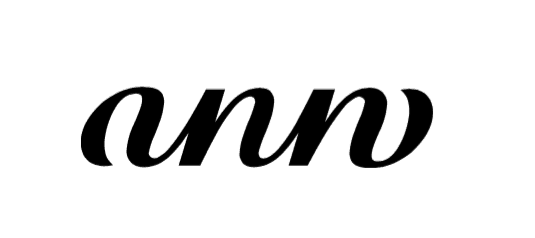
The viewer, at best, will keep his attention on the logos you have created for a couple of seconds and move on. Therefore, clarity is first of all, especially when it comes to an unspoken brand. The client might have a beautiful autograph, but if it doesn’t read instantly, don’t even think about using it for the logo.
3. Be prepared for the unexpected
If you do not know exactly how long it will take to complete an assignment, always take a “spare” time. For example, if you think it will take a week to work on a client’s comments, say two weeks. And then pleasantly surprise the client by completing the work earlier than he expected. Design is the same construction: you put together something bigger from small parts, and at any time a defect may come to light.
4. The logo does not necessarily represent what the company does
The Tiger Woods logo does not depict a golf club, the Virgin Atlantic logo does not have an airplane, and an Aston Martin does not have a car.
The trademark of a dental clinic should not be a tooth, a plumber’s logo should not be a toilet, and furniture should not be placed on the sign of a furniture factory.
What the company does is important, but don’t think your design will get worse if you don’t communicate visually about the products and services your client produces.
5. You can do without the symbol
It happens that a client just needs a professionally executed type logo. The use of the symbol is superfluous in this case.
It is also necessary to talk about this at the beginning of work. Ask what the client is looking for. If the company is planning to expand into other markets, then it is better to make a recognizable type logo, because the brand or symbol may have limitations, especially if the symbol is a literal interpretation of what your customer is selling at this time and place.
6. One memorable detail
Each strong logo has one detail that sets it apart from others: Apple has a bitten apple, Mercedes has a three-pointed star, and the Red Cross has, of course, a red cross.
Let your client remember one detail of the brand you created.
One. Not two, not three, or four. Only one.

7. Take care of your sketchbook
You don’t have to be an artist to appreciate the benefits of sketching to a designer. The flow of ideas is much more abundant when you use pen and paper rather than a mouse and monitor. Always keep a notebook handy because you never know when an idea might come to you.
8. Leave the trends of the fashion industry
Trends come and go. You need to follow the current fashion when you buy new jeans or a dress, but when you develop a brand for a customer, it must be done seriously and for a long time.
Therefore, do not try to “be in trend”. Stand out.
9. There is nothing wrong with using stamps.
But only if you present them from an unusual perspective.

10. Work in b / w
No play of colors will save a weak logo.
Refrain from using color at the beginning of the work – then neither you nor the client will be distracted by reasoning about the merits of, say, green. Focus is on the main idea.
11. Consider who you work with
Are your clients lawyers? So no jokes. Is your client doing a children’s TV show? Therefore, there should be nothing too serious in the design. Are you working for a Michelin-starred restaurant? Then you will opt for muted colors rather than bright and fluorescent ones. And so on – you have understood the general principle.
12. Printing costs
From the very beginning, ask the customer if they are budgeting for printing costs, because color printing is more expensive, and this can limit your freedom of action. Each printing house has its own prices. You can find one where full-color printing will cost as much as printing with one ink, or one where one-color printing will cost more than paper. Your job is to immediately inform the client about the printing house’s pricing and related restrictions.
13. Keep the brand
Many examples of visual identity are accompanied by a style guide and their creation is often your responsibility. The guides will help you maintain your brand style settings so your designs always look the way they should. Consistency defines trust. Customers’ trust is won.
14. Match the font to the symbol
Maintain design consistency. So, if you are using a playful character, match it with the appropriate font. If the character is in bold lines, thin font will not work.
15. Slogan
Slogans tend to work better than logos, but usually you are required to present design options with and without that short statement from your client.
16. Prepare a one-color version
You can use several colors for the logo, however, be sure to prepare a one-color version as well. This will make the logo more flexible, easier to adapt for different applications, and the client won’t have to contact you a second time if they want a monochrome version.
17. Consider contrasts
Regardless of whether the brief suggests a gentle approach to highlighting the main thing or your design needs to be catchy, the level of contrast has a huge impact on the result. The changes you make may be subtle, but they are what makes you a professional.
18. Try different sizes
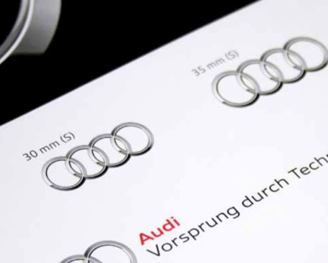
Print your work to make sure it looks better on paper than it does on screen. But at the same time it is not enough just to print one logo – you need to reproduce it in several sizes. If a symbol loses detail when zoomed out, you are always free to prepare different versions for different scales. For example, a small symbol can be executed with richer and simplified lines than a larger version of it.

19. Invert the logo
Show the client what the inverted version will look like – that is, white letters on a dark background. It will not take a lot of time, but it will be valuable for the client.
20. Flip the logo.
Just because a logo looks good in the right position doesn’t mean it will look just as good when flipped over. So, the logo on the cover of the annual report, lying in front of you on the coffee table, to the one sitting opposite you, may appear in the form of a phallic symbol. Therefore, before completing the work, look at it from all sides.

21. Pay attention to the paper
In everyday use, on paper or cardboard, your logo may look completely different from the final presentation. When printing, the color can be distorted beyond recognition, the contour can blur. Therefore, before sending products with your logo to print, discuss all options with the printing house or advise the client to do this.
22. Learn all about registering trademarks
By registering your created logo as a trademark, the client can insure himself against legal problems. Unfortunately, registering a trademark is a long and complicated process, so it is best to outsource it to a trademark lawyer. However, you should brush up on your knowledge in this area to be ready to answer the client’s questions.
23. Don’t be afraid to be wrong
Everyone makes mistakes. Learn from them and move on.
24. Be flexible
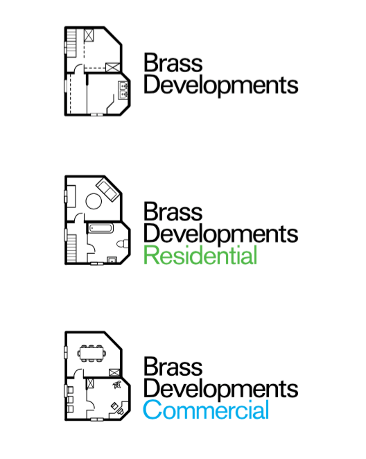
Your client may need wider or taller logo options in case a market strategy develops. Think about what the sub-brands will look like.

25. A logo is a small but significant element
The logo is only part of the brand. The brand as a whole includes a lot more: the mission of the company, its history, how people perceive the company, etc. An effective logo plays an important role, but it will not save a company with a weak mission or low quality products and services.
26. Design is a two-way process
Projects are not always done the way you intended. The client may ask you to do something that you initially disagree with. Do as he asks. If you still disagree with him, do what you think is best, and explain to the client why you think this is better. Customers will be much more willing to agree with you if you agree with them.
27. Differentiate!
If competitors use blue and green, your customer will surely be able to stand out from their background if they prefer red and orange. As Marty Newmeyer said, “When everyone turns sharply to one side, turn the other.”
28. The Importance of Being Cultural
Gestures and colors in different parts of the world can be read in completely different ways. Customers with an international market should pay particular attention to the cultural differences of their customers, and therefore to you too. Somewhere they read from right to left, and somewhere from left to right, so whether the design is hidden, whether explicitly, should set the direction that is assigned to a particular tradition.
29. Recognition
The simpler the design, the easier it is to recognize and remember. Take big corporations like Samsung, FedEx, Mitsubishi or the BBC. Their logos look simple – and therefore easier to recognize. In addition, a simple logo is easier to shrink or enlarge as needed. Ideally, your logo should remain recognizable even if it is a centimeter in size. But be aware of the possibility of creating slightly different versions for reproductions of different sizes.
30. Set context
By placing the logo in all sorts of situations of its use, you help the client to accept your ideas favorably. I once worked with Kairos, a shoe store in London, and decided to present my design ideas as if we were seeing them through the eyes of potential buyers.
31. Let People Smile
Don’t be afraid to be witty.
Buy the book “Logo and corporate identity. Designer Guide “
The book “Logo and corporate identity. Designer Guide “can be bought in the online store of the publishing house Peter at a price of 721 rubles. in printed form or 299 rubles. – electronic.
By the way, an additional discount in 25% can be obtained by coupon infographics when buying through the website of the publisher.
Source: the book “Logo and corporate identity. Designer Guide “
Cover photo: ShutterStock
…


