12 principles of visual hierarchy
12 principles of visual hierarchy
What is the difference between a really cool composition and not so much? The devil is in the details. The Visme team visualized and described them – the basic rules for creating awesome content.
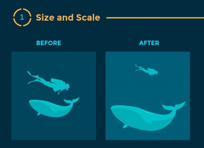
1. Size and scale

Size matters, of course – but proportions and ratios are more important.
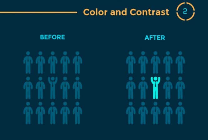
2. Color and contrast

If you need to select one of the elements of the same size, use color and contrast. Emphasize it, make it literally different from everyone else.
3. Typography hierarchy

Think about a newspaper. The headlines and cool articles are made bigger there. the same principle can be used for anything. There is important information – highlight it.
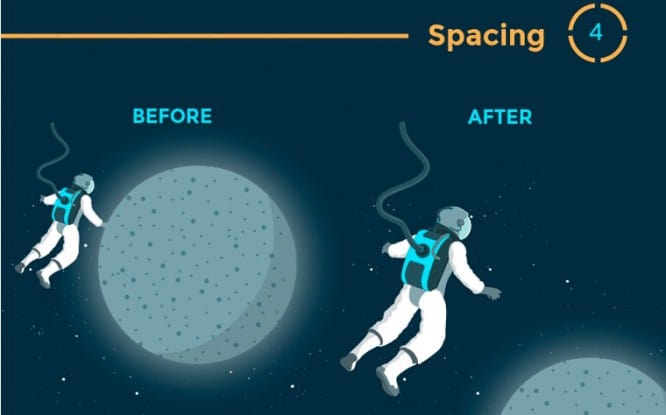
4. Distance

Space enhances your message and creates movement.
5. Rapprochement

The closeness of the elements suggests a well-coordinated relationship. If you write about a friendly team that stands for each other, you cannot separate these people. Put them closer, make them a group.
6. Negative space

Negative space not only makes information easier to read by grouping it into departments, but it also creates focus on individual objects.
7. Construction

Alignment and construction is the basic principle of the structure of your design. If words or elements are just scattered across the page, they are most likely to create confusion.
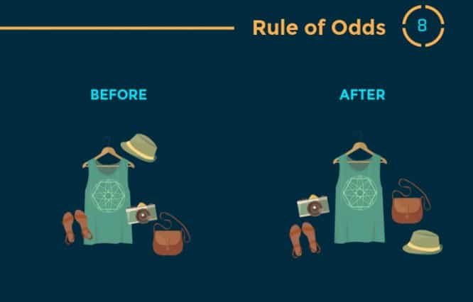
8. Rule of odd numbers

A group that has a centerpiece and an equal number of elements on both sides draws more attention and forces you to focus on the centerpiece.
9. Repetition

Just as contrast accentuates and draws attention to design elements, repetition creates unity that enhances understanding and recognition.
10. Lines

Movement is one of the most effective ways to grab viewers’ attention, especially when it is implied in an unfinished design. Directional lines create just that effect.
11. Rule of thirds

The most effective designs are composed of a specific type of mesh. The most typical grid is the classic modular composition of the intersection of vertical and horizontal lines. Artists, photographers and graphic designers have long used the rule of thirds to improve the overall balance of their compositions. The rule involves mentally dividing the composition into a grid of two horizontal and two vertical lines – or nine separate sections.
12. Perspective

By using perspective, designers can create the illusion of depths ranging from inches to miles. Since we see similar illusions in the real world, we tend to perceive larger objects as closer, and therefore they tend to attract attention better.
Source: Sayhi
…


