
11 cool optical illusions in visual design
11 cool optical illusions in visual design
Over the years as a product designer, when working with visual effects, I have come across many surprises that caused me the following emotions ?????.
I wrote this article to help you understand the reasons why some of these daily “mysteries” may leave you confused. You may not even understand this at first, but many of the techniques you come across when working with an interface, logo, or illustration are actually optical illusions!
So, without further ado, here are 11 optical illusions that you as a visual designer might come across on a regular basis.
1. Triangle-bisection Illusion

Aligning a triangle based on a centroid
Icons can be misleading, especially those with complex geometry and irregular proportions. Not all icons in the set are symmetrical, pixel perfect, or maintain consistent aspect ratios. Some icons require direct intervention, most notably the awful play buttons!
Placing a triangle in a container with rounded or right-angled corners can result in the element being optically displaced. The reason for this has to do with an effect known as the triangle bisection illusion. The center of gravity of a triangle is calculated based on its minimum bounding rectangle. Therefore, if you put a point exactly in the middle of the height of an equilateral triangle, optically it will appear much further than in the middle!
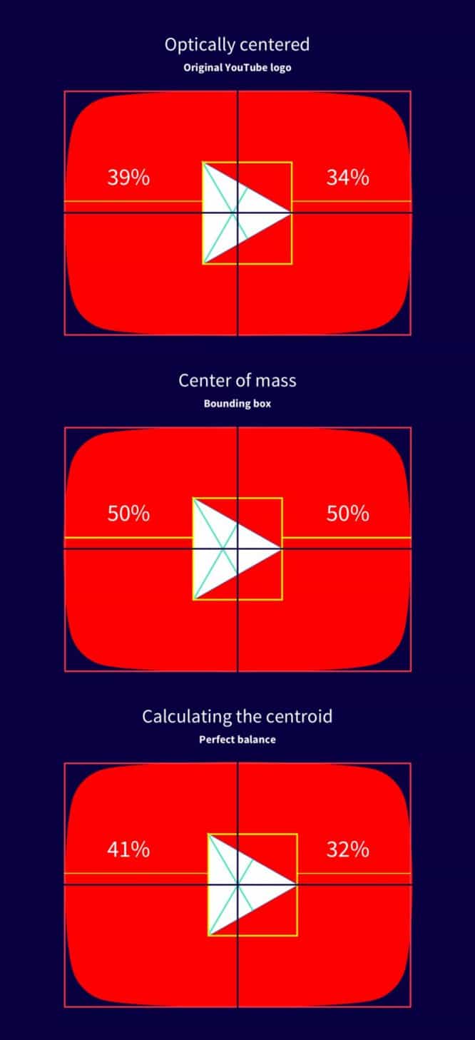
Which version is mathematically centered?
There are two theories for this fascinating illusion:
- Incorrect scaling
This illusion contains perspective guides that increase the perceived size of more distant objects. For example, an equilateral triangle can be perceived as a flat perspective view of a road, with the top apex at infinity and the base as the widest part of the road closest to the viewer.
- Center of gravity / center of area
If the viewer were asked to find the center of the triangle, he would end up pointing to the centroid, which has equal areas above and below itself. The centroid of an equilateral triangle lies well below its center point, and there is evidence that viewers make choices that are a compromise between them.
To make the triangle inside its container look optically centered, you need to find the triangle’s centroid by calculating the intersection of the lines connecting each vertex to the midpoint of the opposite side. Here is the formula you can use:

Just kidding, this is not an article about math and physics ? (but the formula is still correct).
The centroid can be located at a distance of 1/3 from each side to the opposite apex. This technique can be applied to many other shapes as well.
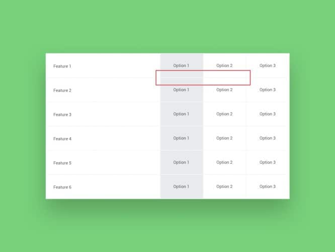
2. Vertical-horizontal illusion (Vertical Horizontal Illusion)
Is it a rectangle? No … is it a square ?!
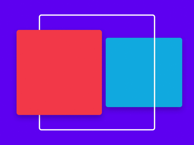
Vertical-horizontal illusion
Squares are the fundamental building blocks of any design system. They can be seen in Material Design cards, Facebook posts, Pinterest pins, and Dribbble shots.
After you drag a square in Sketch, sometimes you have to look at it twice to make sure that each side is equal in proportion. If you look closely, the vertical sides will appear longer than the horizontal ones. It’s as if the square were actually a rectangle! But this is a perfect square with a 1: 1 aspect ratio. This effect is known as a vertical-horizontal illusion.
What’s really interesting is that people of different genders and even different cultures perceive this illusion in different ways. People who live in developed cities tend to be more receptive than people living in rural areas. This is due to the fact that people in rural areas tend to be accustomed to living in round houses.
3. Mach bands (Mach Bands)
A false shadow falls to the surface, is it an illusion?
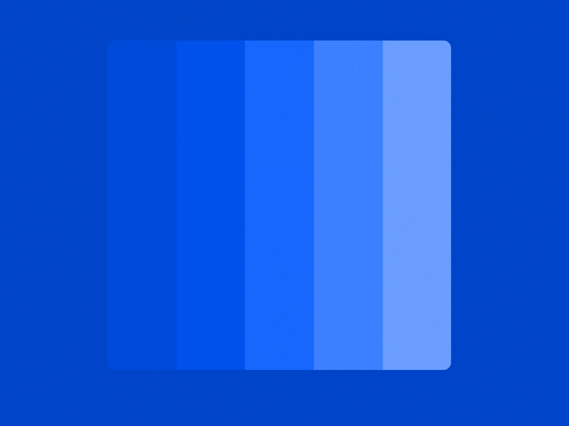
Placing shades of the same color adjacent to each other was a common trend in the flat design era. Looking closely, you can notice a false shadow appearing between the edges of each contrasting shade. This illusion is known as Mach stripes. No shadows have been added to the image, this is just a feature of the perception of our eyes!
The technical explanation for this effect is due to lateral (lateral) inhibition, which means that a darker area falsely appears darker and a lighter area even lighter.
While this effect is barely noticeable in the world of visual design, Mach stripes can be a real problem for dentists, making it difficult to analyze dental X-rays. Mach bands can lead to a false positive diagnosis if not correctly identified.
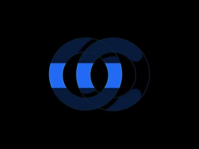
4. Hering Illusion
It’s alive!!!
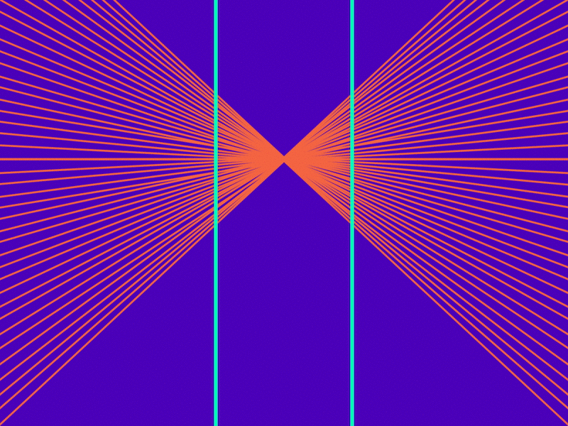
Have you ever encountered a logo containing very thin lines or a background image with tiny dots that appear when moved or pulsate when scrolling? If so, this is due to an overlay effect called moire pattern, where two mesh patterns overlap each other, creating a false movement after being moved. In this case, the two grid templates – the image and the monitor – are constantly updated to create the illusion…
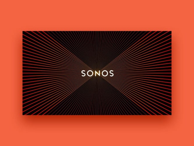
This is a pretty cool effect, although the moire pattern is not an optical illusion per se – it is an overlay pattern. The Sonos logo example uses a combination of moire pattern, Hering’s illusion, and illusionary movement. This sensory technique is quite popular in the Op Art community.
5. Hermann Grid
It appears or does not appear, that is the question.
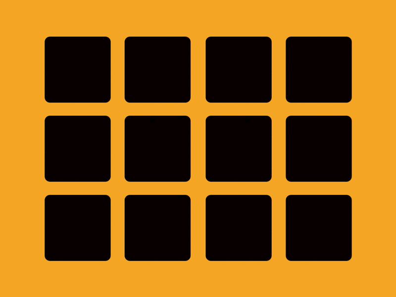
The Hermann grid illusion is quite popular and can be seen in layouts that contain a grid of squares placed against a high contrast background. Look directly at any square, you will see ghostly balls at the intersections of the lines surrounding the squares. But, if you look directly at the intersection, they disappear ?.
The reason for this effect is associated with lateral inhibition. Simply put, this is when an inhibitory cell inhibits nearby neurons
6. Simultaneous Contrast Illusion
Do both isolated squares reflect the same amount of light? Hmm …
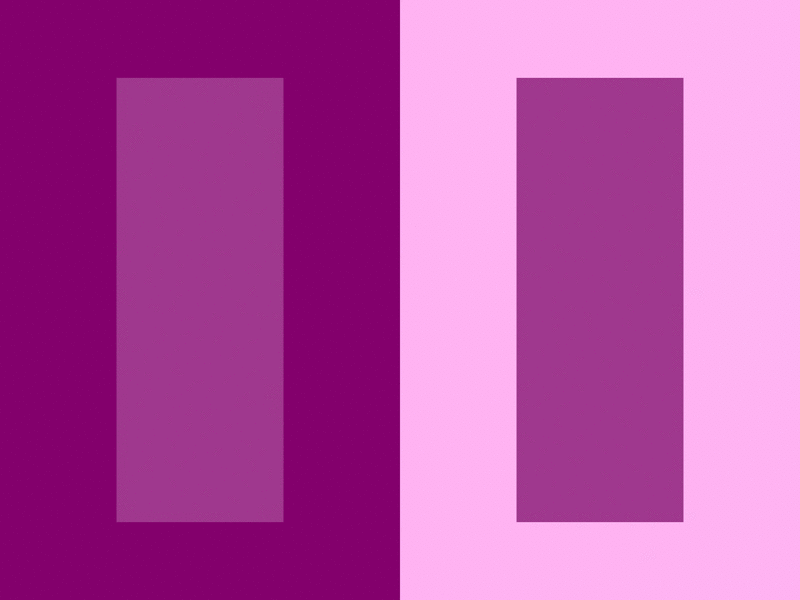
The illusion of simultaneous contrast
Placing two objects of the same color on backgrounds with different contrast can cause both objects to appear as if they were different colors. This phenomenon is known as the illusion of simultaneous contrast. Contrast is king in the world of visual design, and some people may experience this effect differently.
The color of the text is exactly the same on both sides, but you don’t think so
Unfortunately, there is no unified theory as to why this illusion arises, but there are many studies that suggest it. Lateral inhibition, which is responsible for the Hermann grids and Mach stripes, is one of the reasons for this illusion.
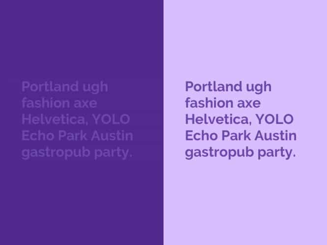
7. Munker-White Illusion
Did my eyes just deceive me? ?
This illusion is subtle, but fascinating nonetheless! Looking at the GIF above, the purple blocks on the left appear lighter than the purple blocks on the right. But both blocks actually reflect the same amount of light ?.
The cause of the Munker-White illusion is … you guessed it, lateral inhibition.
8. Water Color Illusion
Watercolor illusion
It happens that I add a border to an object, and then ask myself the question: “When did I manage to change the background color?” If you look closely, you can notice that the pale area takes on a much lighter shade of the color surrounding the border. You might be surprised to learn that the lighter area is actually white!
These visual phenomena, known as watercolor illusion, rely on the combination of brightness and color contrast of contour lines to produce a color broadening effect.
The white area inside the button seems to take on a bit of a tint to the border color
I admit that this illusion left me perplexed several times so much that I had to use the color picker to check the colors!
9. Jastrow Illusion
Does size really matter?
Jastrow’s illusion
Working on an illustration or logo, be it a sign or a symbol, requires slicing different shapes. This illusion occurs when working with curved objects. These two elements look different in size, but if you look closely, they are actually the same size! Madness, right?
Some equally curved edges may appear smaller than others
How is this possible? Well, this phenomenon is known as the Jastrow illusion, and there is no definitive explanation as to why we think the segments are of different sizes. One explanation is that our brains confuse the difference in size between larger and smaller radii. In other words, the short side makes the long side longer, and the long side makes the short side shorter.
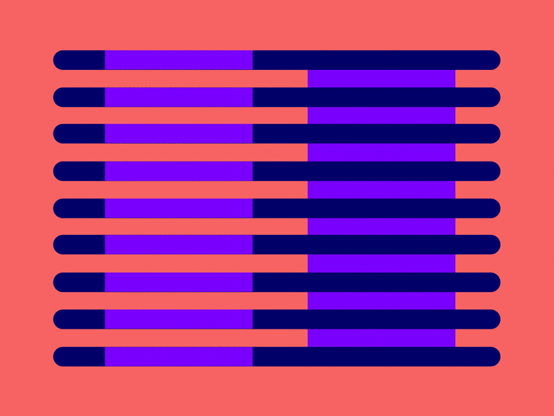
10. Cornsweet Illusion
Cornswith illusion
In addition to the illusion of simultaneous contrast and Mach stripes, the Cornsweet illusion uses a gradient while at the same time uses a center line to give the impression that one side of the image is darker than the other.
But in fact, both sections are the same! You may find that both sections are actually identical when placed in parallel.
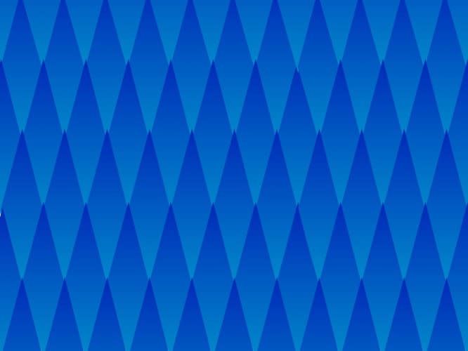
Each diamond has the same gradient, but they seem to get darker (top to bottom)
This illusion creates a similar effect to the above two illusions, but it actually differs in two ways:
- In the Mach stripe example shown earlier, the effect is observed only in areas that are close to the border of each hue. Cornswith’s illusion affects the perception of the entire area.
- With Cornsweet illusion, the lighter portion of the edge appears lighter and the dark portion of the edge appears darker. This is the opposite of conventional contrast effects.
11. Müller-Lyer Illusion

Overshoot for optimal visual perception
Type designers know that creating a type requires you to rely more on your design intuition than on logical thinking. Mathematically positioning each character based on its height will render the entire word out of proportion in terms of visual perception.
Common practice in font mechanics involves a process called overshoot. In simple terms, overshoot is the process of resizing individual symbols to achieve optical balance.
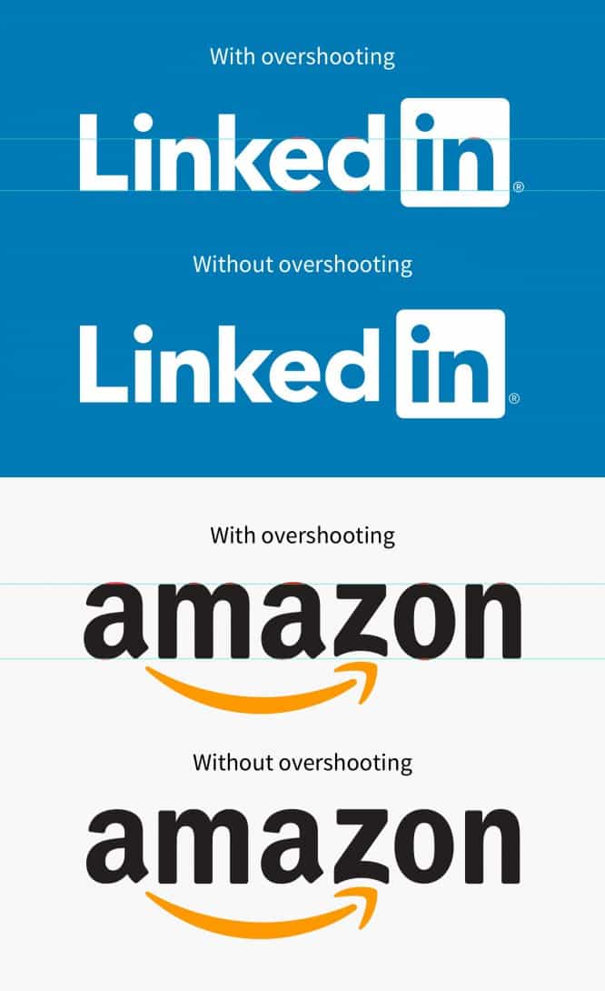
Without overshoot, the e in the LinkedIn logo and the z in Amazon are not optically balanced
Looking at the famous logos above, some of the symbols go beyond the baseline and x-height. Type designers have to manually optically adjust each pair of characters to achieve the best possible result.
But why overshoot in typography?
The reason for overshoot is due to one of the most popular optical illusions in the world, the Mueller-Lyer illusion. These visual phenomena indicate that placing a chevron (herringbone quotes) at each end of a line segment can cause one segment to appear shorter or longer depending on the direction of the chevron. This classic illusion proves the fallacy of human perception. Pretty cool, huh?
Have you encountered any other optical illusions that left you bewildered?
If you are interested in learning more about visual perception, or if you want to improve your visual design skills, I would recommend reading about Gestalt Psychology.
Honorable Mentions:
- Caniza’s triangle
- Ebbinghaus illusion
- Ehrenstein’s illusion
- Scattering neon color
- Illusion with shadow on the chessboard
- Illusionary movement 1
- Illusionary movement 2
Source: sketchapp.me
…

