
14 cool services that use illustrations in the interface
14 cool services that use illustrations in the interface
– Yes, we are a bank! What other pictures are completely stunned?
Many teams think their product is too serious to use illustrations. Like, this is childishness and kindergarten. In the meantime, world-famous services draw pictures with might and main, win the trust of users, facilitate UX, detach themselves from competitors, live and prosper.
I delved deeper into the topic and found illustrations in such unexpected places as a mobile application for a bank, a CMS platform, a help desk system, a password encryption service, and even an application for trading on a cryptocurrency exchange.
Let’s analyze it in order.
Where illustrations are good
The illustrations in the interface work in such cases:
1. Empty states – we use pictures on the page when there is still or no content.
2. Onboarding – we welcome, introduce the service, teach, help.
3. Notifications – we inform about important events, add emotions to messages, confirm actions.
4. Progress indication – visually displaying the current status of the user or system.
5. Ease of choice – we emphasize the differences between the blocks with pictures, speed up perception, reduce the amount of text.
Empty states
Designers (and I am no exception) often forget that when designing a page, you need to think about how it will look without data. At the same time, users see empty sections much more often than we think. For example, after registration, the user finds himself in an empty interface, is perplexed, does not understand what to do there, and leaves. Old users are faced with the same, entering a new section for themselves.
The guys from CMS Shopify (the mega-popular website management platform in the West) sat down and worked through all sorts of empty states, drawing a unique illustration for each.

Notice how the illustrations fit into the app’s style and don’t outweigh the main button on the page.
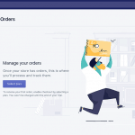
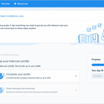
An example Help Scout – a service for technical support kills two birds with one stone – clearly indicates an empty state and “praises” the user that he is a good fellow – raking all his tickets.
An illustration isn’t necessarily something colorful, big, or fun. It can be monochrome and modest. If it fits into the overall style of the product and improves the user experience, then why not use it in a serious application.
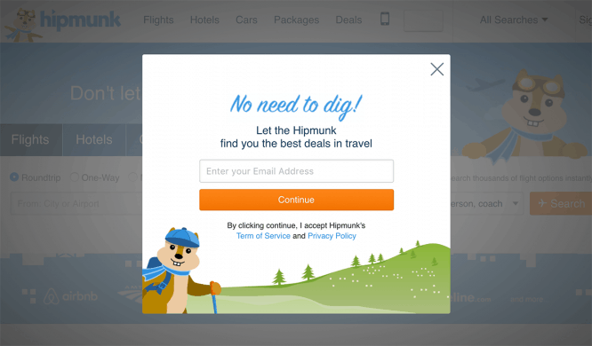
 An example of a mobile client for trading on the Coinbase cryptocurrency exchange and the Alfa-Bank mobile application
Onboarding
With onboarding tips, tutorials and letters, applications try to engage the user and explain what and how to do in the service. Customers often scroll or close the tooltip. If you use little text and clear attractive pictures in training slides, the likelihood that the client will look at them, understand and remember them increases.
It is also important that the welcome training is what creates the first impression of the service. Agree that making a smile at the first meeting is better than driving you into melancholy 🙂
An example of onboarding slides from a Spanish startup Glovo (delivering anything):
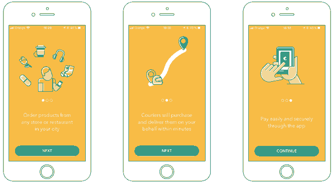 Spanish startup Glovo onboarding slides (delivering anything)
Notifications
Events occur in the system that need to be reported to the user. For something he needs to be praised, warned somewhere, or just to draw his attention. We are not talking about frequent events (like “you received a new letter” in the mail client), but rather rare but significant moments for the user: registration, execution of a key action, payment, etc.
After paying for Convead, our clients see a pop-up with a gold cup, which congratulates them on the successful completion of an important step.
 Convead successful payment popup
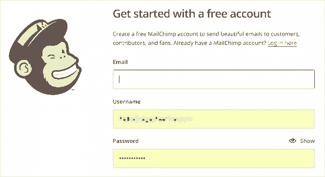
If you sent mailing lists with MailChimp, then remember the sending confirmation screen with a red button and a hairy paw, on which a bead of sweat is dripping 🙂
Seeing this animation, you immediately mobilize and carefully check all the mailing settings again:
 Animation on the confirmation screen for sending mailings to MailChimp
And after the launch of the mailing list, the monkey “gives you five” and you can go and drink tea with a sense of accomplishment.
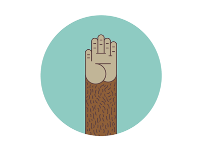 Animation after sending mailing to MailChimp
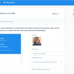
Helpscout cleverly uses illustrations to notify important new updates right on the login screen:
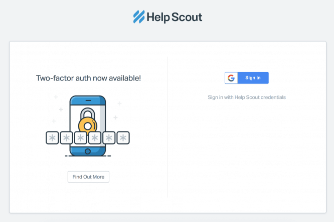 An illustration that draws attention to an important section of the Help Scout
Progress indication
Displaying user progress deserves a separate article. The question is closely related to gamification (the use of game mechanics in non-game applications), which I will write about separately if you are interested.
The task of displaying the user’s progress is perfectly handled by the application for learning English Lingualeo. The player’s progress is shown in the form of a stylized progress bar on the right, plus in the form of character development – Leo the lion. The higher the level of the user, the more sophisticated the model of the character – Leo grows up, he has clothes, things, etc.
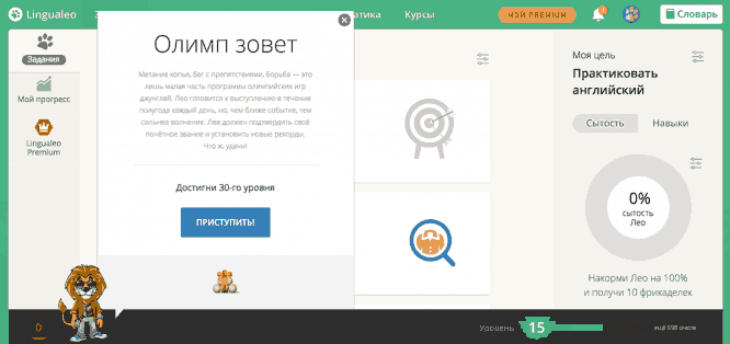 My progress page in the Lingualeo app
With the help of illustrations, you can reflect the progress of not only the user, but also the application itself. AliExpress example is the delivery status of an order
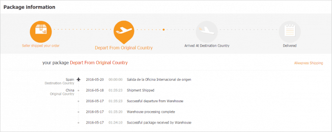 Display order delivery status on AliExpress
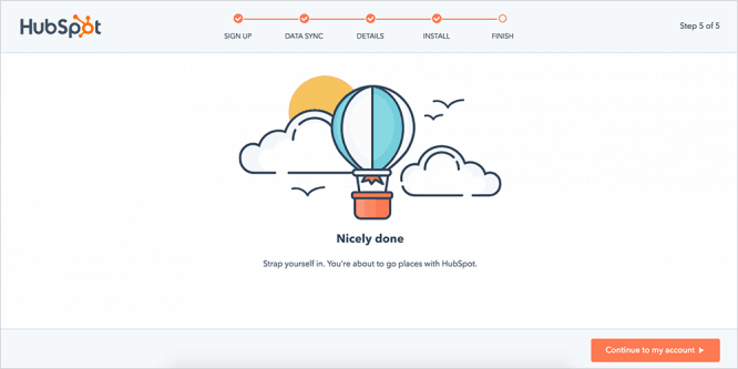
Below is an indication of progress in the HubSpot service (an online marketing platform). How can you not rejoice at your success, seeing such a picture, well?
Characters (edit)
We have already met the character from Lingualeo. But lest you think that the character is appropriate only in educational applications, I will give a couple more examples:
Legendary MOZ (Comprehensive SEO Tool) Robot named Roger:

Monkey MailСhimp named Freddie:
A squirrel named Hipmunk Chipmunk of the Hipmunk airline ticket search service:
The character not only adds uniqueness and recognition to the product, it also facilitates the interaction with the user, because all communication can be conducted through it – both in the application and in social networks, through an email channel, etc.
Making it easier to choose between options
When the user has to choose from several options, it is easier for him to navigate if the options are provided with pictures than if they are presented in plain text. Any pictures will do – from minimalistic icons to full-fledged illustrations.
Service of remembering passwords 1Password illustrates the choice of the type of account: “just me”, “for the family” and “for business” with an armchair, a sofa and an office chair. Cool, understandable metaphor. By the way, the guys on the site have a bunch of other clear illustrations – go and see for yourself.
 Choosing an account type on the 1Password website
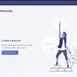
In Convead, we have a section with scripts where the user selects the one they like and launches it on their website. On the page of each scenario there is a picture that reflects its essence:
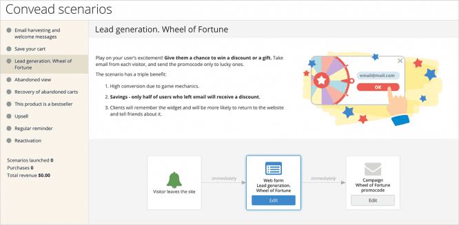 Illustration on the script page in Convead
For illustrations to work for the product, and not against it, you need to:
Distinguish between illustration and decoration. The illustration adds meaning to the content and adds value. The decoration is just a picture that can be thrown away and the meaning will not be lost, or maybe, on the contrary, it will be easier for the user to perceive the content because he will not be perplexed by what relation the cat gif has to his account.
Don’t distract from the UX. The illustration should support the main action, not distract from it. If, after adding a picture, users no longer see an important button, the picture worsened the situation.
Consider the corporate identity and brand. Illustrations should not conflict with the rest of the interface. Corporate colors, 3D / flat images, fonts, etc. For example, in a light flat interface with rectangular elements, a glossy three-dimensional picture with rounded shapes will look unnatural.
Maintain a consistent visual style. Line weights, colors, gradients, rounding of corners, etc. should be the same everywhere. Discrepancy in style looks artisanal and reduces the credibility of the product. If the company has more than one illustrator, or you use freelance services, it is a good idea to describe the style of illustrations in words and provide examples of how you can do it and how you can not.
Last but not least
Perhaps the most important use of illustrations for a product is marketing. This is a way to separate from competitors, to make the product recognizable and memorable. Essentially, illustrations are a visual language in which an application speaks to users, builds trust, establishes an emotional connection.
The success of the whole venture depends on how well you study the users, their background and preferences, what style you choose, how you think over, harmonize with the interface and how well you draw illustrations.
The guys from Intercom (a platform for multichannel communication with users) changed the visual style of the site three years ago. We drew dozens of illustrations with simple animal characters representing clients and managers and showed how easy and simple it is for them to communicate.
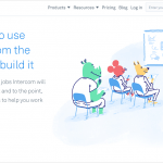
The interface of the service itself was coordinated with the site. We managed to make it clean and easy, and at the same time juicy and colorful, supported by graphics. Added a video with the same characters to each section, which explains how to use.
The same style is used in advertising. It turned out attractive, recognizable and professional. Bravo!
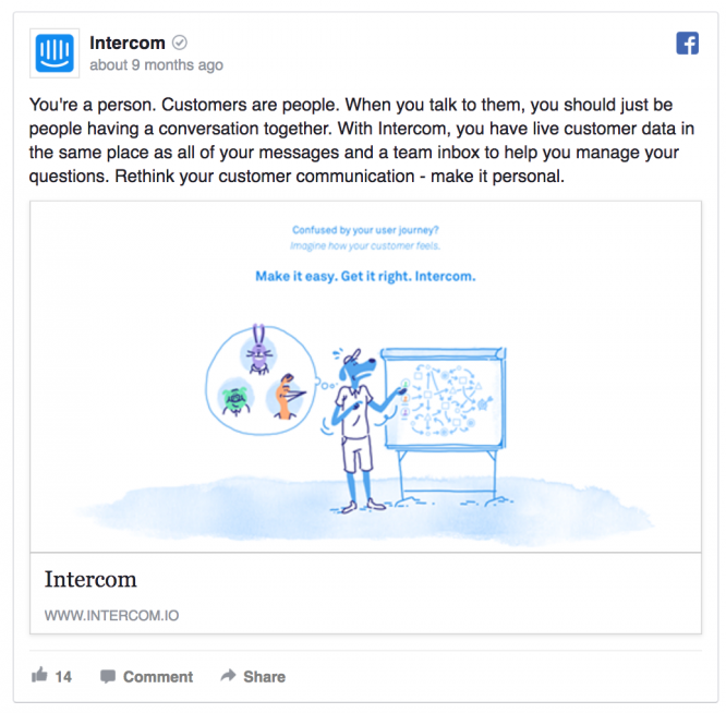 Intercom’s Facebook ad in the same style as the website – recognizable and engaging
Total
Illustrations are an optional attribute of the application. If you don’t want to, don’t paint. But it is useful to understand what such a tool is in the arsenal, how to use it, and what advantages it has.
And if you still think that pictures are not serious and not for you, look back at your competitors – they are already working on how to stand out and improve their UX with illustrations. And may the Force be with you!
Source: olgashavrina.com
…

