
10 rules of typography in interfaces
10 rules of typography in interfaces
User interaction with a product plays a key role in design. If you want a person to be able to achieve their goals, a clear connection must be established between him and the site. Text is one of the tools for this connection. Therefore, the design of the text, in other words – typography, plays a critical role in this process.

A good website design makes the reading process easy, and, conversely, a bad website design only repels the user. As Oliver Reichenstein noted in his article “Web Design is 95% Typography”:
Optimizing your typography can help you optimize readability, accessibility, frequency of use, and overall graphic balance.
…
In other words, by optimizing the design, you are also optimizing the user interface. In this article, I’ll show you some guidelines to help you improve the readability of your texts.
Rule # 1. Use the minimum number of fonts
Don’t use more than three different fonts on one site, or it will look unstructured and unprofessional. Also keep in mind that different font sizes and styles in the same text can ruin any layout.

To avoid these situations, try to keep the number of fonts you use to a minimum.
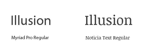
In general, keep the number of typefaces (font families) used to a minimum: two is more than enough, one is the best option. And stick to a consistent style when developing your site. If you do decide to use more than one font, make sure they have a similar style and that their characters are the same width. Below is an example of using two fonts. You will notice that a couple of the chosen fonts match in style and create a harmonious picture. However, in the example on the right, too heavy a font pulls all the attention, and harmony is disturbed.

Make sure the typefaces are complementary and match the width of the characters.
Rule # 2. Try to use standard fonts
Some services, such as Google Web Fonts and Typekit, provide different fonts that can bring something new, fresh, and different to your website design. They are very easy to use. Take Google for example:
- Choose any font like Open Sans.
- Generate the code and paste it into your HTML.
- Done!
What can go wrong?
In fact, two problems can arise:
- Not everyone has access to the same font. This can be a problem as the font you choose so carefully may not read or look different on your users’ screens.
- Your users are accustomed to standard fonts, therefore, they will be able to read such text much faster.
If your site just needs its own font, for example, for brand recognition or to create an immersive effect on the site, then in this case you can choose a special font. If not, then it’s best to stick with system fonts. You can’t go wrong if you use such system fonts as Arial, Calibri, Trebuchet and so on. Keep in mind that good typography draws the reader’s attention to the content, not the type itself.
Rule # 3. Limit the length of lines
The correct number of characters on each line determines how readable your text will be. Do not be guided only by the design, which dictates the width of the text blocks, think also about the readability of the text itself. You can take advantage of advice from the Baymard Institute on readability and comprehensibility of text.
Place about 60 characters per line if you want your text to be easy to read. The correct line length is the key to the readability of your text.
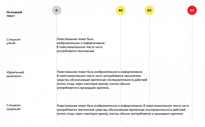
If the line is too short, you will have to look very often, this breaks the reading rhythm. If the line is too long, it will be very difficult for the user to focus on the text.
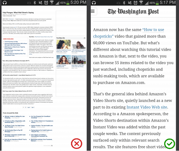
For mobile devices, you should stick to a line length of 30-40 characters. Below is an example of two sites viewed from mobile devices. On the first site, the number of characters per line is 50-75, which is acceptable only for printing a document or viewing it from a computer screen. On the second site, the number of characters in a line of 30-40 is the best option.
To achieve the optimal number of characters per line, limit the width of text blocks: use em units or pixels.
Rule # 4. Choose a headset that looks equally good at any size
Users will visit your site from different devices, with different screen sizes and resolutions. Most user interfaces contain a variety of text elements (copy buttons, labels, headings, and so on), so it is important to choose a versatile typeface that looks good and readable regardless of size.
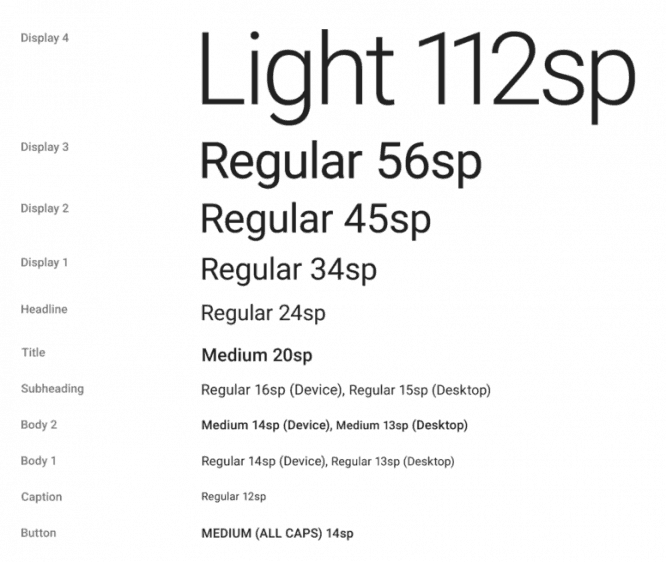
Google’s Roboto headset.
Make sure the headset you choose is legible on small screens too. Try to avoid handwritten typefaces like Vivaldi. Despite their beauty, these fonts are very difficult to read.

Vivaldi will be very difficult to read on a small screen.
Rule # 5. Use a font with clearly distinguishable characters
Some fonts make it difficult to read similar letters, especially such as “i” or “L” (as in the example below). The same problem can be caused by too close arrangement of letters to each other. For example, “r” and “n”, when written very closely, resemble the letter “m”. So when choosing a font, be sure to test it in different contexts to make sure it doesn’t cause problems for users.
Rule # 6. CAPS is not always good
Text written in capital letters only is suitable only for those cases where it does not require a long reading (for example, abbreviations or logos). But where it is necessary to concentrate, it is better not to use such a technique. As Miles Tinker pointed out in his work Ligibility of Print, text written in capital letters only significantly slows down reading compared to the same text written in lower case letters.

Rule # 7. Don’t minimize line spacing
Typography uses a term to refer to the spacing between lines of text – leading or line spacing. Increasing the spacing increases the vertical space between lines of text, thereby improving readability, but reducing the amount of text you can fit on your screen. Typically, for easy readability, line spacing should be 30% larger than the characters themselves.

Correct leading improves readability. Image from Microsoft.

As Dmitry Fadeev notes, the correct use of spaces between paragraphs improves reading comprehension by 20% and helps the user to more easily “digest” the text that is not overloaded with unnecessary details.
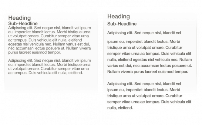
Left: Lines in the text are packed very tightly.
Right: Correct use of leading improves readability.
Rule # 8. Make sure you are using sufficient contrasting colors.
Do not use the same or similar color for the text and its background. The clearer the text, the easier it is to perceive and read. The World Organization W3C recommends the following contrast ratio:
- For text with small print, the contrast ratio between the text and its background should be at least 4.5: 1
- For text with large print (font 14 bold / 18 non-bold and above), the ratio of contrasts between the text and its background should be at least 3: 1

The contrast ratio of the text and its background does not meet the recommendations, therefore it is difficult to read

The contrast ratio of the text of its background meets the recommendations, so it is easy to read
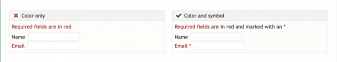
Color blindness is a very common disease, especially among men (8% of men cannot distinguish colors). Therefore, it is recommended to use additional tools besides color to highlight important information. Also, try not to use red and green in writing text – with color blindness, a person most often does not distinguish between them.
Rule # 10. Don’t use flashing text
Flashing or flickering text can trigger an attack in sensitive individuals. In addition, such text is more likely to cause irritation than interest for most users.
Conclusion
Typography is very important. The correct design of the site will bring a sense of freshness and completeness to it. Conversely, misuse of typography will only confuse your users. Design your sites to be readable, understandable, and legible.
The challenge of typography is
emphasize content favorably
…
Typography should emphasize content in a beneficial way without creating additional cognitive load for the user.
Source: contented
…
