
10 outstanding examples of brand coloration
10 outstanding examples of brand coloration
Color theory is one of the pillars of design. Its consideration is especially relevant within the framework of branding: a correctly selected color favorably distinguishes the product on the market and promises fabulous profits to the manufacturer. We’ve collected 10 of the most successful marketing colors.
Red

An ambiguous and difficult color that embodies warmth and passion, danger and aggression. Research has shown that it raises heart rate and blood pressure, so the use of red in branding carries risks. The Coca-Cola Company took such a risk and, I must say, made the right decision.
Orange
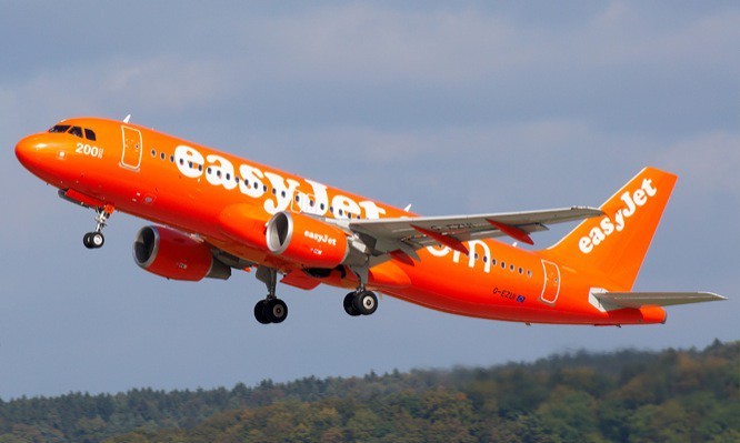
Bright and friendly, orange traditionally appeals to our childhood. One of the largest adopters of orange is easyGroup. For example, planes of the low-cost airline easyJet are painted orange, orange prevails in the design of hotels of the easyHotel chain. An unconventional solution for an organization of this size.
Yellow

Yellow is characterized as sunny and positive, its use is desirable to attract attention: it is known that this color is one of the first to catch the eye against the background of others. An example of the use of yellow in branding is the American Caterpillar. Despite the harsh conditions in which its special equipment is operated, the design of these machines looks attractive and unusual even years later.
Green

Symbolizing growth and rebirth, endurance and abundance, as well as nature itself, green has a beneficial effect on the emotional state of a person. Dark shades of green are also able to emphasize status: they were taken as the basis for its brand by the fashionable London department store Harrods.
Blue

A clean and cool color that is associated with reliability. The range of applications for blue, like red, is unusually wide: for example, one of the shades of blue – the color of a robin’s egg – formed the basis of the brand of the jewelry company Tiffany & Co. Her blue jewelry boxes have become an attribute of sophistication and style around the world.
Purple
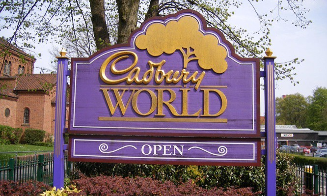
It offers many interpretations: the pale lavender color symbolizes sentimentality, the darker shades of purple – luxury. The most famous company associated with this color is the British Cadbury. In the perception of customers, it is so strongly associated with purple that in the advertising of 2007 the company even allowed itself not to introduce itself: the color spoke for it.
Brown
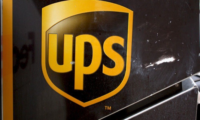
It personifies simplicity and honesty, along with the green color, referring to nature and the earth. At the beginning of the 20th century, brown, however, also symbolized luxury, which was the reason for the use of this color in the UPS courier service brand.
Pink
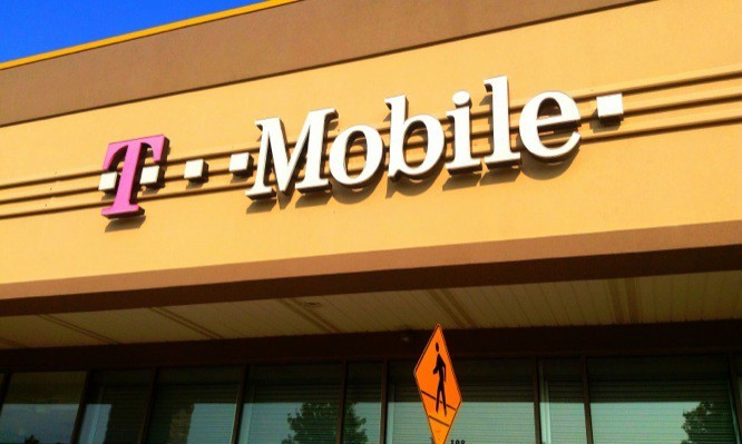
The perception of pink depends on the degree of its intensity: bright colors evoke “girly” associations, paler ones – clichéd sentimental ones. Who is not afraid of accusations of stereotyping is T-Mobile: This telecommunications company uses bright pink to attract a female audience.
The black
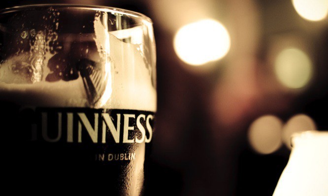
A very popular color associated with classics, rigor and wealth. The beer brand Guinness has put black at the heart of its philosophy: the producer himself speaks of its dry stout as a “black thing”, and on St. Patrick’s Day, Guinness encourages everyone to “paint the city black.”
Author: Denis Strigun
…

