
10 inspiring websites with bold typography
10 inspiring websites with bold typography
Heavy typography has been a notable trend throughout 2018. Taking a cue from Apple, which pioneered the initial trend on mobile with the release of iOS 10, web designers began to rapidly develop the trend in new and creative ways. As Apple continues to roll out heavy typography in almost all of its iOS apps, the trend looks set to stay for a while.
The results of heavy, expressive typography are often visually impressive and can add some interesting and dynamic aspects to a website. In this article, we’ll take a look at some of the most creative heavy typography implementations in web design in 2018.
Gregory maslov

Gregory Maslow’s portfolio uses a large, bold slogan in serif type against a bright and focused background image.
Havaianas
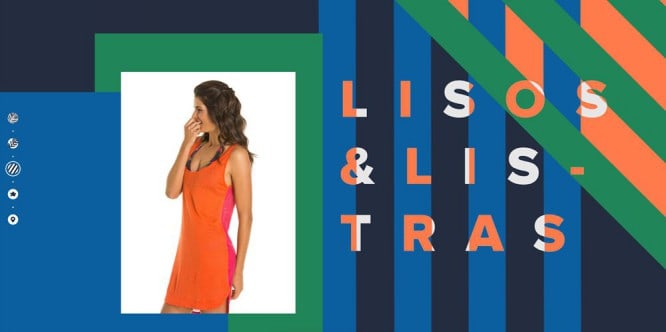
The playful, summertime design of Havaianas uses large, heavy typography with accentuated spacing and unique color overlays on base patterns.
KOTI Sleepover
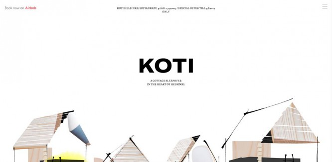
KOTI’s simple homepage design is one of the most subtle yet effective implementations of heavy typography. The minimal illustrated style contrasts beautifully with the large, black expressive type.
Humaan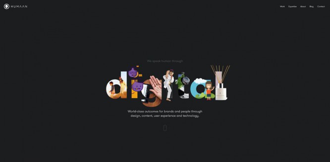
In one of the most unique implementations, Humaan applied a graphic design to each of the heavy letters that make up the word “digital”. This is a very creative approach and it was done beautifully.
Work & Co
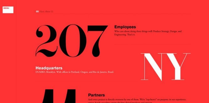
Work & Co uses an oversized and heavy serif typeface to highlight the statistics and data around their company.
GHAFARI
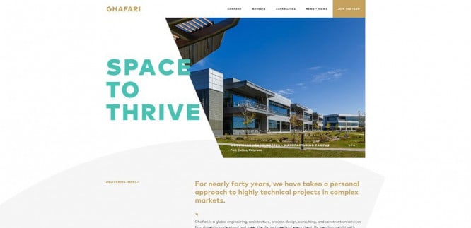
GHAFARI use pretty capital letters. The text overlaps the image for a semi-brutal effect and contrasts nicely with the gold and white colors.
Super16
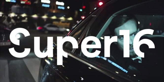
Super 16 fills the entire main section with its own title. Heavy and unique typography that carves out 90-degree letter sections is supported by a carefully selected series of background designs.
Huge
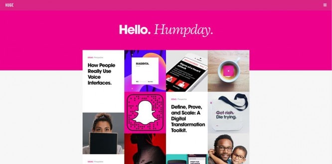
Huge uses a mix of heavy sans serif fonts along with light italic serif fonts. It creates an impressive juxtaposition and is especially effective against the bold pink color that forms the main section of the site.
Shopify Credit Card Reader
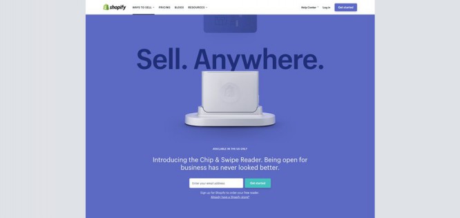
Shopify uses heavy but thin typography behind its product photo to highlight the main selling point.
UNFOLD
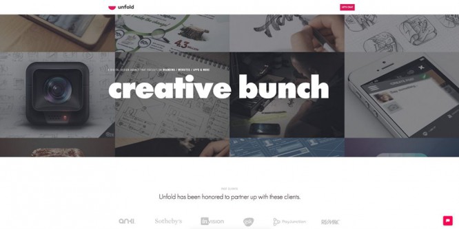
The new UNFOLD home page uses some very heavy fonts above the main section. They contrast nicely with the darkened filled portfolio in the background.
Source: 1webdesigner
…
