
10 impressive flyer designs
We have collected, in our opinion, the brightest and most eye-catching flyer designs.
A great flyer design can work wonders and help promote an event or product. You look at the design and it makes people feel the emotional connection between the product and the flyer. Artistic performance and print are key factors in flyer effectiveness, but in general – design – including proper use of color and typesetting – needs careful thought to achieve its goal.
More media are competing for consumer attention than ever before, and it is a real challenge to keep people interested these days. The art of flyer design is a great place to get inspiration. Here are some of the very best flyer designs we’ve found to help inspire your next project.

Carmen Zeng (Carmen Zeng) got origami inspiration for The Wing flyer design. The Wing is an American network of communities and workspaces specifically for women. The network evolved and began to promote its expansion in Sydney. The design of this flyer aims to capture the spirit of collaboration and ownership.
“Fold and Roll is a physical metaphor for The Wing’s growth, and adds visual flair and movement to the design,” Zeng explains on Behance. The combination of pink paper and blue ink blends with The Wing’s positioning and good typography contrasts with more delicate contoured lines and illustrations.
“Using small waves as a stylistic decoration generates a mystical mood, grabs the audience’s attention, and stimulates the search for the opening moment of The Wing Sydney,” adds Zeng. The flyer was printed with a risograph to add an extra layer of texture.
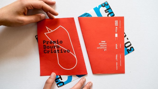
Prémio Douro Criativo is an award that celebrates creativity in the Portuguese region of Duoro. When positioning this brand, everything is centered around the idea of folded paper, and the point was that the flyer for this event would not be just a flat sheet. Double-sided printing and clever folding as well as contrasting different colors and patterns help this design stand out. The awards personality was created by Portuguese studio Lateral in collaboration with designer Nick Ohlo (Nick Öhlo)…
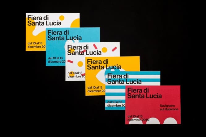
These eye-catching flyers were created to promote Fiera di Santa Lucia in 2016. This street fair includes music, shows, market stalls, artists and artisans and takes place in Savignano sul Rubicone in Italy. Italian graphic designer Matteo Vandelli (Matteo Vandelli) worked with Julia Faini (Guilia Faini) and Luca Sarti (Luca Sarti)to create an accentuated, distinct and vibrantly colored identity that captures the festive mood. The trio came up with six different templates that could fit and mix among posters, programs, and of course just flyers.
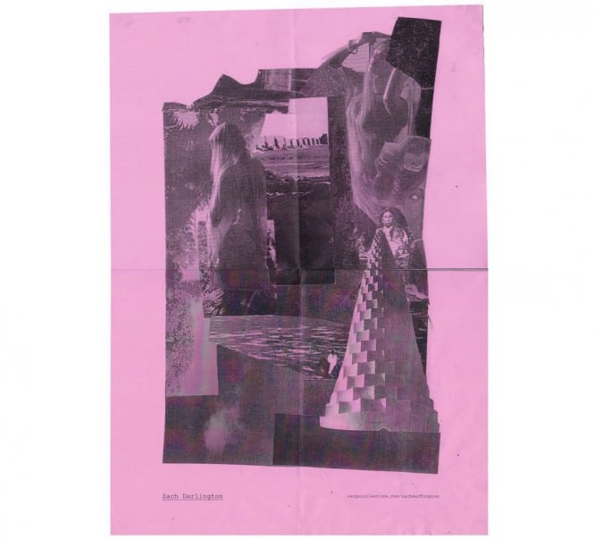
This Liverpool-based designer has brought things back to basics with a self-promo flyer. We all love the amazing things that can be done in Photoshop CC, Illustrator CC, and InDesign CC, but sometimes you can’t beat the old-school combination of copier, scissors, glue and full gibberish. Good job, Zach Darlington (Zach Darlington), over this in a retro-styled collage flyer.
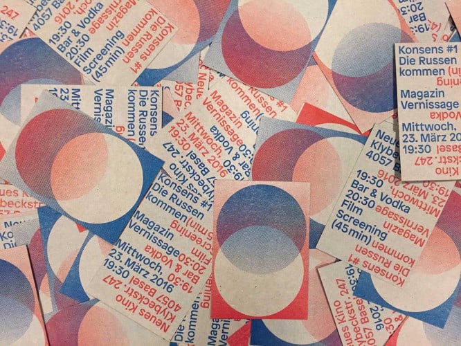
Created by Philip Meckley (Philipp Möckli) in collaboration with Max Frishknecht (Max Frischknecht), these A7 flyers for Konsens magazine really stand out thanks to the risograph printing. She uses a layering technique similar to that used in silk screen printing to produce multi-color prints.
Silkscreen Is a type of screen printing in which special polyester, nylon or metal nets of small thickness with a high frequency of filaments are used as a material for making a printing plate
…
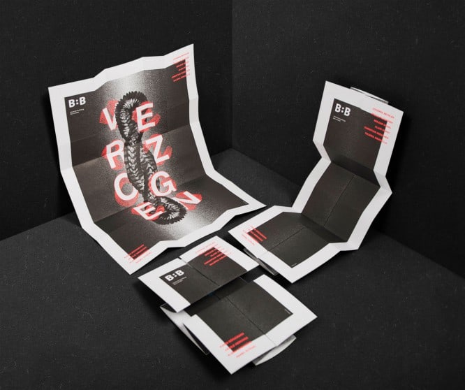
These flyers created by the Studio Bureau for the Ceramics Department at the Bern School of Design (Switzerland) (the Bern School of Design, Switzerland) are a gift that keeps on giving away. Talking about the exhibition of diploma works related to the theme of the German word “Verzogen” (means “twisted”)The eye catching flyer was designed to fold and curl into an exhibition poster.
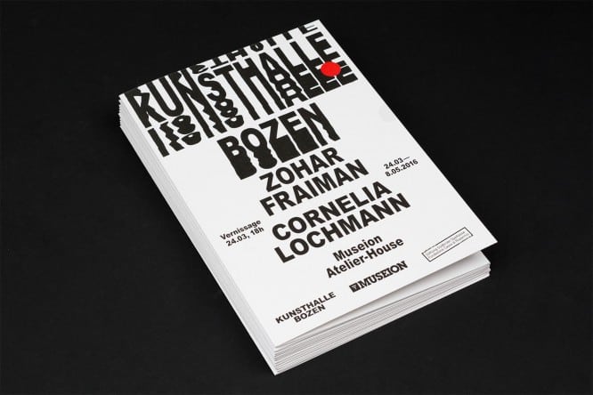
Studio Mut created identity and communication designs for the Kunsthalle Bozen, a cultural space in Bolzano (Italy)who wants to become a center for hedonism (thirst for pleasure) and beauty. The personality of the Italian graphic design studio conveys a youthful spirit with the anti-establishment, “just do it in PowerPoint” aesthetics and the use of stretched black and white letters, as you can see from these “face to face” flyers.
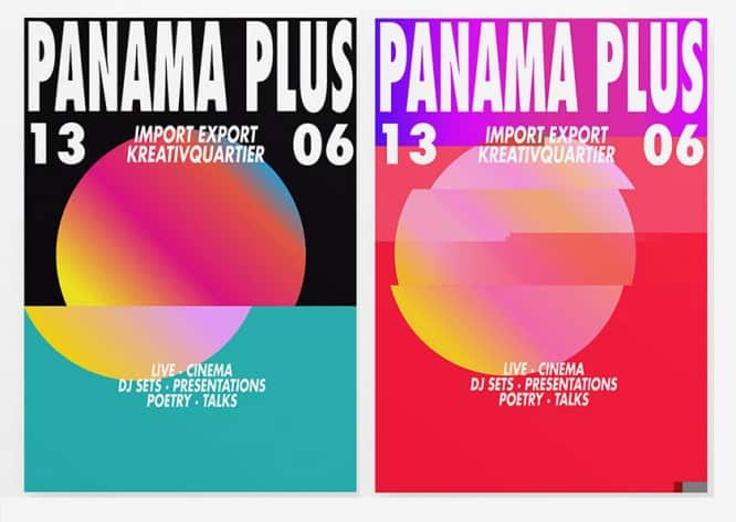
Panama Plus is a subculture festival of arts, music, creative performance and writing. Munich-based design bureau Moby Digg, working in collaboration with ZOO, took the festival’s energy as an inspiration to create this cheerful artwork filled with vibrant colors. Each piece of show material is characterized by a circle filled with a different brightly colored gradient, which then passes through a noise generator. The result is a beautiful, eye-catching series of renderings.
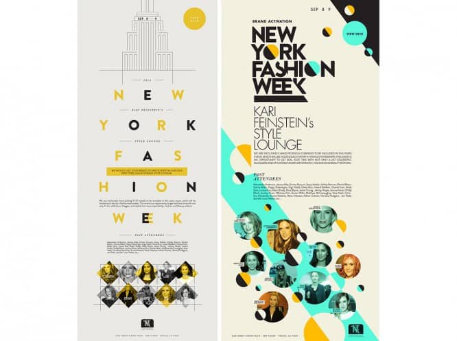
Freelance graphic designer and illustrator Evgeniya Anselmo (Eugenia Anselmo) used this creative typeface to create a digital flyer for Kari Feinstein PR. In fact, she made a selection of options for this brief, each of which is an interesting experiment with the same look and feel. Above you can see the final version of the right one – take a look at the full gallery on Behance.
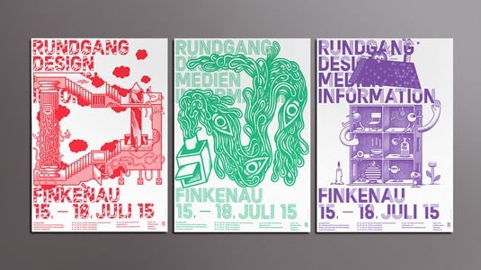
Rundgang DMI is an exhibition in which the three faculties of the university in HAW Hamburg (HAW Hamburg – Hamburg University of Applied Sciences) – design, media and information – present their work together. Accordingly, the promotional material had to represent each faculty separately in such a way as to tie them together to expressively show that each in itself is a separate show. Villa has done an excellent job of giving each faculty its own color and font while maintaining a consistent theme across all three flyers.
Source: Design Code

