10 awesome web design studio sites for inspiration
10 awesome web design studio sites for inspiration
Web design studios need to solve a difficult task – to create their own website that would reflect their skill level through various visual elements. Their website design is rated in the same way as the portfolio provided. This is a critical aspect for any web design studio.
As such, studio sites are often meticulously designed, with considerable attention paid to even the smallest details. This, in turn, means that their sites themselves represent some of the most promising and exciting examples in the web design industry.
This article features ten of the most beautifully designed and polished web design studio sites to date.
R&D
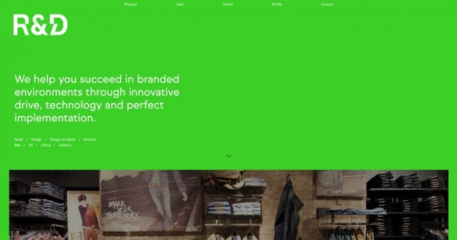
The R&D agency website combines a spacious grid with a unique, vibrant green background. It contributes to the visual impact and makes the site memorable.
Mast
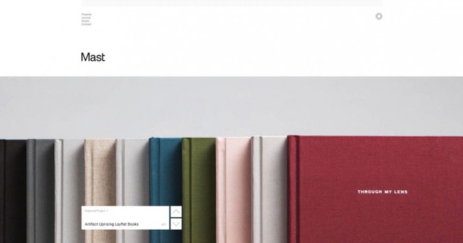
Mast’s website is very minimalistic, but uses nicely laid out images and overlapping navigation elements.
A day out
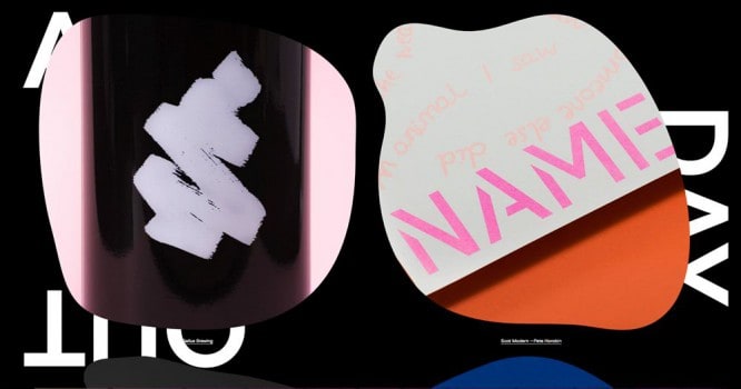
The website of this agency is unique and effective. It uses large outlines with a lot of imagery and large typographic captions.
Lg2
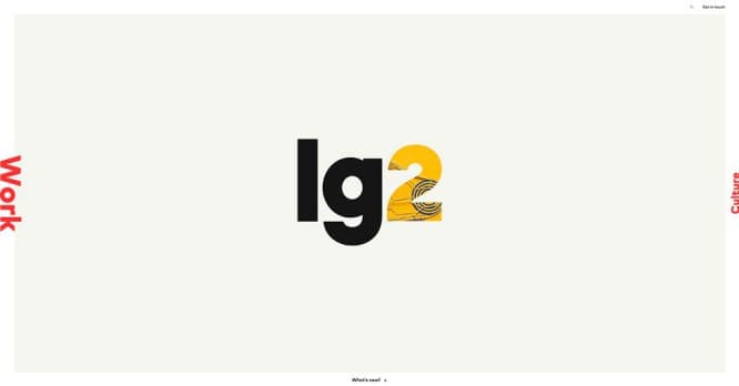
The Lg2 website has an unusual navigation scheme that spans the border of the center content area. The animated visuals in “2” are an attractive addition.
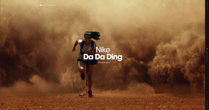
Mathematic
Mathematic’s website is focused on visual effects. The slider spans the entire section of the hero, creating an immersive experience perfect for showcasing their work.
Phoenix
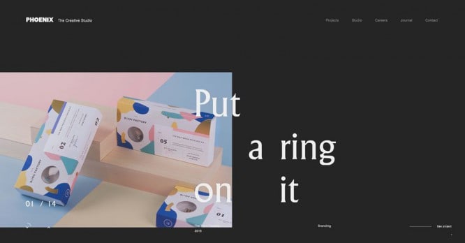
This site from Phoenix offers one of the most unique types of layout. Typography looks sporadic but provides a great impact as it overlaps rotating images.
2LG
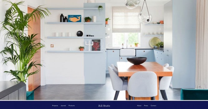
Studio 2LG uses an immersive visual loading effect on its website, where an image is gradually overlaid on the logo. The site then seamlessly transitions to a sophisticated homepage with minimal graphics and typography.
Designgoat
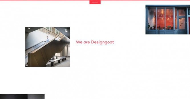
The site from the agency Designgoat also spontaneously approached the arrangement of the images. The result makes you feel the influence of the brutalist movement and attracts the eye with red text.
Gin lane
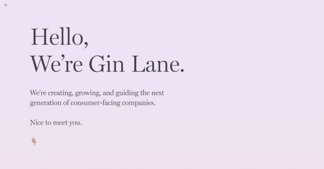
A simple site from Gin Lane uses a nice serif font with a muted gradient background. It fits perfectly into the lightweight design of the home page.
P22
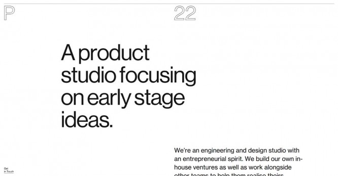
The guys at P22 approached their website with a mix of minimalism and brutalism. The limited logo text is attractive and contrasted with the filled typography used in the rest of monochrome designs.
Source: 1webdesigner
…

