
Why Simple Website Design Is Scientifically Better
Why Simple Website Design Is Scientifically Better
Google’s research had two key findings:
- It only takes a user 1/50 to 1/20 of a second to rate whether a site is beautiful or not.
- “Visually complex” sites are rated less beautiful than their simple counterparts.
In other words, the study showed that the simpler the design, the better.
But why?
In this article, we’ll take a look at the role of cognitive fluency and visual information processing theory through examples, which play an important role in simplifying your web design and helping to increase conversions.
What is a “prototype” site?
If I say furniture, what image will appear in your head?
If you are like 95% of people, you will think of a chair.
If I ask what color is associated with “boy”, you think “blue” (and a girl – “pink”, etc.)
The prototype is the basic mental image your brain creates to classify everything you interact with.
From furniture to websites, your brain has a template for how everything should look and feel.
On the web, prototypes fall into smaller categories.
You have different but specific psychological imagery for social media, websites, e-commerce, and blogs.
If on any of these sites something is missing in your mental image, you shut down the site on a conscious and subconscious level.
If I were to say “women’s fashion website,” you could imagine something like this:

Now let’s look at the prototype of the “online clothing store” sites, have you noticed that they are all very similar and have a similar site structure? (even if this site is from another country).
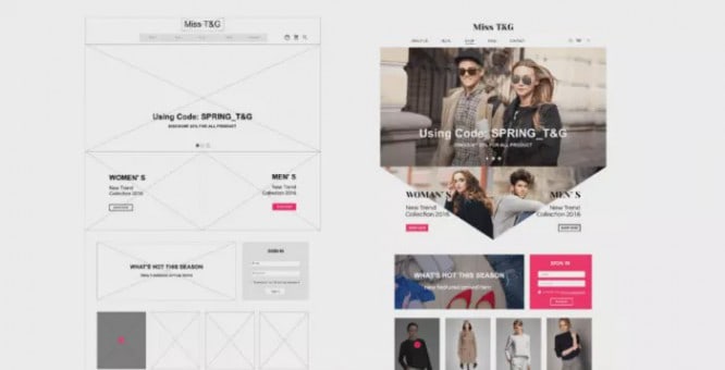
Similarity does not mean that the sites lack originality or that they “stole” from each other. With this structure, they meet your expectations of how an e-commerce site should look.
What is Cognitive Fluency?
The basic idea behind cognitive fluency is that the brain prefers to think about things that are easy to think about. This is why you prefer to visit sites whose design and structure you instinctively understand.
Cognitive fluency stems from another area of behavior known as the Simple Impact Effect, which states that people prefer things that are familiar to them.
This rule also applies online. We are used to the fact that the subscription on the site is located in the right corner of the site, and the company logo is in the upper left corner.
If your visitors are driven by certain site designs in your category, deviations from them can subconsciously put you in the “less beautiful” category.
This does not mean that you should simply “do what everyone else is doing.” You need to know which site design options are prototypes for your category. Be sure to check and find evidence that this particular design is the prototype in your category.
Without doing research, many designers make poor choices. For example, many e-commerce sites use an automatic slider to scroll through product images, but study after study shows that automatic slider kills conversions.
What happens when you meet expectations?
A site with a high level of fluency will feel familiar enough that visitors don’t have to spend mental effort searching for the right product or button, and instead can focus on why they came to your site.
However, when your fluency level is low, you will immediately feel it.
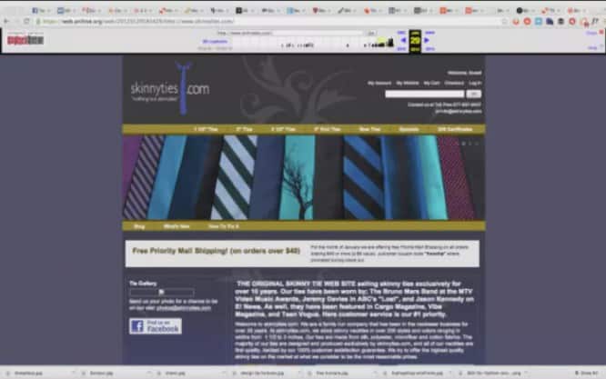
Take online tie shop Skinny Ties, which didn’t look like an e-commerce site before the redesign:
Before:
After:
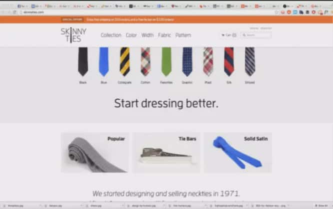
Several key changes have led to tremendous results:
- Simple and straightforward design and structure of the site;
- Much more “open” design with clever use of spaces;
- Images contain one product with high resolution and contrasting colors.
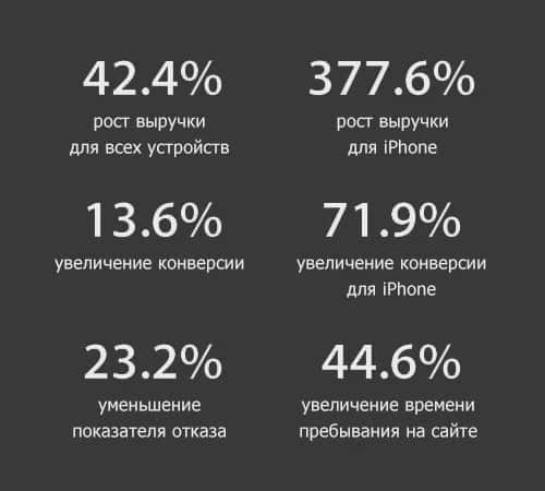
Let’s take a look at the statistics for this redesign.
After just two and a half weeks, the results were stunning:
The redesign itself, while cute, isn’t revolutionary. The site exactly matches the expectations of what a modern online clothing store should be. It is “open”, responsive and has a consistent style across all pages.
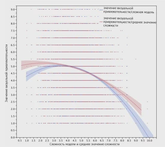
Visual information processing and site complexity
In this collaborative study by Harvard University, the University of Maryland, and the University of Colorado, researchers found a strong correlation between “aesthetically pleasing” sites among different demographic groups.
For example, PhD participants didn’t like the very colorful websites.
As a result of the research, no specific universal design principles have been developed. The only thing that was versatile was that the visually complex website had less visual appeal.
Why simple designs are scientifically easier to handle
The reason “visually light” websites are considered prettier is in part because low complexity doesn’t require our eyes and brains to work as hard to decode, store, and process information.
Watch this short video on how the eye sends information to the brain to see what I mean:
Basically, your retina converts visual information from the real world into electrical impulses. These impulses are then channeled through the appropriate photoreceptor cells to transmit color and light information to the brain.
The more color and light variations on a page (i.e., the greater the visual complexity), the more work the eye has to do to communicate information to the brain.
Each element conveys subtle information
When designing your website, be aware that every element – text, logo, and color choice – conveys subtle information about the brand.
When these elements don’t do their job, the webmaster often compensates by adding unnecessary elements or images, which increases the visual complexity of the website and breaks the overall aesthetic.
Optimizing a page for processing visual information, in particular, simplifying the passage of information from the eye to the brain, is the transfer of as much information as possible with the minimum number of elements.
Let’s take an example of the redesign of the MailChimp logo.
When they wanted the brand to “grow,” they didn’t add the usual “We’ve been working with email since 2001! Three million people trust us! That’s why we’re awesome! Blah blah blah…”
It was:

Became:

Instead, they simplified the writing, simplified the website (the top heading just reads “Send a Better Email”), and added even simpler animation for the main product.
Mailchimp went through another logo redesign in 2018:

What were the guidelines for the second major redesign? Simplicity was paramount:
“The Freddie badge has long been the main trademark of our brand. We’ve simplified it a bit, tweaked its shape and worked on small details to make it look great at any size. Through a process of iteration and refinement, we developed a font that harmonizes with Freddie’s icon. ”
Working Memory and the Holy Grail of Conversion
According to research by Princeton psychologist George A. Miller, the adult brain is capable of storing five to nine “pieces” of information in its short-term, or “working” memory.
Working memory is the part of your brain that temporarily stores and processes information for a few seconds. It’s what allows you to focus, resist distractions, and most importantly, guide your decision making.
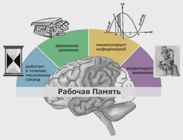
On a “low-complexity website with prototypes,” five to nine “chunks” of working memory can handle things like warranties, product descriptions, pricing, or offers, instead of wasting time figuring out where to click.
When you deviate from expectations – the price was higher than expected, the color scheme was not normal and there was no symmetry, the site took a long time to load, the photos were of poor quality – working memory processes these unnecessary “chunks” instead of doing important things.
This is because working memory calls on long-term memory to use what it already knows to complete a task. When long-term memory cannot help in processing information, the thread is interrupted, and the working memory is turned off and moves on.
This is why it is very important to know your visitors if you want to hack their working memory with design.
The blogs they read, the sites they shop on, their browser, age, gender, and physical location can all help you make your design “familiar” and create the right first impression.
7 ways to create a simple website
- Research your audience and the sites they visit the most. Check out case studies of design changes in your category.
- Create a collage for your site with all the “working” components you find.
- Follow the rules of cognitive fluency.
Arrange items where visitors expect to find them. - Don’t add unnecessary elements if they don’t communicate what your visitor cares about.
- Less is more. One large image is usually better than several small ones; one column instead of three; more spaces instead of more “elements”.
- Make sure your site meets expectations for pricing, aesthetics, speed, and more.
- Maintain originality. “Prototyping” a site does not mean that every aspect of your site must conform to that shape.
Don’t think of your site as a unique piece of art; keep it simple and familiar to your users.
Conclusion
If a visitor cannot rely on their previous experience when interacting with your site, they do not think about how innovative your site is. He simply wonders why things are not where they “should be.”
By designing with cognitive fluency, you allow your visitors to process more important things with their working memory, so it’s easier for them to say yes.
Source: Medium
…