
Why shouldn’t the design be pretty?
Why shouldn’t the design be pretty?
A story based on personal experience
This question I began to ask myself for the last 2 years, when I started working as a product designer in banks. Even in UI design, functionality dominates, and first of all, clarity. UI is inextricably linked with UX, so when you start coloring buttons, you should think about their functions.
When designers create a new product, they must follow the customer’s experience with similar products. This is the only way to create useful functionality for the user. A design that ignores logic and sticks to aesthetics is useless.
We get rid of all that is superfluous, of what we do not consider necessary. If the functions of four buttons can be combined into one, we will do so. Our goal is to make the device user-friendly and to simplify production as much as possible.
Jony Ive
…
What we see every day
Pay attention to the designs you use on a daily basis. Surely, you will not have difficulty logging into your Facebook account or creating a new one:

Users always choose familiar signs, colors and forms of communication. They follow along familiar way, because he more reliable, clearer and exactly will bring results… That is why the checkbox is a choice of one of the options, the buttons are rectangular, and the titles are in bold.
What’s wrong?..
So why can’t the design be as beautiful as Dribbble and Behance show us?
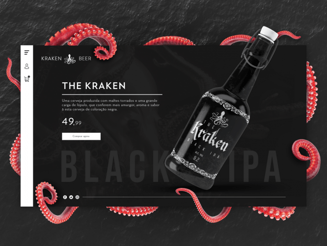
Until we use the site, it is static, the content does not change in it, so we can place beautiful photos of the product on the layouts or use non-standard fonts.
1) content can’t go off-screen
The screen of any device has its own size, so content should be placed within it. Recently, designers have often used this method – taking graphic elements outside the artboard. You can design a website in a portfolio in this way, but at a presentation with a client, you should not resort to this, otherwise, when selling a product, he will not receive what he expected.
2.Copy-paste
You are not going to sell one product, are you?
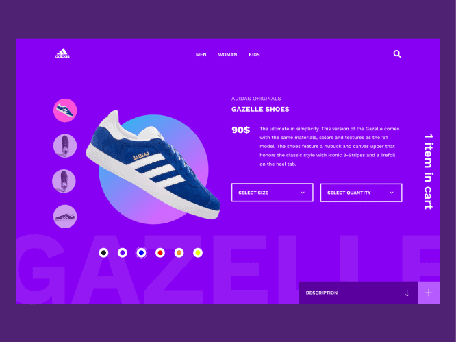
3. Flying sneakers are only from Adidas
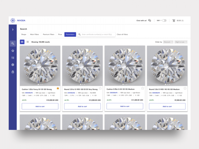
It’s really cool if your customers can take the time to prepare content for the site or hire a content manager who will cut all the products and upload beautiful photos. But usually, not everyone can afford this. It will be especially difficult for shops with a large amount of goods.
As soon as the service starts working, we fill it with the content that is necessary to attract customers. As a result, the service is different from what was drawn. But it contains real data – this is its value. Therefore, the task of the designer is to take the material necessary for the user and present it as clearly as possible, but at the same time aesthetically pleasing.
The real product is filled with real content, implemented technically and meets the needs of the target audience.
We are similar, but we are different ..
While exploring layouts on Behance, we look at the experience of foreign users. It is not right. We can get inspired project colors or take as a basis its composition, but the visual perception of foreign and Russian users is very different.
This is the site of the familiar to all Ashan:
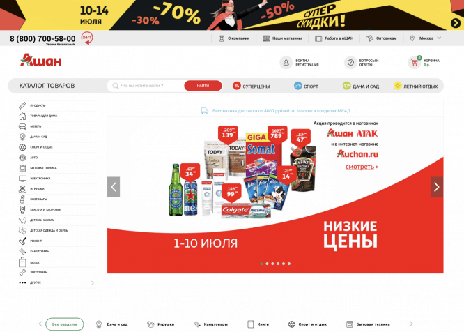
The Russian buyer sees all the product categories at once in the menu on the left, Walmart has it hidden in the hamburger menu. Auchan’s cart is presented as an icon and text, but Walmart users only need an icon.
When starting to design, take a close look at your target audience and their habits.
Communication
I would compare the creation of services and the elaboration of the design of systems with the design of communication signs for the environment around us.
By the way, I’m writing this article from an airplane. I am flying from Saratov to Moscow.
Talking about communication signs – after the Moscow airport it was very difficult to find your way at the Saratov airport.
Just compare these 2 places:
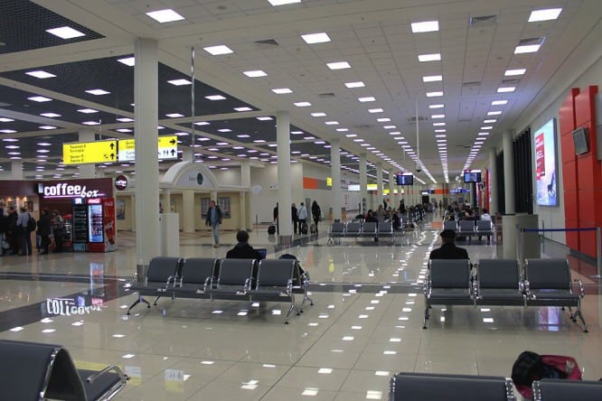
Waiting room. Domodedovo airport
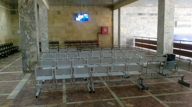
Waiting room. Saratov airport
Let’s not take into account the UI components of these places, let’s turn our attention to the UX. Passengers should understand where to board, in which side the toilet and where to have a quick bite. It would be nice to dilute the introductory information with advertising or entertainment, so that, even for a small period of time, the passenger can forget about the upcoming flight.
First of all, functionality.
Beauty is rather an inappropriate concept for design, organic – this word can replace “beauty”.
I call organicity the right content, colors, composition and placement of elements in an orderly manner, if necessary, taking into account the modular grid. When content and graphics look appropriate.
When working on the appearance of the site, you must not only clearly understand the principles of web design, the basics of colouristics, typography, but also how you will interact with your target audience.
Source: Medium
…

