What is Hero Header and how to use it
What is Hero Header and how to use it
The use of Hero Header is one of the most fashionable trends in web design: when the first picture that a visitor sees on the site takes up all or almost all of the browser space.
There are many variations of Hero Headers: simple image, image with text, slider, pinned image, video or animation.
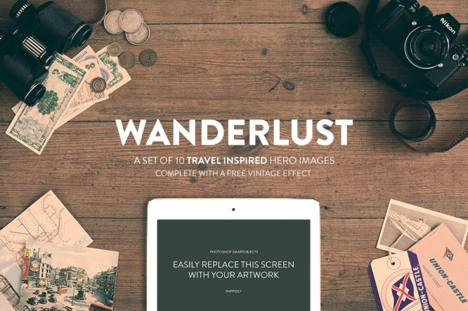
The hero header is the first thing that catches the eye of the site visitor, so the image for him should attract the eye and arouse visual interest.
Hero Header Rules
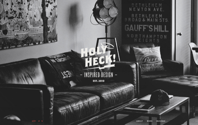
- There are some basic rules to keep in mind when designing your hero header. The design should not be overwhelmed and the elements should not distract from the main image or video.
- Use a logo. It is usually located in the upper left corner. Preference is given to black and white. The logo should not be full of bright colors.
- Don’t be afraid to use bold formatting for your text. So the letters will not get lost in the background of the image.
- Do not highlight navigation elements and secondary text, they should remain in the background.
- Choose your color palette wisely. If your main image is in color, stick with black and white for the rest of the hero header. Conversely, if the image is black and white, use a single bright color for the text.
- Do not place text over faces or other important parts of an image.
- Use large and thin letters (this text is easier to read)
- Using ghost buttons will add sophistication to your design.
- Fixed navigation elements make it easier for the user to explore the page. Play with the navigation that lives both inside the hero header and outside of it.
- Use color gradients and midtones to make the text stand out – it shouldn’t blend in with the image.
- Looking at the Hero Header, the user should know what to do next – click or scroll down the page. Use visual cues. Remember that the hero header does not have to fill the entire visible area of the screen.
- Your Hero Header should be responsive. Note how it appears on lower resolution screens.
Examples for inspiration
grainandmortar.com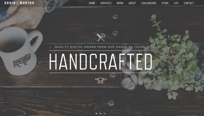
wearecuppa.com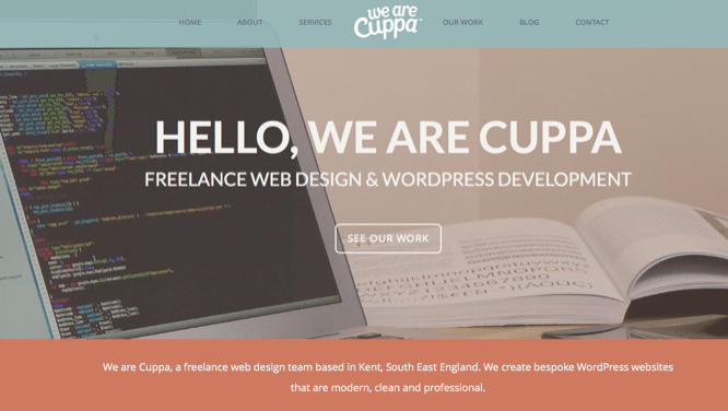
We also put together a set of Hero Headers for you, using which you can draw even more attention to your project!
6 Free Vintage Hero Headers
A small bonus awaits you in the archive 🙂
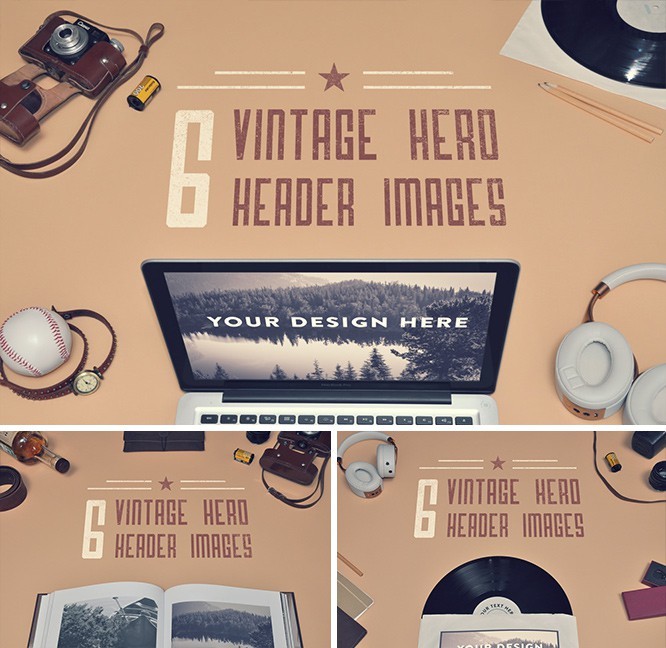
Download 6 Free Vintage Hero Headers
Flat Hero Header Kit
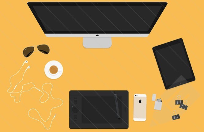
Download Flat Hero Header Kit
Freebie hero image

Download Freebie Hero Image
Creative bundle set

Download Creative Bundle Set
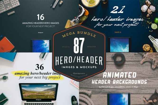
87 Hero Header images
A mega-set of 87 Hero Headers available for purchase from Creativemarket.
Content for members of the Private Forum
You cannot view this material, because not a member Private forum site Infogra. If you want to become a member, read the rules for joining.
…

