Tricks and Tricks: Layout Elements in Figma
Tricks to make life easier for you and your front-end or QA. And most importantly, it will reduce the number of inconsistencies between layout and design.
Problem
Probably few people noticed, but if you go to Figma with “can view” rights and hover over an element that does not have a fill color, then Figma will not display the borders of the element.
Even if you give the element a stroke or assign a color but set it to 0% opacity, the border will still not be displayed.
And since front-end developers, QA, and other team members often have “can view” rights, this kind of figma behavior causes them a lot of inconvenience.
Just imagine that every time you try to determine the size of an element or the spacing between elements, you have to go to the layers panel and select the desired element. Or to click to the element through the jungle of layers. This is inconvenient and this is something that most likely no one will do.

What does it lead to
Frontenders cannot determine the correct size of an element or the spacing between elements and, at best, check the dimensions with the designer, but more often than not they typeset at their discretion. As practice shows, the sizes and indents in this case will not correspond to the design.
The second problem is exporting the icon layer without the frame in which it is located. This leads to the fact that the icon is positioned incorrectly in the element or has the wrong size.
I wrote in more detail about icons in the design system in the previous article.
All this complicates the development, and adds extra work, since you will need to describe the issue for all inconsistencies, and the front-end vendors will fix all this.
Solution to the problem
To solve this problem, I came up with a little crutch, or “Piston” as one dude on YouTube says.
- Create a color style.
- Open the style editing window.
- Click on the square color preview and in the upper left corner select “Image” instead of “Solid”. Then move the cursor over the chessboard and click on the “Choose image” button
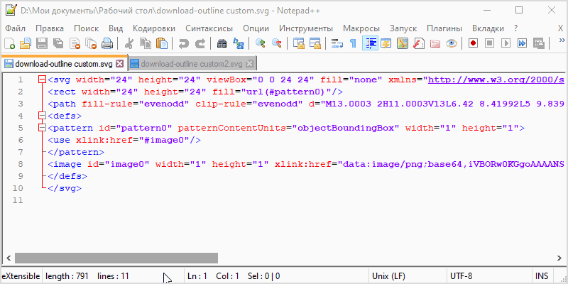
- Next, select a fully transparent png image. The smaller the image the better, I used a 1 × 1 pixel image. (Image can be downloaded from the link below)
- Everything, the style is ready.
Now apply this style to all the elements where you want the frame border to appear on hover.
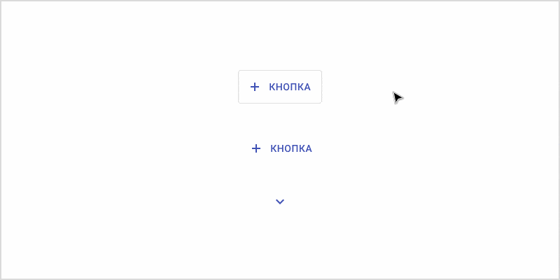
For example, I have prepared two frames with elements. In one I applied the styling to the button and icon components, and in the other I did not. Just try to highlight the elements and get a feel for what your fronts are feeling every day 🙂
Transparent png file 1x1px can be exported using this link (in a red frame, see the layers panel)
Where to apply?
I assign this style to transparent elements such as basic buttons, stroke buttons, tabs, list items, icon components, table cells, etc., and also use this style to mark up the page structure.
I do not assign this style to all transparent frames, but only to those where I think it is important for the frontend to see the borders of a block or element. I deliberately do not assign this style to some frames, because I understand that the front-end developer has more options and they do not wrap elements in containers as often as designers. Since figma is not perfect, we sometimes have to wrap the element in 100,500 frames to achieve the desired behavior.
PS. If you apply this style to an icon component, do not forget to uncheck the “Show in exports” checkbox so that there is no extra code when exporting an icon to svg.
Bonus
If you use the technique when the icon component is wrapped in a union, then if you paint the icon component in this style, you can quickly select the icon by pressing ctrl + LMB. You no longer need to fall through several layers or press Enter to get to the icon.
Source: Design Kabak
