Trending materials for the designer 2021
Trending materials for the designer 2021
We’d like to share a selection of cool trending materials for graphic and web designers to complement your designs in 2021.
3D materials
I don’t think I should tell you how much 3d materials and everything connected with it are gaining momentum now. This year should explode the 3d niche, there will be many specialists and even more materials to use. So, do not rush to take the first free 3d icons that come across, because a lot of people use them, which will make the icons look pop and hackneyed.
But this does not negate the insane popularity of 3d, many large companies are already in the subject and draw custom icons and illustrations. Below I will leave the most relevant resources for use.
SUPERSCENE
Handy 3D Hands by Icons8
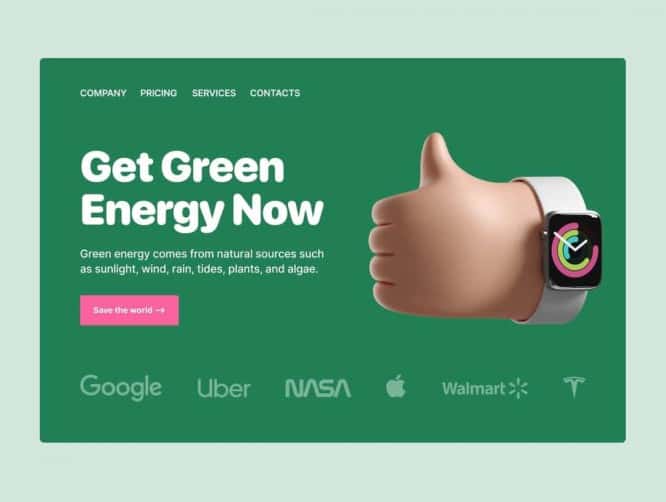
3D Assets by Ui8
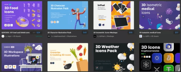
ICONZ

Illustrations
Illustrations have been in great demand lately, but please forget about stock illustrations of the same type and don’t use them, let’s leave that in the past! Now the more unusual and unique the illustration, the better. Abstract and absurd illustrations rule, so illustrators will have a lot of work;)
Storytale
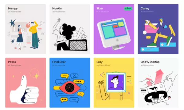
Oh my startup
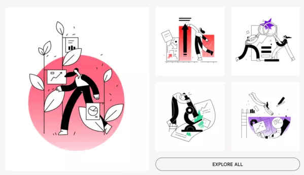
Smash
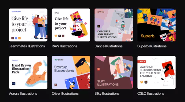
Growww
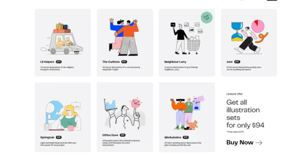
Icons
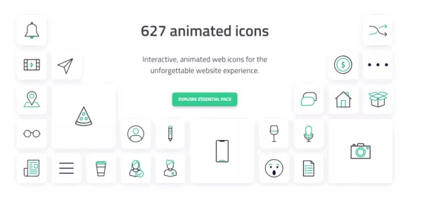
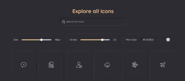
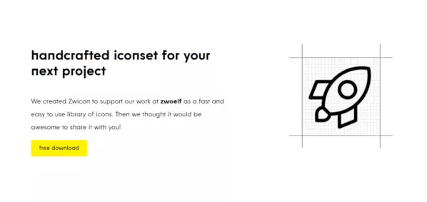
Ideal icons have become the basis in interface design, so minimalistic symbols will be in demand in 2021. Do not forget that not all sites need to shove the same icons, sometimes they can be replaced with illustrations, text or geometric abstraction. But, if you do decide to use icons in your design, then they should be clear, readable, simple and unique.
Lordicon
Shape
Forge icons
Zwicon
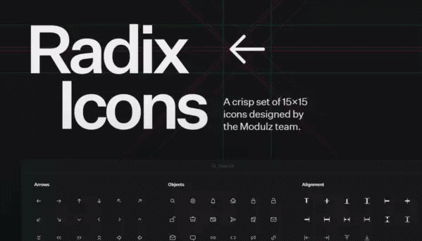
Radix icons
Mockups
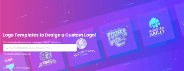
This is something that will always come in handy in website design and graphic materials. Mockups are gradually replacing illustrations and photos, as they look more lively. However, there are tasks that are difficult to solve without using a beautiful mockup. In this regard, I have collected relevant resources with various mockups for every taste.
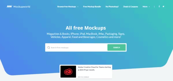
Mockupworld
Mockups-design
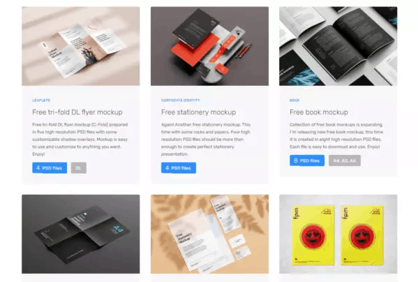
Unblust
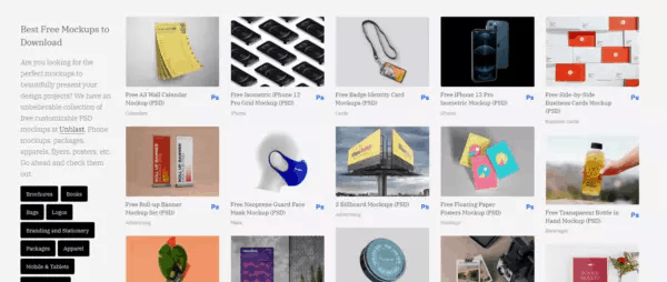
PlaceIt
Color palettes
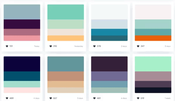
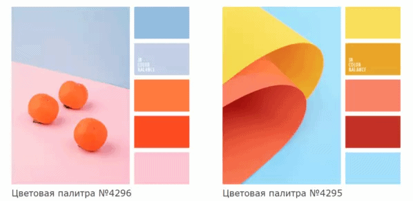
Basically, when working on a project, designers use an existing color palette from the company’s brand book. However, it is not always successful and suitable for a web interface. Because, most brand books are geared towards print, not web use. Or, you need to come up with colors from scratch, but nothing comes to mind, here you will need ready-made color palettes.
Color hunt
In Color Balance
Canva

Gradients
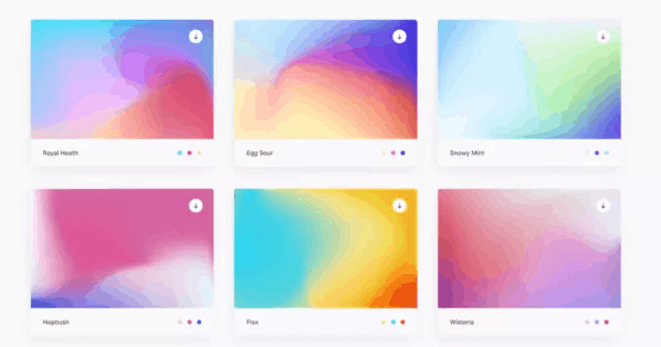
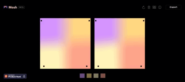
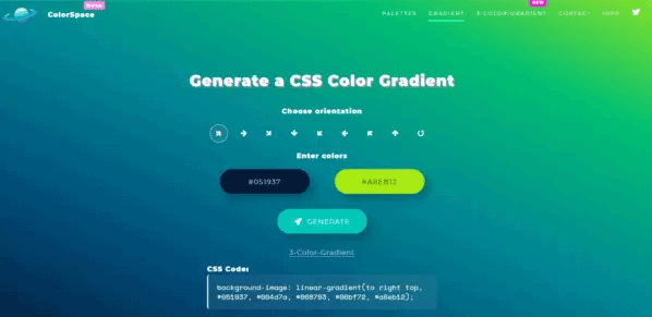
The main thing to understand in creating gradients is that gradients should be light, airy and voluminous. The gradient gives the design a minimalist feel that makes it look fresher and more modern.
LStore
Mesh
ColorSpace
Fonts
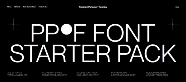
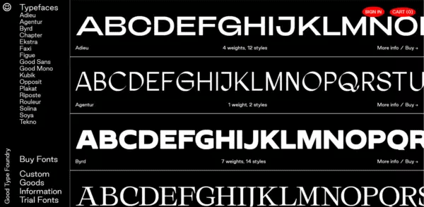
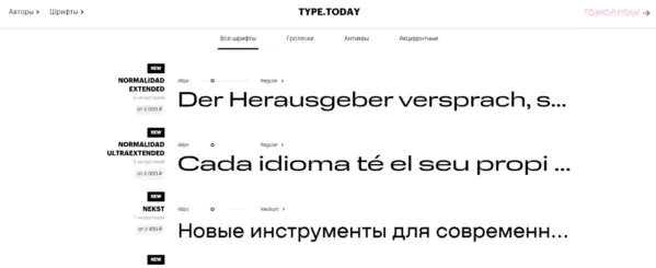
Typography is something without which it is difficult to imagine any interface design or other materials. If we talk about trends, then wider and broken fonts are relevant now, so you should pay special attention to them. Today, Cyrillic fonts have gained great momentum, a wide variety of fresh Russian fonts have appeared, therefore, they are used more and more often.
Pangram Pangram
Good type
Type.Today
Free photo stocks
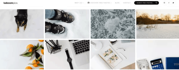
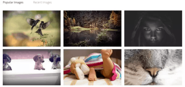
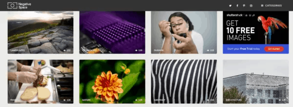
Using the photo as the main element of the composition is becoming an integral rule of aesthetic design. Because, through a photo, you can coolly convey the desired emotion, idea, or show the product from a beautiful side. Correctly selected photos can brighten up your design without cluttering it with unnecessary elements or the same type of illustrations. However, choosing a photo is not as easy as it seems, especially when the client has not provided a bunch of cool photos for the project. This task can easily be handled by the free photo stocks that you will see below.
KaboomPics
albumarium
Negative Space
Pexels
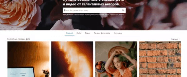
UI Whales
A very useful thing when you need to make a bunch of template elements for the interface, but there is no time. Besides, why reinvent the wheel when it was already made for you a long time ago. UI whales will save you time, for example, when developing an application or a template solution for various tasks.
UI Store Design
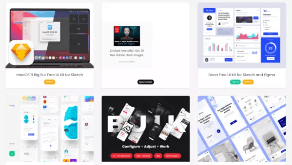
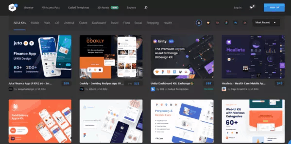
Ui8
Inspiration
One of the most important components in the development of any designer is being seen. It’s like the basis for our brain, so that it knows what to sculpt out of, so to speak. So, this important point should not be missed, since your results depend on it, and the more design variations we see, the more chances for a high result.
I have collected sites on which you can train your taste, observation and, in general, find more ideas for your tasks, understand what is relevant now and what is not.
Tilda
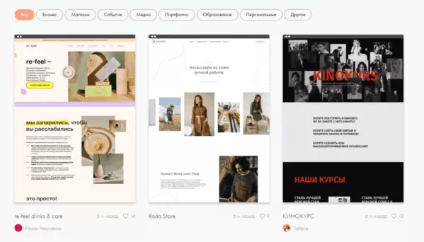
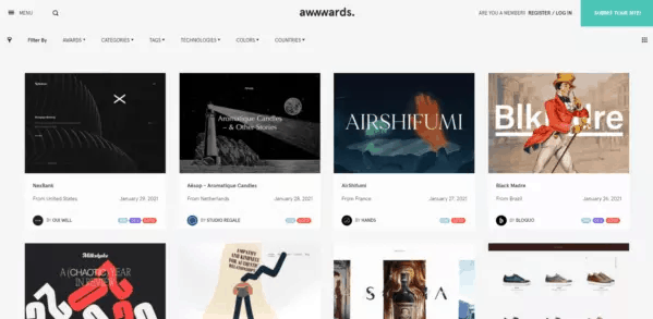
Awwwards
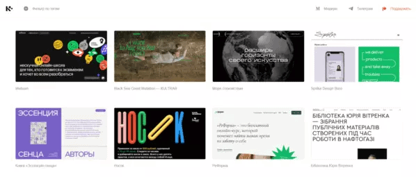
Cyrillic. design
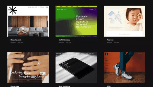
UiJar
Source: vc.ru
…

