Selling design: 3 rules for interacting with customers
Selling design: 3 rules for interacting with customers
Ultimately, design is subjective. Often, what the designer intended as the strengths of the work meets with resistance in the face of the client and only hinders commercial success. So how do you sell your design with minimal waste?
Demonstration of examples
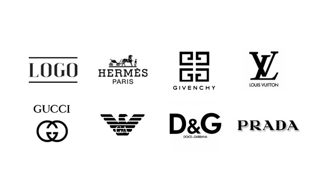
The main concern of the client is how competitive the design of his product or service will be, how it will look in the field against the background of other brands. You can devote your counterpart as much as you like to the intricacies of effective design, but it’s better to see it once. When talking about the benefits of your solutions, support the conversation with examples of already well-known brands with an established reputation (if, of course, they are relevant to the topic of the conversation):

These examples illustrate a situation where a customer needs a trendy design logo. By comparing the option provided to him (top left corner) with famous brands, he will be able to intuitively understand the strengths of your design without further ado. In addition, by putting the new logo on a par with the monsters of the industry, you are flattering the client in an amicable way. All of this together increases the likelihood that the design will be sold.

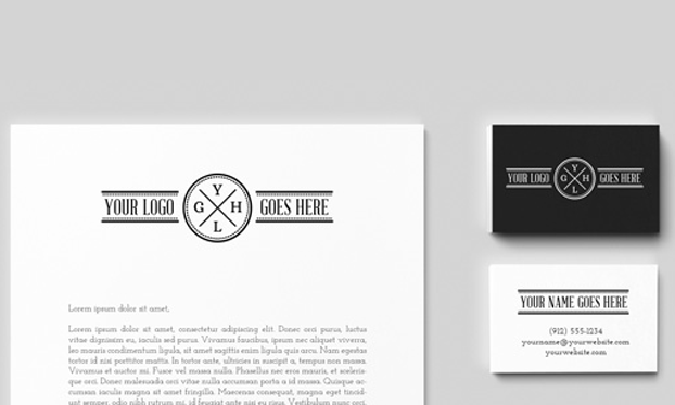
Also, don’t neglect the effects of visualization. Let the customer see how your design looks on a business card, letterhead. You don’t have to use gold-embossed layouts or hyper-realistic textures.
More personal space

It is difficult to go to furniture stores, if only because at the entrance you will be attacked by various specific information: in which country and from what tree this chair was made, how much cotton was picked and by whom to make such a beautiful cape on the sofa, and so on. You are simply not given a pass, demanding: buy!
Don’t repeat the mistake of furniture stores. Leave the client room for maneuver, at least at first, it is always better if he makes this or that decision not under pressure, but more or less independently. By providing the customer with psychological comfort, you not only clear karma, but also attract commercial success.
A good designer is like an attentive and responsive doctor. Try to listen to the client, let him speak out before you start to bend your line.
In the language of the interlocutor

Here is a short list of terms that confuse customers: vector, bitmap, small caps, kerning, tracking, PPI, DPI, crop area, slug area, spot object, design, stroke, fill. In addition to the fact that most non-designers are not familiar with these concepts, they are not impressed by them, so it is not worth using a specific vocabulary without additional explanation.
Keep in mind that “client” is a very vague category, it can be either a programmer, lawyer, athlete, or a farmer or, say, a politician. It is important that your language is understood equally by different customers. By the way, the ability to clearly explain complex things to the client in simple words will once again emphasize your professionalism – to a much greater extent than the inappropriate use of terms from the proposed list.
Summary
However, the listed recommendations can, if desired, be reduced to the opinion that “a person needs a person.” If your work is somehow connected with communication, at the initial stage it makes sense to give priority to building trusting and productive relationships. And the material benefit will follow. Try it.
Author: Denis Strigun
…

