Redesign of the site “Art. Lebedev Studio”
Redesign of the site “Art. Lebedev Studio”
Internet publishing house CPU continues a series of materials devoted to the redesign of sites and applications of the largest companies. This time, the editors asked UX experts from digital agency Uprock to redesign the representative office of Art. Lebedev Studio.
Lebedev Studio is the first web studio in Russia. It was they who set a large number of trends that are still relevant today – rubbery layout (gradually transforming adaptive design), the use of “crumbs” and so on. They have formed their own unique, inimitable style. That is why it was interesting to look at the redesign of their website from our point of view and in the light of dynamic modern trends.
First of all, we will study similar sites of our colleagues: festival projects, projects of other agencies, Western and Russian.
We highlight general trends: this is beautiful typography borrowed from magazine layout, with an emphasis on visual information: large photographs, responsive design and interface solutions such as animation of elements, “hamburger” and so on.
Step 1: Site Analysis
First of all, we study all the pages of artlebedev.ru and form a structure – we build a connection between all elements of the site. This is one of the most boring, but necessary stages of website analysis. This is where the understanding of the project, the links between the pages and the ideas that can be implemented arise.
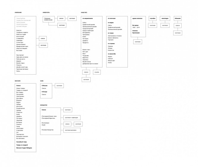
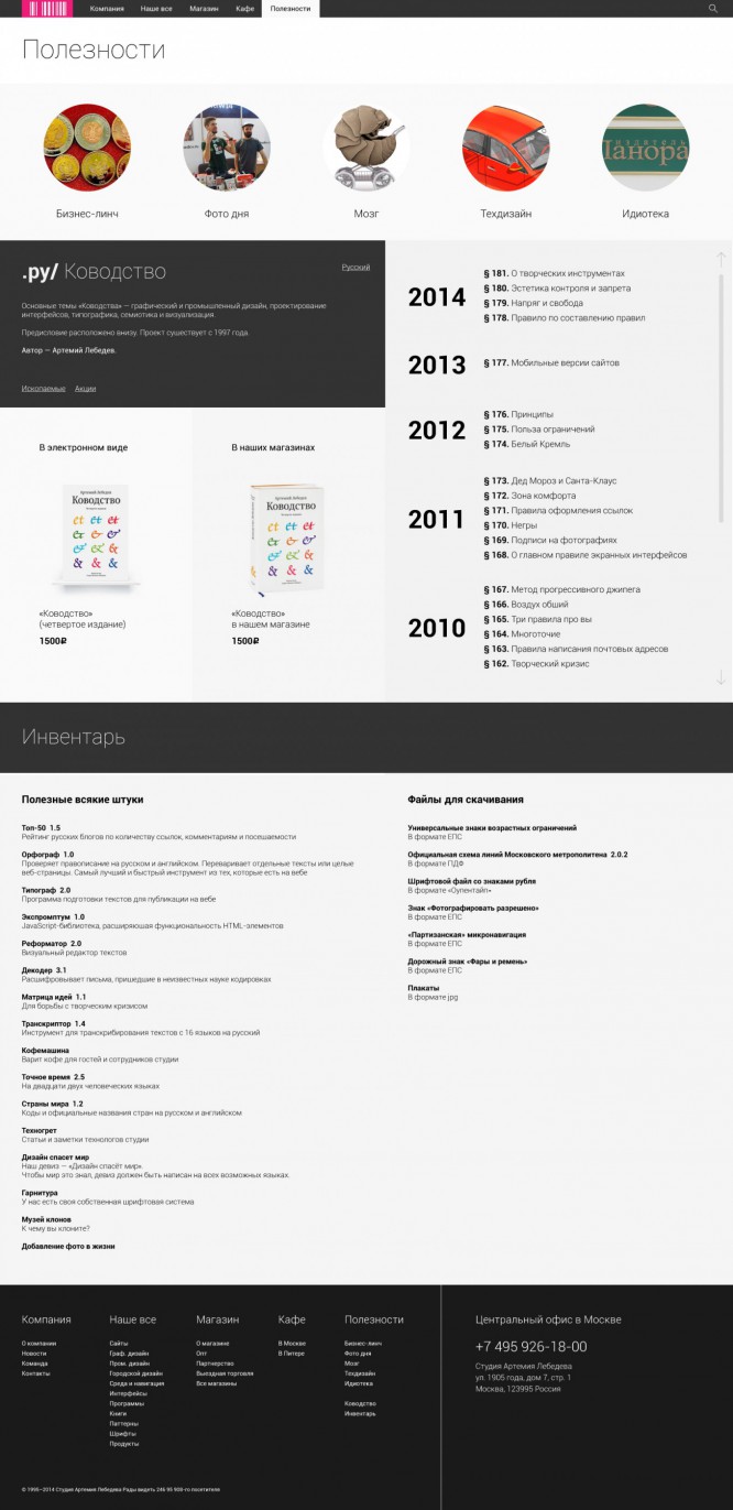
One of the first hypotheses is to combine the Inventory and Manpower sections into one large independent section dedicated to everything useful, interesting, non-commercial. From the “Company” section, you can also pull out “Artemius Headset”, “Mix”; from the portfolio section “Our Everything”, “Business Lynch”, “Photo of the Day”, “Brain”, “Techdesign”, “Idioteka”, “Backstage”, “Museum of Clones” – that is, to combine everything that is of interest to users into a large traffic generating section. It will be useful for a specialized environment – designers, copywriters, developers.
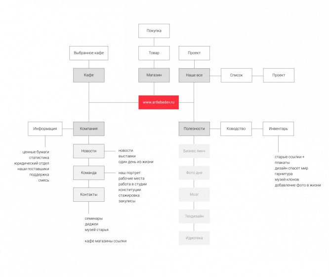
Mesh preparation
It is necessary to think in advance how the elements on the site will be located at different resolutions. Preparing the mesh of elements.
Home page
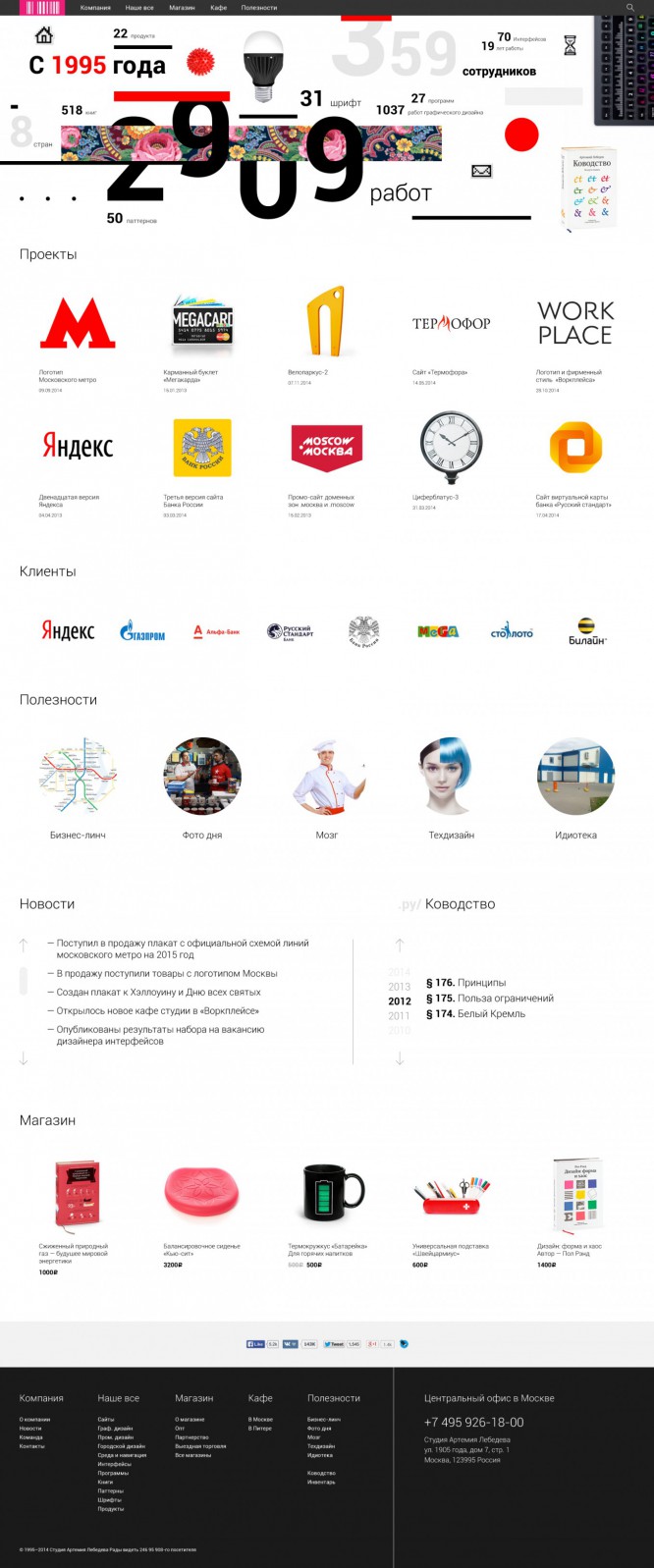
An agency home page can be presented in three ways: focusing on a portfolio, a description of an offer, or a summary of the company. The third way is a compromise between the first and the second (actually an aggregator). In our case, given the large amount of content, the choice fell on the third option.
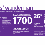
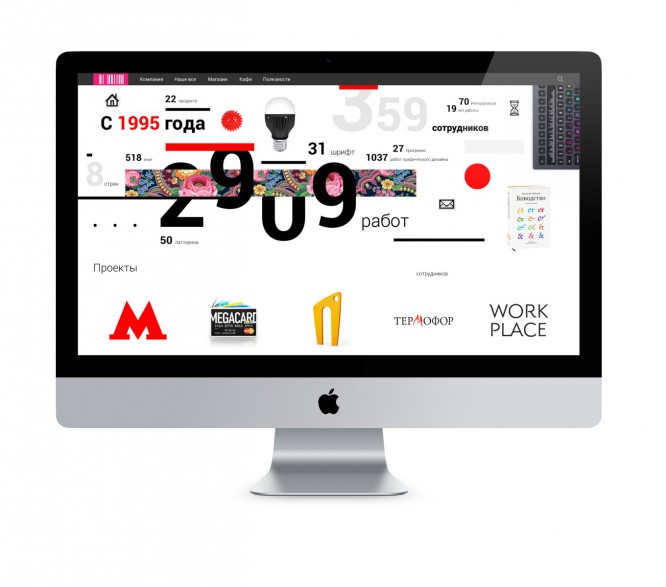
Knowing the scale of the company, it would be worthwhile to make an interactive dynamic promo block in the form of infographics and focus on it. This way, visitors will see how strongly the studio is influencing the industry. And for customers, a large promo block will be an aspect of trust and understanding of value. We will put the next emphasis on projects – so that you can always see the latest project from the main page. Then – the key clients of the company, thereby we consolidate the connection between projects and clients.
Let’s single out five key headings for which many come to the site – “Business Lynch”, “Photo of the Day”, and focus on them with the help of visual presentation. We also add a dynamic section “News” and “Manhood”, as it is constantly updated with interesting guides.
We add a section “Store” – but we would also make it more dynamic, given the huge number of interesting devices. It would be great if the displayed positions of the store changed every time you visit. Now the emphasis is on the keyboard, and it was only when analyzing the site that I found out how many other devices the studio produces – it would be worth taking it out.
In the basement, we duplicate the entire structure of the site and contact information.
Section “Company”
Considering the large amount of information contained in the section, it would be reasonable to make it a big promo section, telling about the company in an interesting, engaging way. We made navigation a kind of adaptation of the classic menu and “crumbs”, breaking it down into understandable blocks and thus setting a clear structure.
As the first block, we would make a video that clearly shows the work of the studio from the inside: the faces of the employees, the workflow and Artemy Lebedev himself. Further, in an interesting presentation, we talk about the studio.

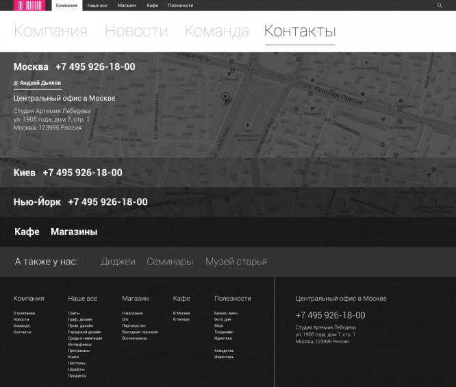
Contacts
Here we have added information that the company conducts seminars, invites DJs, and displayed relevant information. Everything else is in a classic form, with some interface solutions.
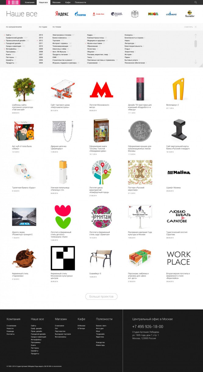
Our everything
We identified key customers – by analogy with how it is done now on the site. Since we love complex and large UX solutions, we decided to implement advanced filtering. All works would be displayed in one large canvas, and, thanks to this solution, the user could select the desired projects. For example: 2014, interfaces, automotive industry.
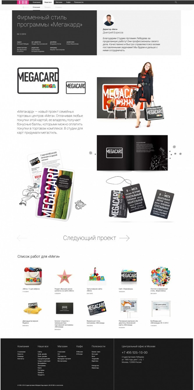
Projects now have cards, they are accented, highlighted in dark gray and give information about the project name, date and team. We posted a review next to the card – almost every project has third-party reviews, and they are positive, and this is an important aspect of trust in the studio.
We lay out all projects in block layout, with the possibility of switching to the next project – convenient for those who came to the site to study the work of the company.
We also added a list of works for a specific client.
We have adapted the pages for mobile devices.

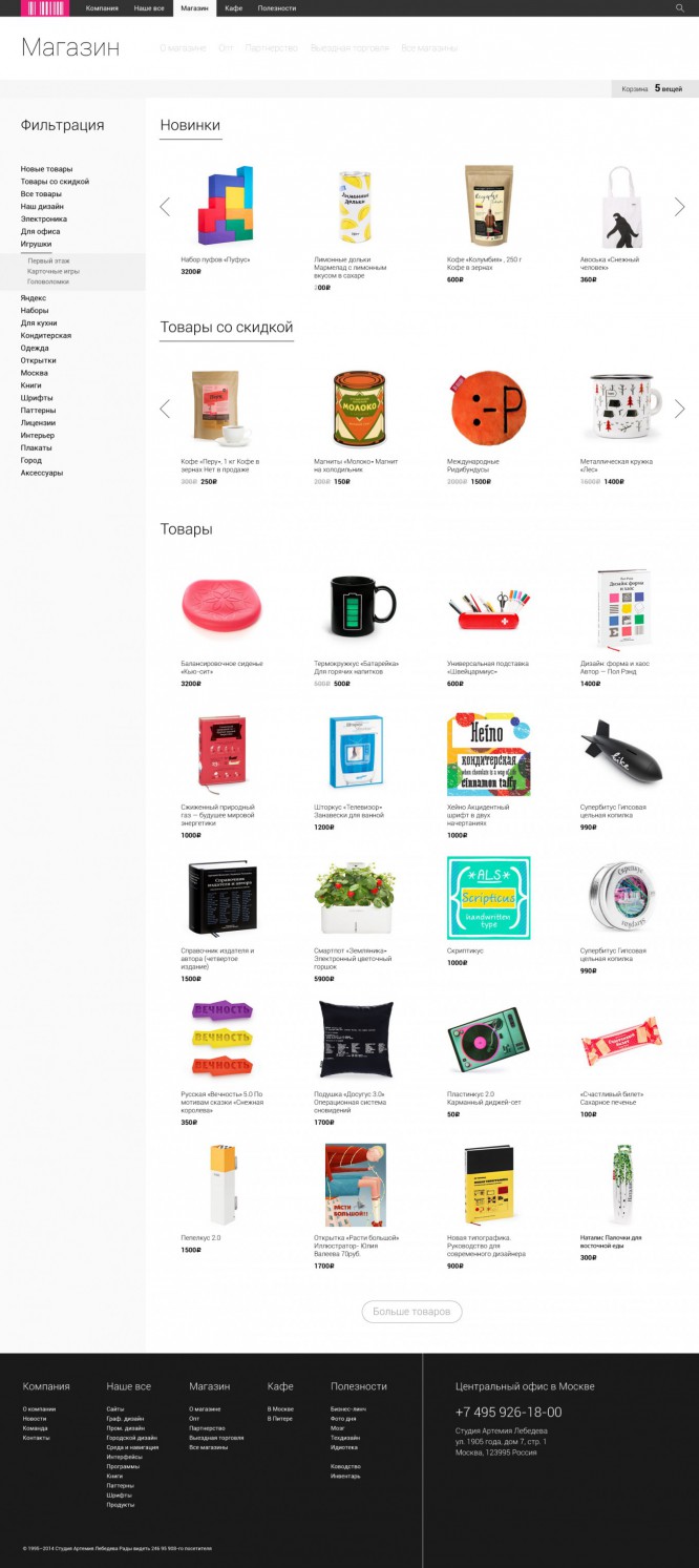
Score
We focused on filtering goods; for convenience, we moved it to the left edge. We selected the basket, and all additional information was placed in a separate block – a list of stores, contacts, and so on. The products were divided into three categories – new products, discount products and the rest.
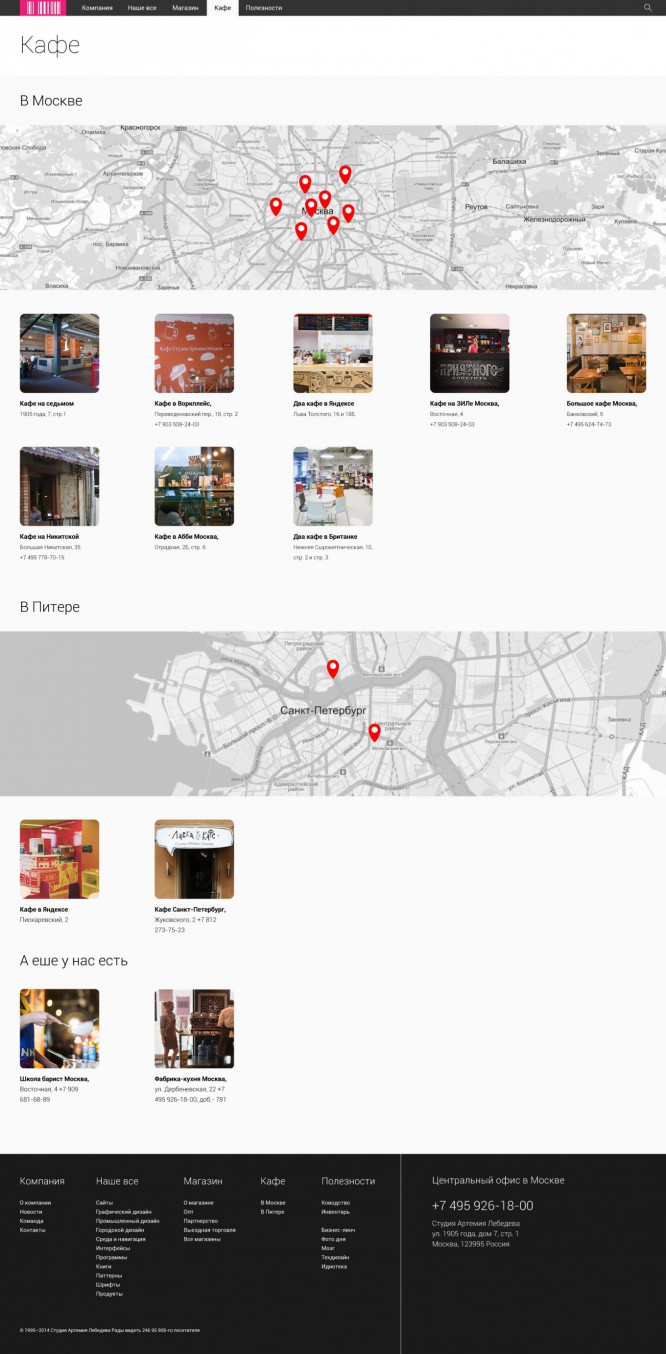
Cafe
In the “Cafe” section, the user will most likely want to know their location – we focus on this.
Usefulness
This is a large and interesting section. We have implemented it as one large aggregator of useful content available in the studio.
Conclusion
This is our vision of how we would work on such a large and interesting project. All sources can be downloaded from the link (.ai format). We will be glad to hear your critical opinion.
Source: siliconrus
…

