
Principles to Know When Designing Diagrams
Principles to Know When Designing Diagrams
Let’s talk about charts. Any designer who has worked on a project that requires at least a little data visualization knows that this can be incredibly complex. (and standing) design challenge.
For the past 15 years I have been developing complex web and mobile applications with a lot of data, so I deal with charts every day (see what I mean on Dribbble). Therefore, I want to share a few design principles that I use to create aesthetically pleasing and functional graphics that users love.
Use a familiar chart view
Experimenting with unique and weird chart types like Streamgraph can be a fun exercise for a designer, but users shouldn’t learn to read a chart you just make up. In most cases you should use one of the most common diagrams: areal, columnar / strip, linear, sector / ring…

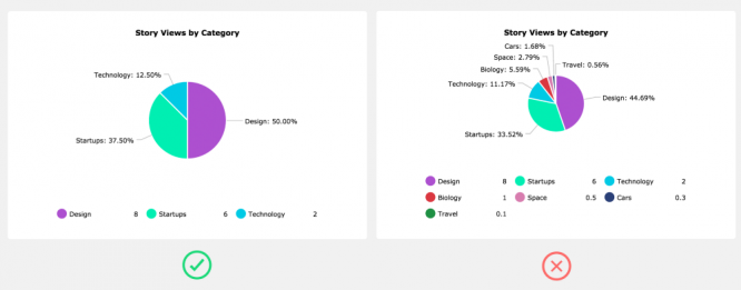
Don’t go more than 5 pieces in a pie chart
Golden Rule, if you really If you want to use a pie chart, try to fit into five or fewer sectors. The more sectors in a pie chart, the more difficult it will be to show the user a meaningful story. Ultimately you will have to come up with stupid decisionsto show shortcuts and work with hover interactions.
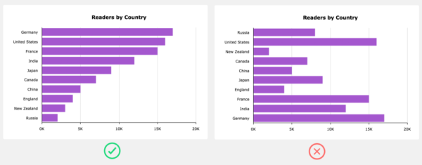
Arrange data series
When you’re working with data, you can greatly improve the readability of your chart by sorting the data series in ascending or descending order. This mainly applies to bar and bar charts.
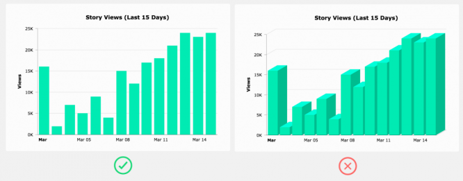
Avoid 3D charts
3D diagrams serve absolutely impractical purposes (maybe only if you are wearing VR glasses) – they don’t even look very good.
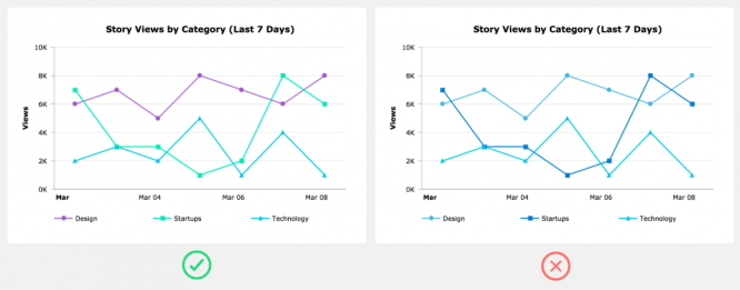
Don’t use randomly selected colors
Some programs will randomly generate the colors of the data series. These algorithms rarely assign colors that match the overall color scheme and provide sufficient visual distinction between data runs. Better to come up with your own color scheme. Make sure you have enough colors for all the data runs that could potentially be plotted.
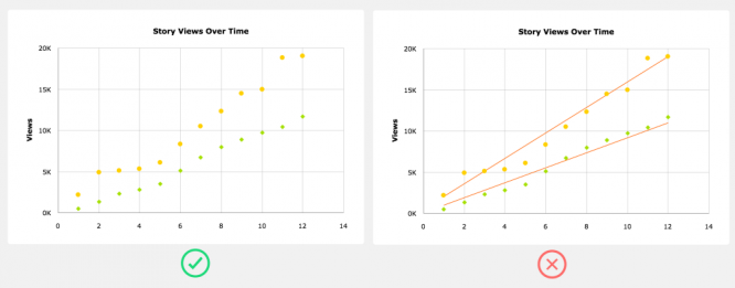
Trendlines are usually distracting
Trendlines always seem like a great addition to a chart, but in reality they are often far from what a user can see using existing data. If you choose to add a trendline, at least let the user turn it off.
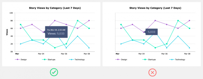
Don’t depend on tooltips
Think of tooltips as an add-on or as extended information. In other words, the tooltip shouldn’t be the only waywhich the user can see the value on the graph.
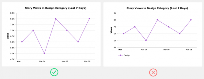
Don’t add a legend when you don’t need it
If you only have one series of data, instead of adding a legend that takes up space, simply use the chart title to indicate the data that was used to plot the chart.
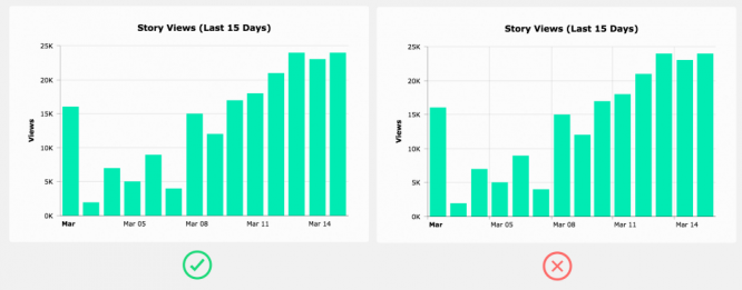
Use a grid only when it is useful
Gridlines can be helpful in guiding the eyes of the user from the axis label to the data point. However, gridlines are usually unnecessary in simple charts. When you use grid lines, it is important to decide if you need them in both the X and Y directions. Often you only need them along one of the axes.
Use real data in your charts
Designers tend to create the prettiest version of a chart without considering the real data that it has to manage when it is actually built.
This can cause endless headaches for developers trying to build the diagram you designed, and more importantly, you haven’t even tested if the diagram design would be practical in a real life situation.
The best solution is create two versions of the design… The first version shows the diagram in a state where the data is perfect (i.e., optimized for purely aesthetic purposes). This design can be used for your portfolio and presented to potential clients. In the second version, use the data that is likely to appear in the chart when it is actually implemented. This is a design that you can pass on to developers.

Finally, there are always exceptions
As a designer, it is your responsibility to use your best judgment and creativity when designing your data. However, data can be complex and creating a meaningful story around that data is not always routine.
You may find that the data you are working with does not fit well with some of the principles described above – not a problem, sometimes it is necessary to break the rules. It is important that you test your designs in real-life situations.
You can find my diagrams at Dribbble and in Twitter…
And don’t forget to put likesif you find this article useful ?
Ryan Bales – founder and creative director Bync…com… He has over 15 years of design experience with a focus on data visualization and design for SaaS data-intensive applications.
Source: sketchapp.me
…

