Memo to web designers: 11 important points
Memo to web designers: 11 important points
There are two sides to both programming and design. The first and foremost is how the project itself looks and works. And the second – how it is built and how quickly you can understand what its insides are.
In programming, these are code style, hierarchies, comments, and more. It’s the same in design. To prepare a high-quality PSD (Photoshop Document), you must follow certain rules throughout the creation of the design.
In this article, we will give you a specific set of recommendations that will help give your designer status more respect and make the layout path easier and more understandable.
Create a document based on web standards

You should always be aware of all new web standards, screen resolutions and technologies. For example, if you’re using a 1280px screen resolution, remember to leave at least 20px left and right padding. If you are doing a design for a website, then create a document in 72 dpi resolution. Today it is recommended to create a document with a width of 1920px, even if the site will have a maximum resolution of 1280px, and then it will remain centered, since you need to think over and understand how it will look on monitors up to 1920px.
Use a modular grid
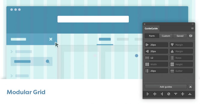
The modular grid should be one of the first concerns when designing a design. Initially, you must determine which modular grid you will use in the current project and follow it on all internal pages. The modular grid will help users quickly navigate your interface and understand many things on an intuitive level.
Modular grids are completely different, both light and complex. The main rule is to adhere to the initially chosen modular grid throughout the entire project. The topic of modular grids requires a separate article, in the future we will tell you in more detail about them and their application in different situations.
Use integer point sizes
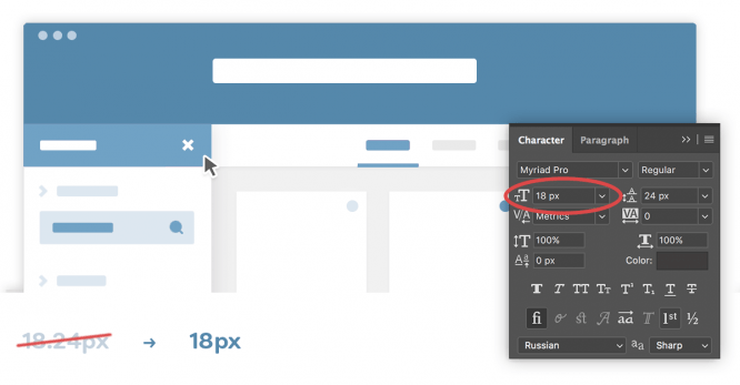
Use only whole numbers in all text, block sizes and other elements. Using a 14px font instead of 14.25px is unlikely to ruin the design, but it will keep it neat and crisp during the typesetting phase. Please note that when using a well-thought-out modular grid, all subsequent areas, blocks will already be integers. Thus, observing the rules outlined in the previous paragraph (“Modular grids”), you automatically facilitate the implementation of the tasks touched upon in the current one.
The same applies to icons, logo, pictures. Use whole numbers for all of these objects as well. The logo with the dimensions 151.5 × 183.4px is clearly the result “pulled and so it became”. Use math as much as possible. Calculate sizes, indents and positions.
Use only vector objects
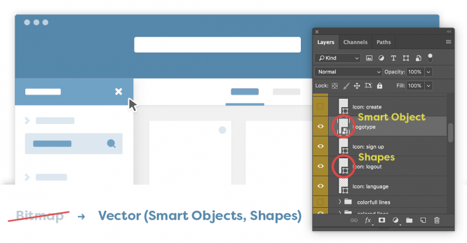
Long gone are the days of sites with fixed widths and shadows / gradients pieced together in PNG files. Much of CSS3 and HTML5 is now completely free to use and is compatible with all popular browsers. In this connection, you should have one basic rule: all design elements are vector, with the exception of photographs.
Do you have a square block? Make Shape. Icons? As an example, find vectors and import from Adobe Illustrator and then create a Smart Object. Ideally, we recommend creating font icons for future transfer to the layout designer. This can be done through numerous online tools.
Unify everything
Use the same font size for all headings, and for all subheadings, too. Follow the logic in the design structure.
Do not use more than 4 shades of the selected color. This kit is enough to keep the design from being boring, while the excess will give it chaos. You can also check out our previous article on 30 Tips for Web Designers. This article describes in more detail the process of choosing a color scheme and their shades.
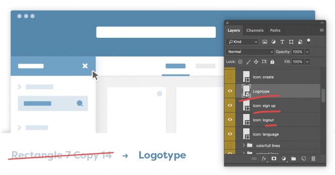
Give your layers logical names. It will be difficult for an outsider to understand the “# 169” layer, while the “logo” layer is clear and legible.
Comments (1)
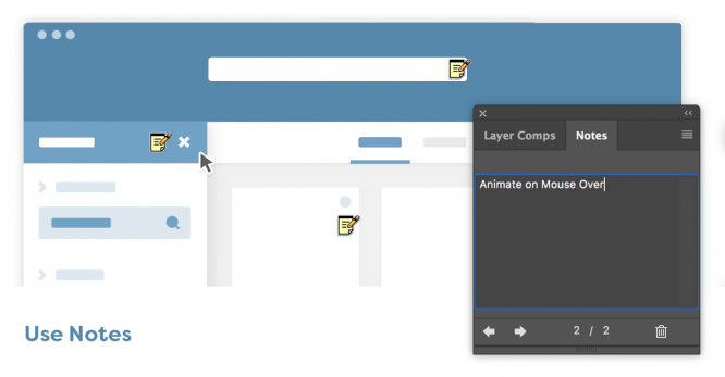
It might be obvious to you that there should be some animation when hovering over the buttons, but it’s not obvious to a third-party layout designer. Comment on all such nuances to save both yours and the designer’s time. Adobe Photoshop has a great tool that lets you take notes. Make the most of it!
Don’t forget about Retina displays
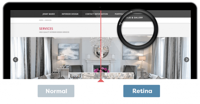
Displays with high pixel density per inch are becoming commonplace. When using images for sliders, backgrounds and more, use photos that are at least 2 times the size you want. So that the quality does not suffer, of course, you need to place them in a Smart Object, and then scale them to the desired size.
States of interactive objects
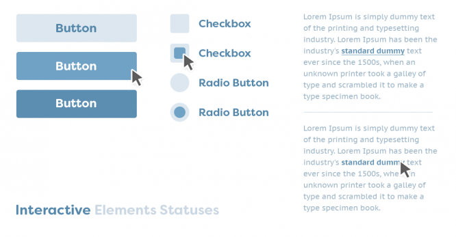
Remember to create different states for all interactive objects. For example, if this is a button, then at least the states must be drawn for it: normal, active, pressed. The same applies to links, navigation items, forms, and more.
Maximum field values
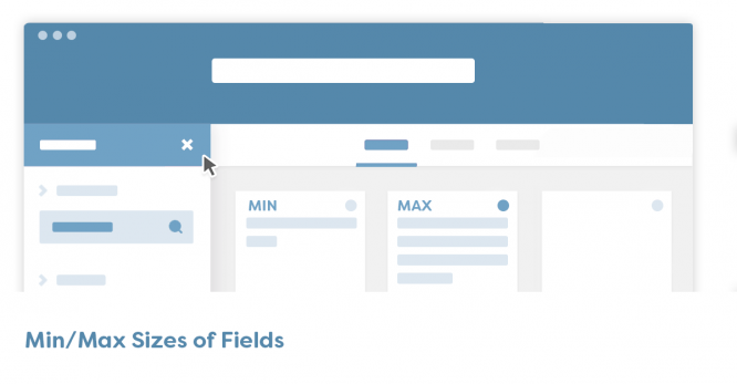
Have you drawn a block with statistics? Do not forget that today statistics can display the number 10, and tomorrow 10,000,000. Use as logical a value as possible to ensure that the design will be the same with different field values. Another example: drew a menu with categories and indicated a short word in each category? Don’t forget that a category can have very long words and even phrases. When drawing your design, use both the minimum and maximum values.
Website design is not printing
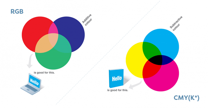
We even happened to see this! In this connection, we want to clarify such an obvious point. When creating a website design, use RGB (sRGB) color space. And the units of measurement are pixels or points. Do not use meters and kilometers with CMYK color space. Draw sites in the appropriate tools. It can be Adobe Photoshop, Sketch, but not Corel Draw.
To understand exactly all the key differences between printing and graphic design will help article 8 differences between print and web design.
Don’t overlay colors
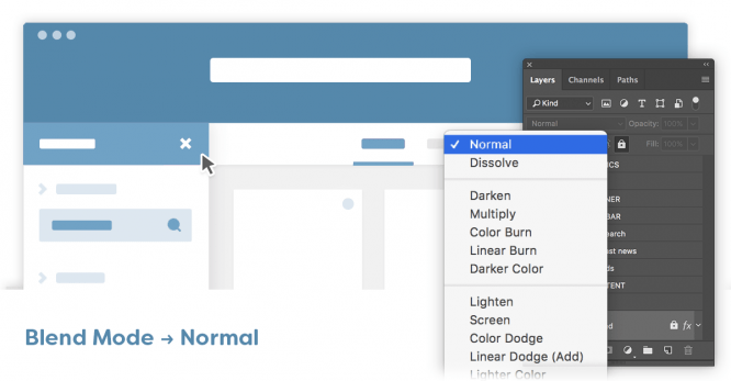
Initially, you need to master basic skills in web technologies and website design. Don’t try to achieve certain layering effects over thousands of layers. You must clearly understand that such a layout is almost impossible to create. And if it is possible, then painstaking work, in which the final result is likely to differ from the original. Also, try to use element transparency only when you are 100% sure that it will not be difficult to translate your design into the final product.
Source: perfecto-web.pro
…
