
Magazine grid rules
Magazine grid rules
Didactic introduction
Meshing is an extremely simple exercise with little theory; however, students regularly experience difficulties due to their inability to operate with traditional polygraphic units of measurement. Of course, today you can do without accurate typometric calculations, choosing the type size “in place”, but this partially loses awareness of the process. Therefore, the proposed exercise, despite its deliberate simplicity and convention (everything converges, as in the arithmetic textbook for the third grade), allows you to clearly explain the basic principles of construction.
To conduct a lesson, students need scissors, an adhesive pencil, a ruler, a pencil, paper (usually it makes sense to divide students into pairs – in this case, a set for a couple), several magazines for cutting. In one pair, as a rule, it is not possible to complete the exercise (the first hour is spent entirely on building a geometric basis), therefore, either two pairs in a row are needed, or the actual prototyping should be given as homework with mandatory analysis in the next lesson.
Creation of the geometric basis of the mesh
The first thing to know when designing a grid is what font size we are building it for. For greater simplicity, we will make our grid for 10 point type with 12 leading, and for the size of the magazine page we will take the standard A4 format.
So, the dimensions of A4 format are 210 by 297 mm. How many modules can fit in this space? Let’s start with the width: the basis of the modular grid for multi-column layout is set by columns, and you can’t make more than three columns in 10 point size – for a book publication there would be 2 of them, but for magazines of the 2nd category (popular, for leisure) according to SanPiN 1.1. 998-00, we have the right to make 3 columns.
Accordingly, it makes sense to make 4 modules vertically, this will significantly simplify the work of the advertising department, creating a supermodule for us half a page horizontally. Anyway, 3 by 4 is more interesting than 3 by 3.
So, we have 3 by 4 modules, starting with the width. We have 3 columns wide (equal to each other), 2 middle ones – for the sake of simplicity, I propose to assign them to 1 cicero; why it’s easier – it will become clear a little later. There are still fields. Since the layout is conditional, we will adhere to book standards, i.e. the radicular field is the narrowest, followed by the cephalic, outer, and inferior – the largest.
We get:
210 – 9 – 3K = P1 + P2,
where 210 is the width of A4 sheet in mm, 9 mm are 2 mediators of 1 cicero and 3K are three columns of the same width.
Now we begin to select the value of K, taking into account that the width of the column is equal to an integer number of squares (or a simple compound fraction of squares). With a column width … well, let’s say, 4 squares, we get 201 – 3x18x4 = 210 – 216, i.e. negative value of the sum of the fields. It is clear that 4 squares is a lot, let’s take less. With a column width of 3 squares 201 – 3x18x3 = 201 – 162 = 39 mm, which is already quite acceptable. We divide these 39 mm in a ratio of 1: 2, we get 13 and 26 mm. However, let’s remember that in fact the external field is equal to the visual sum of the two internal, and not geometric. I think that if we take 16 and 23, then we will do the right thing.
Now we have not only the horizontal dimensions of our modules, but also the estimated values of the head and bottom margins. Since the head field should be in the range of 16 to 23 mm, it is not a big stretch to count it just 20 mm. And the lower one should turn out to be more than 23, which, I think, we can quite achieve.
Now it remains to resolve the issue with the vertical skipping between the modules. Of course, if I propose to set it equal to one cicero, similarly to horizontal spaces (middle ones), it will look logical. But in fact, everything is exactly the opposite: we chose the middle between the columns in the cicero precisely because we knew that the vertical skips would be exactly equal to this value!
How was this known? Yes, from the chosen font, with which we began our reasoning. 12 point leading is exactly the 1 cicero vertical step. And here we come across the main rule of building a grid: the vertical distance between modules must be a multiple of an integer number of lines of text. It is the lines of text that create the real step that we can use when building the grid, and nothing else. If we imagine that we have chosen a vertical skipping that is not a multiple of the line height (leading), then the problem of fluidity of blocks of text within a strip inevitably arises, and the layout becomes more complicated, instead of becoming “automatically light”.
This is how it looks:

Therefore, we have 4 lines in the square, and the intermodule space is another line. This allows us to fine-tune the postscript font values to the required Didot points – we still have to adjust if we are using a layout program that is not friendly with continental typography. According to the SanPiNov table, we should add half a point to the size (instead of 10, use 10.5 postscript points), but the leading simply cannot be increased by 0.5. Therefore, we just build the longest column on the strip (well, for example, 15 squares – 270 mm, with 12 Didot leading points, this should give us 60 lines), fill it with text and adjust the leading so that they actually coincide in place.
The correct leading will be somewhere a little less than 12.8 – therefore, if the program does not allow using hundredths when assigning this parameter, it will be quite possible to slightly move the layout, which we are now considering so carefully. Because the only reality is the lines of the text. And it depends on them what kind of rounding we will take as working when translating post-script points into Didot points.
We can count similarly to the horizontal:
297 – 3×4.5 – 4M – 20 = P4,
where P4> 23,
but we can count more cunning. Let’s turn on the horizontal padding of 1 cicero right in the height of the modular rectangle, and then subtract it from it – while the padding of the lower module will increase the bottom margin (we remember that the bottom margin can be increased with almost impunity).
297 – 20 – 4M> 23
So, 277 / 4M> 23, where M varies as an integer number of squares or a simple fraction of squares. Using the calculator that each student has in his cell phone, after a short selection, we establish that M = 3 1/2 squares, therefore, without padding 3 1/4 squares, or, as it is easy to calculate, 13 lines.
We just lay aside 63 mm vertically four times, and then cut off 4.5 mm from each module from the bottom. Thus, the bottom margin is 25 + 4.5 = 29.5 mm. And so that the extra line, spaced from the lower module on the cicero, does not go to waste, it can be used to tie the column number.
Thus, the geometric base of our modular grid is ready. Let’s take a look at it as a whole:
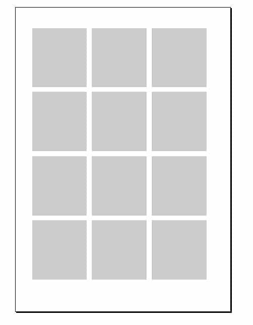
We have 12 modules of 3 squares (54 mm) in width and 3 1/4 squares (58.5 mm) in height, separated by skips of 1 cicero, which gives us an additional line when typesetting a text block for several modules in height.
Of course, for a modern magazine this is a very bad grid – it is very “bookish”, it is built for an extremely large size, it is simple-minded – but it is built correctly and clearly. I think you can now easily build (after a few tries) a grid for your specific needs.
What I would like to draw your attention to – to functionality mesh.
At first, now it is clear what size illustrations (and advertising modules!) are needed on the page. Obviously, the minimum size will be 1 module – 54×58.5 mm, then 2 modules – horizontal 112.5×58.5 mm and vertical 54×121.5 mm, and so on. This means that the layout and processing of illustrations can be “parallelized” by dividing it between two workers. This makes publishing the magazine very easy.
Secondly, we now know exactly how many characters are on the strip. We have 3 columns of 3 squares in width and 55 rows in height (4 modules of 13 and 3 in the intervals between modules). Knowing the capacity of the square in the selected headset with the selected tracking, it is easy to calculate the capacity of the strip. Of course, the capacity of a square will have to be determined experimentally: this was earlier, when all the printing houses of the USSR had two dozen of the same fonts, it was possible just to give a table of capacity in the reference book – look at Gilenson, it was done there. Now it all depends on what program you are using, what version of the font you have installed, even under which phototypesetter you compiled the publication – but this problem is easy to solve. We type a column of two dozen lines, count the number of characters with spaces (just drop it through the clipboard into the “Word” and look at the statistics), divide by the number of lines multiplied by the column width in squares – voila!
Here I have for the font used in the example – this is MagistralC, the real values are 10.5 / 12.7 – the capacity of the square is 9.55, or 28.65 characters per line. Well, even if you slightly underestimate the estimated capacity, this means that a page completely filled with text will have 55x3x28.6 = approximately 4,700 characters. Now we are looking at the volume of the article, which we are invited to make up for a spread. Suppose there are 8,600 characters, and I also want to put 2 illustrations: one larger and square one (2×2 modules), and one narrow but long (1×3) module. It is easy to calculate that the first picture will consume 27 (2×13 +1) lines in 2 columns, for a total of 1544 characters, and the second one – 13×3 lines, or 1115 characters. On a spread, we have 2×4 719 = 9 400 characters, but we need 8 600 + 1 544 + 1 115 = 11 259, which is already 800 characters more.
But you still need a place under the heading (let’s say, about half of the module height, i.e. another 500 characters), and you want to put something in a box on a colored plate … Therefore, you can, without starting the layout, ask the editor (author, responsible ) either shorten the text by at least one and a half thousand characters, or pick up another illustration and give three strips for the material.
Thirdly, Having built the grid, we have thereby created a ready-made price list for the advertising department. It remains only to indicate in millimeters the possible options for advertising modules and set the price. Anyone who has ever had to typeset a magazine or newspaper knows well that most of the effort is spent on bringing the customer’s modules to standard sizes. But sometimes good advertisers do it themselves, if they are explained in time.
Grid based layout
Well, now the most important thing remains – to design the magazine on the basis of the constructed grid. Here are two examples based on the simplest grid we have. The first is built emphatically “large” and “across” (in fact, I reproduced a version of the layout of one of the magazines I once made up), the second – “small” and “vertically”. The text parts of the spreads are absolutely the same, up to the sign (in one place the line is pulled in). These examples, in my idea, should show that on the basis of one grid, you can create significantly different layouts.


Author: Andrey Yakubovsky
…