

Ipod Scroll Wheel: Iconic Interface Design
When Apple introduced the original iPod in 2001, it revolutionized not only how we consume music but also how we interact with digital interfaces. At the heart of this groundbreaking device was a deceptively simple yet incredibly powerful input mechanism: the scroll wheel. This tactile navigation tool quickly became iconic, defining the iPod’s identity and helping it become one of the most successful consumer devices in history.
TLDR: The iPod’s scroll wheel is one of the most iconic design elements in tech history. It offered users an intuitive way to navigate large libraries of music with unprecedented ease. Its evolution over the years reflects Apple’s dedication to form and function, and it left a lasting legacy on the user interface design landscape. Though now a relic, the scroll wheel still stands as a masterclass in minimal, user-centered design.
The Genesis of a Design Marvel
In the early 2000s, the digital music landscape was chaotic. MP3 players existed, but they were clunky, with confusing interfaces and poor storage. Apple saw an opportunity to simplify digital music consumption and designed the iPod from the ground up with elegance and ease of use in mind.
The scroll wheel was central to this vision. Developed in collaboration with Synaptics, the original iPod’s mechanical scroll wheel allowed users to navigate through hundreds or even thousands of songs with a simple circular motion. It was a radical shift from the button-heavy interfaces common at the time.
How It Worked
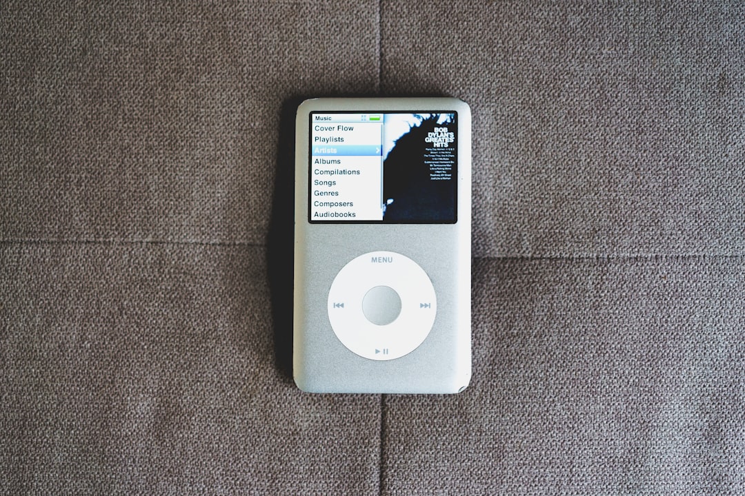
The scroll wheel combined rotation with button functionality. Users could physically spin the wheel to scroll up or down through menus and lists. Four buttons—Menu, Play/Pause, Forward, and Back—were arranged around the wheel, giving instant access to vital functions.
This radial approach to input was incredibly efficient. Apple leveraged the natural ergonomics of the thumb and human cognition—making navigation feel almost instinctual. This design reduced friction between intent and action, allowing users to focus on their music rather than the device.
Design Evolution of the Scroll Wheel
Over the years, the scroll wheel went through several major iterations, each refining the experience:
- Mechanical Scroll Wheel (2001 – iPod 1st Gen): A physically rotating wheel with separate buttons surrounding it.
- Touch-sensitive Scroll Wheel (2002 – iPod 2nd Gen): Enabled by Synaptics’ touch technology, allowing smoother navigation without mechanical resistance.
- Click Wheel (2004 – iPod 4th Gen and beyond): Combined buttons into the touch-sensitive wheel itself, creating a seamless, unified interface.
The introduction of the click wheel was especially pivotal. By integrating touch sensitivity and button functionality into the same surface, Apple reduced mechanical complexity while increasing usability.
Why the Scroll Wheel Succeeded
The success of the scroll wheel wasn’t just about its novelty—it addressed several key usability challenges:
- Speed: Scrolling through long lists on MP3 players was typically tedious. The scroll wheel allowed users to skim through their entire music library in seconds.
- Accuracy: The circular motion naturally slowed as users neared their desired selection, allowing precise control without overshooting.
- Muscle Memory: The physical and tactile aspects of the interface allowed users to navigate menus almost without looking.
The scroll wheel also had a psychological advantage. It made users feel in control. There was a direct correlation between movement and response, between touch and outcome—a digital interaction that felt deeply human.
Minimalism Meets Functionality
Apple’s design philosophy hinges on minimalism. The scroll wheel epitomized this by eliminating the need for complex controls while still offering rich functionality. Unlike multi-button remotes or directional pads, the scroll wheel offered a cleaner, more intuitive interface.
This minimalism extended to the visual design. Differentiating itself from overly technical competitors, the iPod presented music through a sleek monochrome screen and this elegantly simple wheel. The message was clear: the technology is powerful but invisible.
Comparisons with Other Interfaces
At the time, competitors used multi-directional pads, tiny joysticks, or cumbersome menu buttons. None offered the speed or elegance of the scroll wheel. Apple prioritized user experience—and it showed.
Even after competing devices began to imitate the scroll wheel, none could fully match its tactile feedback and seamless integration. While Apple eventually moved to touch screens with the iPhone and iPod Touch, the scroll wheel remains a testament to the power of intelligent constraint.
Impact on Interface Design
The scroll wheel didn’t just influence music players—it inspired a broader rethinking of how devices should interact with users. It became a case study in industrial design classes and was analyzed by UX designers worldwide.
Here are a few areas where its influence is still felt:
- User-centered design: Put navigation in sync with human gestures.
- Simplicity: Showed that less is more, sparking a wave of minimalist design languages.
- Tactile engagement: Emphasized the importance of physical interaction even in digital spaces.
Its legacy is evident in the Home button of the iPhone, the Force Touch feature on Mac trackpads, and the haptic dials in modern smartwatches and vehicles.
The Scroll Wheel in Pop Culture
Beyond its practicality, the scroll wheel became a pop culture symbol. It featured prominently in Apple’s memorable advertising, which showcased silhouetted dancers navigating their music with iPods in hand. The action of spinning the wheel, selecting a song, and losing oneself in music became iconic in itself.
It even found its way into art exhibits, fashion designs, and film references, symbolizing a turning point in digital culture where devices felt less like tools and more like companions.
The Inevitable End
As touch screens became more prevalent and capacitive displays allowed more complex interactions, the scroll wheel began to show its limitations. It couldn’t offer access to apps, video playback, or web browsing in the same way a touchscreen could.
By the late 2000s, Apple began phasing out scroll-wheel-based iPods in favor of devices with full-face touchscreens, like the iPod Touch and iPhone. The final blow came in 2014, when Apple officially discontinued the iPod Classic.
Still Missed Today
Despite its obsolescence, many users look back on the scroll wheel with a sense of nostalgia and reverence. Vintage iPods, especially those with click wheels, have become collector’s items. Some enthusiasts even upgrade them with modern features like solid-state drives and Bluetooth connectivity.
There is something enduringly special about physically spinning a wheel to scroll—an interaction that today’s glass screens often fail to replicate in feel and satisfaction.
Conclusion
The iPod scroll wheel remains one of the most iconic and celebrated interface designs in tech history. Marrying form with function, tactile pleasure with digital efficiency, it became more than just a navigation method—it was an experience. And in an age where digital interfaces are increasingly invisible and abstract, the scroll wheel stands as a reminder that sometimes, the best interfaces are the ones you can feel.

