
Illustration Fundamentals: How to Build a Successful Composition
Illustration Fundamentals: How to Build a Successful Composition
Any work of art, be it a painting, a symphony or a movie, undoubtedly requires one or another construction, structure. In other words, compositions or layouts. In musical works, this is the arrangement of notes, in cinema, it is a carefully composed script, but in illustration, photography and painting, it is the arrangement of objects on the working surface.
It is about the composition in drawing that will be discussed in this article.
Any illustration or drawing consists of objects, which, in turn, consist of lines and shapes. Composition as a whole is also determined by colors, shadows, contrast, texture, shapes and proportions of objects.
The artist’s task is to arrange objects, colors and shadows in a certain order so that it all adds up to a harmonious picture.
There are several basic rules when composing a composition. Let’s look at the main ones with illustrative examples.
The rule of three thirds
Dividing the work surface into 9 equal squares, as shown in the figure.

This is done in order to position the central object as harmoniously as possible with other elements of the composition, thus clearly seeing the center of the working surface and its peripheral zones.
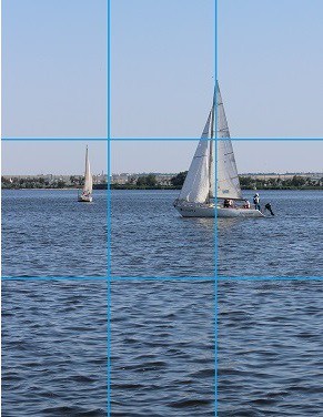
So, the central object is present in every composition. In this case, it is a sailboat. As we can see, part of the boat protrudes into the central zone of the photograph, and its other parts fall into the upper and middle right zones.
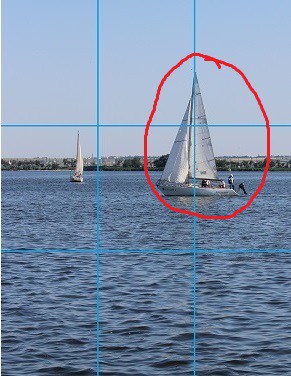
Let’s take a look at another example:
Here one more rule comes into force – any composition, be it a photograph or a drawing, always looks more advantageous with a central object displaced at least slightly from the center in any direction. Just a few centimeters from the center to the edge – and the composition is already turning from mediocre to interesting and lively.
Angle or view of objects
Sometimes the artist chooses a non-standard position of the object. That is, he draws it in such a way that it seems to be located at a certain angle, for example, “top view” or, on the contrary, “bottom view” – the possibilities are endless. There is in drawing such a concept as perspective reduction – changing the size of objects in order to give the drawing the effect of three-dimensional space.
This is where artists’ difficulties begin – after all, a certain perspective requires a reduction in individual proportions of the subject in perspective. In other words, if, for example, a person is drawn in the “top view” position, then his head will be large, and his body and legs will be very small, since there is a reduction in perspective – the further from the viewer one or another part of the object, the smaller it will be in size , and vice versa. Let’s take an example:
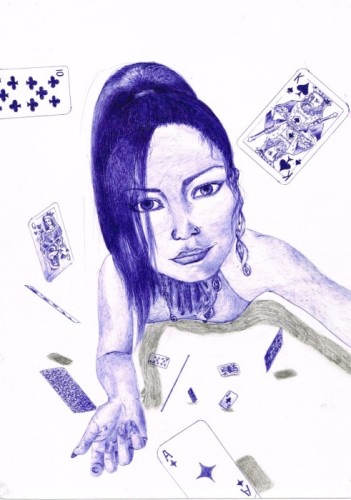

We see that the girl’s head in the first picture is huge, while her arms are very small in comparison with her head, and her body is not completely visible at all. This is because the artist has positioned it in such a way as to create a top-down effect. The body of the object seems to go down. In the second picture, the road goes away from the viewer, creating the effect of a long distance, narrowing in the distance.
Working with a perspective is not easy in itself and requires constant practice. Here it is important to divide the sheet into conditional lines that go as if “deep into the composition”, depending on which direction the artist chose to build the object.
Thus, in the first drawing, the lines go down, having the greatest distance between them at the top, becoming narrower until they intersect somewhere in the area of the girl’s legs (even if the legs are not visible in this drawing).
On the second composition, the lines move away from the viewer into the distance. Working with a distance, you can and even need not to limit yourself to only two lines, their number can be anything you like. The main thing to remember is that the conditional lines will sooner or later intersect with each other at a single point, in this direction it is worth cutting all objects in the composition. This will be very difficult at first, however, having mastered the successful application of perspective reduction, the artist will be one hundred percent successful in composing any composition. So the game is worth the candle!
Odd rule
The rule says that a composition with an odd number of objects always looks more interesting and advantageous than a composition with an even number. This is due to the fact that the viewer subconsciously groups the composition with an even number of elements, thus losing the central object.


It would seem that in both pictures there are horses, but the picture with three looks more interesting in comparison with the composition, where there are two horses.
In addition to the location of central and auxiliary objects, respecting proportions and perspective, the artist must take into account color schemes, light-shadow, and contrast. Practice, experimentation, and a love of art are essential ingredients that will help you succeed in this field. The result will not be long in coming – you will see how your work will only grow in terms of quality and professionalism. Feel free to experiment, improvise, otherwise what kind of art is this. And most importantly, do not be afraid of anything – and then everything will work out for you!
Source: say-hi.me
Cover photo: ShutterStock
…

