
How to Learn to Draw: 10 Painting Tips for Beginners
How to Learn to Draw: 10 Painting Tips for Beginners
Many people want to learn how to draw, but are afraid to start. How to approach paints? Which brush and paper should I choose? Where to start? Painting from Scratch has answers to all of these questions.
Here are the basics of how to start painting. Follow these tips, do the exercises and you will no longer be afraid of a blank slate. You will receive the necessary knowledge and basic skills. Painting will become closer, clearer and more enjoyable.
Part 1. Preparatory
1. Find an inspirational object to paint
It so happens that you have already prepared everything, but you cannot find an object that would inspire you. This should be taken care of in advance. Something interesting must have been lying around in cupboards and drawers. Keep an eye on sales, commissions, and grocery stores. Explore the paintings of your favorite artists.
The selection should include items that are pleasant to look at: this is important for creating a successful work.
An interest in color and shape will motivate you as you work on a painting. There is a connection between feelings for an object and the ability to reveal their abilities. You can do more than you think.

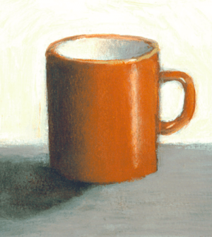
For the first picture, a simple one-color symmetrical vessel, for example, an ordinary coffee cup, will do. Illustration from the book
2. Get to know brushes and paints
Pick up a soft round and bristle brush and compare the bristles. Squeeze some acrylic paint from a tube onto a palette. Try applying undiluted paint with different brushes to canvas or watercolor paper. strokes should be bright and embossed. Feel the difference in strokes with different brushes. Add a little water and apply the strokes again. The medium consistency of the paint has the same color intensity as undiluted, but its texture is smoothed. And do this exercise again with a weak paint solution. Note how quickly the paints dry the first, second and third time.
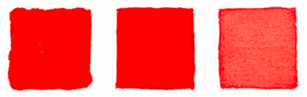
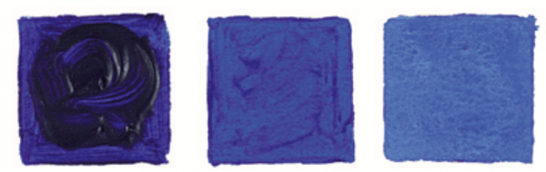
Illustration from the book
Try using different brushes – oval soft, synthetic fine, bristly flat. Try each brush until you are sure you know which brush to use to complete your design.
Illustration from the book
3. Useful techniques for working with a palette
The colors in the paintings that we see are usually obtained by mixing: the pure color from the tube is usually too intense. These techniques will make it easier for you to get the color you want.
- 1Squeeze paint from the tube to the edge of the palette, leaving a distance between colors. Use the center of the palette for blending. Keep mixes away from each other to prevent unwanted mixing.
- Draw a solid color on the brush from the edge of the palette, and not from above or from the middle of the squeezed out “sausage”.
- Intense dark colors such as black (although not scientifically considered a color) should be added with caution: even a small amount can significantly change the color you mix.
- You need to mix the colors with each other until the batch is completely homogeneous.
- Don’t spare the paint. Squeeze out as much as necessary – usually it is a circle the size of a ruble coin (for white – about a five-ruble coin). Paint consumption is an integral part of the painting process. If you save too much, you will never learn how to use paint.
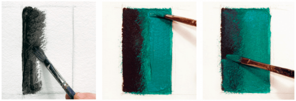
4. Learn to get neutral colors
Any painting contains neutral colors – “visually gray”. Due to their low intensity, they are invisible at first glance, but this is the most useful tool for creating a harmonious color composition. Let’s see how to achieve this.
Mix blue and orange in any proportion. Now let’s try changing the color temperature by proportioning the warm to cool colors in the mixture. If the result is more purple, try a rusty color by adding more orange paint and then white for a lighter peach color. If you get a rusty color in the first step, add blue to make a cool color close to purple, and then white to get a light purple-gray.
Repeat the previous steps for another pair of complementary colors – yellow and purple, red and green.
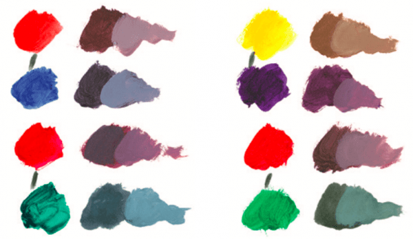
Pairs of complementary colors are connected by short vertical strokes. The colors of each pair are mixed with each other to obtain two neutral colors, each of which was dominated by one of the parent colors – they are located to the right of the corresponding parent. Illustration from the book
5. Primary, secondary and tertiary colors
Draw a circle, then break it into three equal sectors. Paint the upper sector with cadmium yellow in the middle, the lower right – with ultramarine blue, and then mix the main red from raspberry naphthol and cadmium red light and paint over the lower left sector with it.
On the color wheel of the primary colors, draw semicircles with centers at the intersection of the sector boundaries with the outer outline of the color wheel. Paint these semicircles with secondary colors, positioning above the “parents”: cadmium red light above the border between red and yellow, violet dioxazine above the border between red and blue. Add yellow to the green FC and paint in a green semicircle above the border between yellow and blue.
The primary color, when mixed with an adjacent secondary, gives a tertiary. Add one triangle on each side of the semicircle for a total of six. Paint over each triangle using the captions.
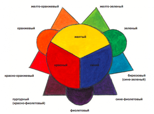
Primary, secondary and tertiary colors. Illustration from the book
Part 2. Drawing
6. Start with abstractions
Abstraction is a fun and easy way to prepare for realistic artwork. It is important to choose 3-4 colors that you like in order to feel an emotional connection with the painting. Draw a continuous angular or rounded line across the entire surface of the sheet with a simple pencil. It can be crossed several times.
Paint over the shapes in the picture with the colors and shades, paint consistency and brush that you like. Listen to your inner voice. The main task is to do as you like, forgetting about everything else.
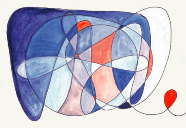
Illustration from the book
7. Scheme of strokes
Beginners are often not sure how to apply strokes. In the illustration, the arrows indicate the direction that will help to achieve a good depth of the depicted space using the example of a circle.
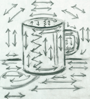
Stroke scheme and result. Illustration from the book
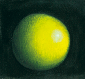
8. How to apply shadows
Shadows play a key role in creating a volumetric image: first of all, you need to learn to see and write them. There are four types of shadows in total:
- Own shadowslocated on objects. These are areas of dark tone contrasting with the lighted parts of the depicted shape. They usually have a sharp border on the outer contour and a smooth transition at the border with areas of the light tone of the object. They play a major role in creating volume.
- Halftone regions – narrow, with a soft outline, located on the border between their own shadow and the illuminated area of the object. These shadows are the mid-tone between the contrasting darks and highlights of the subject.
- Falling shadows – silhouettes of an object, “fallen” or thrown by it on any surface, except itself. They give the impression that the object is on some surface.
- Shadows at the point of contact – the darkest area of the falling shadow that lies next to the object. They are responsible for the “stability” and mass of the object. These shadows are also called accent – the darkest area among the dark tones. The accent is the dark counterpart of the highlight, the lightest area among the lighter tones.
To paint the shadow, use black paint or paint that is darker than the base color. And in the second step, cover this darkened area with the main color. The mid-tone black should show through under a new layer of paint, creating a colored shadow. If you want to make the shadow darker, apply more black from the clear border of the shadow and blend with a mid-tone color.
A shadow on the example of a cylinder. Illustration from the book
9. How to apply glare
To create a realistic highlight, brush the lightest part of the subject with a dry white brush as many times as necessary for sufficient brightness. In the middle of the flare, place a small dab of thick paint for more brightness.
Two examples of overlaying highlights. Illustration from the book
10. Paint pictures in your imagination
As you go about your daily activities, paint in your imagination. Look mentally between the surfaces and textures you see around you and the way you work with the brush and paint.
Source: blog.mann-ivanov-ferber.ru
…

