
How to create a great app icon
How to create a great app icon
Translation of an article from the studio Gapsy “How to Design a Great App Icon” about tips, rules and principles that should be followed when developing another icon for a mobile application.
Did you know about this shocking fact? Users now spend over 90% of their time with smartphones using mobile apps. Each of us has more than ten programs installed on the phone, and this number is only growing every year. To stay one step ahead of your competitors, create a unique app icon that will increase your brand awareness. We will tell you how to do this in this article. Check out our tips on how to make a great icon for your mobile app.
What is an application icon?
A mobile app icon is a small image that represents an app in a marketplace such as Google Play or the App Store. The small image that users see on their phone screen is one of the most important elements of your project’s identity. The icon will help you stand out, remember the brand, and reveal the essence of your unique business proposal.
According to statistics, there are currently over 2.9 million apps available on the Google Play Store, and nearly 4.4 million on the Apple App Store. Therefore, your task is to create an application icon that instantly grabs attention and makes the user want to know what is behind the image.
![]()
What’s the difference between an icon and a logo?
Some people think there isn’t much difference between a logo and an icon. But the main difference is this:
Icons:
- The icon directly represents an idea, concept, or action. It makes it easier for the user to work with the graphical presentation.
- Icons are commonly used in applications to represent what they are used for and are a key element of the UI / UX interface.
Logos:
- The logo is used to recognize the main part of the logo used to represent the organization. The way the organization is presented can be direct or hidden. The logo must be associated with the organization. This reflects the mindset of the organization and represents its graphical summary.
Icon categories
There are two types of icons in design – icons for the Android operating system and the IOS operating system. Although they look very similar at first glance, they differ in many technical nuances that should be considered when developing.
![]()
Tips on how to create a great icon for your application
As we delve deeper into the topic of creating mobile app icons, here are some tips on how to create a cool icon that your target audience will love.
a) Make your app icon unique
Remember that you are making an icon for a competitive market and you will be competing against all sorts of other mobile app icons. That’s why, if you want to be chosen, you need to stand out and be unique, not like everyone else. You want your audience to pay attention to your icon and use your app day in and day out.
![]()
You need to analyze your competitors in order to evaluate the design of their icons and decide on this basis with yours. Research the most popular mobile apps in your niche, look at their icons, what features they have, if they have anything in common, different, what colors they mostly use, and think about how you can stand out among them. Perhaps create an icon with the opposite color, or use a different graphic design to make your icon stand out from the crowd. But be careful with experiments, because your main task is to satisfy the tastes of the target audience, therefore, first of all, you must study their tastes in detail and understand what attracts and likes them in general.
b) Keep it simple
Keep your icon simple but thought out down to the smallest detail. Don’t use overly complex designs. First, your icon is tiny; few people will be able to see any text or details in it. The more details, the more difficult it will be for the user to recognize and correctly perceive it. Your icon should be easy to scale across different media and be easily recognizable, whether it’s a phone screen, an app store, or a control panel.
Let’s take a few icons of famous mobile apps as an example. Learning and drawing inspiration from successful brands is a great idea!
- WhatsApp icon – phone on a green background;
- Google Maps application icon – the simplest white background and multi-colored pin;
- The Zoom app icon is just a video camera.
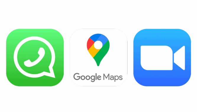
Look at most of the applications on your phone – all icons will be as simple and straightforward as possible, expressing the main idea of the application.
c) Use conventions, not words
To grab the user’s attention more, it is better to use legends rather than text. The text always makes it difficult for the audience to perceive the icon. Likewise, it is best not to use a photo as an icon, as this will confuse users too. For more engagement, use the logo that best describes your company or brand.
To correctly identify which logo best describes your brand, make a list of the things you associate with your product. This will make it much easier to find the logo you want and turn the words into an image. Take a look at the logo of one of our projects as an example. The airplane emblem lets us know that the app is for booking flights. Just one picture instead of a thousand words.

d) Work in the corporate style of the brand
All users appreciate when the created design is thought out to the smallest detail. Make sure your icon captures the essence of your mobile app. This is why mixing content and design is one of the surest ways to connect with your audience and create a visual identity.
Use corporate colors, shapes, and textures to make sure your icon matches your branding. If, for example, your application has geometry or a gradient, try inserting that into an icon.
It’s also worth combining icon design and functionality. When users first see your application’s icon, they should understand at a glance what the application is being used for. For example, the Airbnb app.
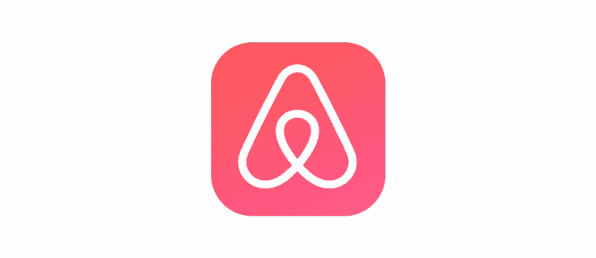
They used an airplane in their icon designs, which immediately makes it clear to users that this app is related to the travel industry.
e) Think about color
Since color can be a determining factor when choosing an application for many, choosing a color theme for an icon must be done carefully. Here are some tips for using colors for your icon:
- The chosen color of your icon should be related entirely to your brand and the color palette of your application. The colors of your app and icons should be the same and look good on different backgrounds (be it black, white or colored)
- Don’t use too many shades in your icon design, as there is a risk of your design becoming a mess and confusion.
- Among the most famous colors used for icons are blue, red, white. Keep track of color statistics, consider what market you are making an application for, and do not forget all the factors that influence the choice of color for your target audience.
g) Test your icon and keep improving it.
Testing an icon is like checking a map before a race. It’s better to spend a few minutes checking before you start than spending a lot of time and money fixing bugs later.
To create an effective app icon that not only looks good among competitors, but also increases conversions, it needs to be subjected to two stages of testing:
- Technical testing;
- Audience testing.
Technical testing of an icon can be divided into stages:
- Testing on different devices (see how the icon looks on different screen sizes);
- Testing in different sizes (let’s see how the icon looks from the smallest scale to the largest);
- Testing on various background options (testing the icon on white, black, gray and other backgrounds and wallpapers);
- Testing against competitors (we test how the icon looks against other apps in stores). Audience testing.
- Is the icon easy to find?
This aspect should always be tested in context.
![]()
First, ask yourself the following questions and do a heuristic analysis:
- Does it harmonize with other icons?
- Is she where expected?
- Are other elements on the page distracting from the page?
After that, you can understand how long it will take new users to find this or that icon. During testing, ask people unfamiliar with your site or application to take a specific action and write down the following information:
- How long did it take them to find the right icon?
- How often did they manage to choose the right icon the first time?
Let’s summarize
So, let’s briefly summarize what the icon design for your mobile application should be:
Captivating simplicity
Find the element that conveys the essence of the application and put it in a simple, memorable form. Add details carefully. The content or shape of the icon is too complex to distinguish, especially at reduced sizes.
Sharp focus
Create an app icon with a clear focus that grabs attention and identifies the app.
Recognizability
No one will analyze the icon to understand its meaning.
For example, the image of an envelope is traditionally used as an icon for a mail application associated with mail. If you want a good icon, take the time to design an attractive and easy-to-understand abstract logo.
No photos, screenshots, or interface elements.
Do not include photos, screenshots, or interface elements in the icon. The details in the photograph are difficult to see when they are small. Screenshots won’t tell you the purpose of the app. The interface elements in the pictogram mislead the user.
Check the icon on different wallpapers
People choose different wallpapers for their home screens, so when you make an app icon, you should test it against different backgrounds.
That’s all! We wish you good luck and many beautiful icons for your applications.
Source: Gapsy
Lorsque vous recevez le medicament, vous devez parler a votre médecin du traitement de la dysfonction érectile
https://problemederection.org/levitra.html
Si vous envisagez de prendre des medicaments en ligne, vous souhaitez probablement connaître ce problème
https://problemederection.org/viagra-generique.html
C’est pourquoi les individus recherchent souvent l’option. Les particuliers peuvent acheter des medicaments à prix réduit et de nombreux autres medicaments liés à une gamme de problèmes de santé en ligne, mais les remèdes plus puissants ne doivent pas être vendus en ligne. Bien sûr, choisir la bonne option de traitement peut devenir un défi sur ce marché. Comment savoir si le Prix du Viagra est vraiment sans danger pour vous? Il ya certainement d’autres questions importantes
https://problemederection.org/cialis-generique.html
Connaître le problème peut vous aider a decider de commencer ou non de nouveaux médicaments. Souvent, lorsque les jeunes disent “pharmacie sur Internet”, la plupart d’entre nous sont préoccupés par le coût du cialis generique.
Vous trouverez ci-dessous quelques points clés à ce sujet. Beaucoup de gens connaissent la question. Vous avez une question à ce sujet? Si quelqu’un clique sur le résultat suggéré par Google pour “cialis generique”, il apparaît une liste montagneuse de publications. Beaucoup de gens ont des questions similaires.
…

