
How to Become a Successful Web Designer: 8 Features
How to Become a Successful Web Designer: 8 Features
Web designers and developers dream of the perfect website that users will absolutely adore. The most important thing that they can do for this is to provide the site with visual harmony of all elements. This article provides some tips on how to become a successful web designer. Ready to get everyone talking about your site? Then let’s get started!
Intuitiveness

While all designers strive for uniqueness (and this is quite normal), some of them deny the importance of intuitiveness and clarity.
In a user-centered world, all applications and sites must obey the rules of intuition and make a product that is easy to understand and use. Without this, no site will be remembered.
Users want and should spend more time getting to know your site / app, but it shouldn’t take them hours. How to simplify the procedure and not require special efforts to perform this or that action is up to you.
Innovation is another essential skill that a good designer must possess. The works should be interesting and creative, and they need to appear at the right moment. However, the best solution for the designer is to avoid serious deviations from the already accepted standards.
For example, use a generally accepted registration process, or place key elements where users expect them to be.
Familiar navigation
Think of this life example: you are visiting a friend for the first time, and you do not yet know where which room is. You are unlikely to ever come to a house where the bathroom is located in the basement, and if you suddenly come across one, you most likely will not like it very much.
Absolutely the same with web design: users must learn to navigate the site, while entering it, they have certain expectations. What you don’t have to do is confuse them so much that they don’t want to come back anymore.
Be a good guide! Users are impatient and they won’t wait until you tell them where to click and what to do.
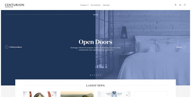
Just like in your home, you host guests on the site, and you must tell them in detail how to achieve their goal. Good design should have intuitive navigation and place elements where they need to be.
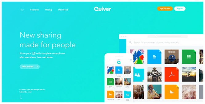
As in the example, the log in / sign up option should be in the upper right corner. Remember that each button / panel can serve as a simple navigation: you need to work with shape, lines and colors; and use them to tell people what each element is for.
Flexibility
Flexibility is the most controversial aspect of design; you need to create a product that will work equally well on any browser / device. Many designers underestimate the importance of flexibility and end up presenting designs with unreadable fonts, or even ones that don’t work.
Designing for a specific browser / device is not the best approach: remember that all users have different preferences, so the design must be suitable for all possible devices that users may have.
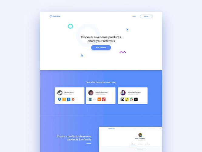
Simplicity
It’s hard to resist the temptation to add a bunch of different elements and options. Too many tools, buttons, navigation, and sections will confuse users and lead to unnecessary choices. And if you look at this in general, it can generally lead to ignoring important information pages.
Take Google, for example: one of the reasons for its success is that it works as simply as possible.
However, we are not telling you to simplify everything to the point of boredom and a complete lack of interesting solutions. We say that your back-end will remain complex, it is simply necessary to make it as easy as possible for the user to interact with the site.
Comfort
Good designers know that their sites need a redesign here and now, especially to make it look nice and feel comfortable to visit. And yet, redesign must innovate while retaining functionality. There are many cool sites out there that were much better before the redesign.
Reduce waiting time

As a user, you probably know how load time affects the perception of a site by visitors. Nobody likes to spend hours waiting for a page to load, while a thousand other sites can get the same information, or perform the same action.
Today, the competition is very high, all sites are pleasant and interesting, and time may be the only criterion that will make a site stand out from all.
To reduce load times, first, cut down on the number of graphic elements (animations, videos, graphics, and even high-resolution images). Content optimization will never make a website worse.
Pay attention to the feedback
Leaving and receiving feedback isn’t just a trend, it’s an analysis of what people really think about your product. Look at the most successful designers and developers: they almost always rely on what their users tell them.
Plus, they know that the user is always right, and there is no other argument other than that. Feedback shows what needs to be changed, but also creates a strong connection with users where they feel valued and cared for. Everyone loves it!
By providing a feedback option, you show that you really want to interact with users. Remember that feedback is not your only interaction tool: you can provide visual cues to guide users (pointing to important elements, for example); support dialogues; error messages, etc.
There are many tools that can be used to create visual cues: shape, size, color, and placement will show users that you always care about what they are doing.
Readability
You may have the most perfect website you can think of, but if you don’t make it readable, it doesn’t make any sense. As you know, users have no problem navigating to different sites, especially if they find it difficult to read the content. This is why you should think about readability as the most important element of your site.
Readability isn’t just about the size of the letters: you should use an eye-catching font and place information in a logical and understandable way. Let’s not forget that the content must be interesting in order for users to want to visit the site again.
Outcome
Don’t stop working for yourself and learn new things about your work. Perhaps when you’ve built an awesome website, it won’t be worth anything if you don’t keep your users comfortable.
To summarize, don’t belittle the visuals of your design. Leave plenty of space and use eye-pleasing colors to avoid scaring users away. Don’t turn your site into something stressful, with tons of details and options that users don’t need at all. And remember, the more you work on your content, the more enjoyable your users will be to explore it.
Source: deadsign
…

