
How to apply contrasts in graphic design
How to apply contrasts in graphic design
The design layout of any site assumes the presence of a certain set of elements, from which the interface is composed.
All these elements, based on the tasks of the interface and the needs of users, should be located in the layout. It is clear that users, solving their problems, will consistently pay attention to different elements. It is clear that there are, elements are more important, there are less important ones. To solve just this problem – managing user attention – it is necessary to know and be able to apply the basic rules of contrasts.
Your users:
- Little click on the button?
- Not seeing important information?
- Don’t know where to press?
- Leave without performing targeted actions?
Could it be the contrast? Are they just not paying attention to important elements?
Read the simple rules of contrasts and take a look at your site, I’m sure you can find ways to improve your interfaces.
And so: contrasting elements on the site can attract more attention of users. Let’s consider the main types of contrasts.

Size contrast
Larger objects on the site are perceived by users better, they attract more attention than small ones.
Different fonts are an example of using size contrast. More important information is highlighted in large print.
In the example, the heading is in a larger font, so it is more noticeable and readable than the rest of the text. Another example of size contrast can be seen in the same example. The target action is important, implemented by the “Yes” button, larger than “Cancel”. This increases the desire to press on it. It is more correct to make the options of refusal less contrasting, including due to the smaller size.
Color contrast
Color contrast is the difference between the brightness of colors. Contrast indicates how light or dark a color is.
Contrasting color on sites is used to highlight the main action.
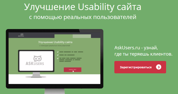
In the picture, the first screen of the main page of the AskUsers site, the “Register” button is highlighted in red, it is in contrast to the main colors of the first screen – green, black and white.
You can read about how to properly style call-to-action buttons in this article on the AskUsers blog.
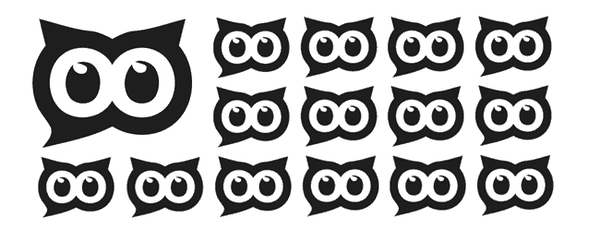
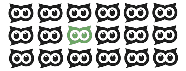
Shape contrast
Complex objects provoke more of our reaction than simple ones. We focus our eyes on complex objects longer.
If you need to focus on an object, you can make it harder than others, and you will definitely notice it!
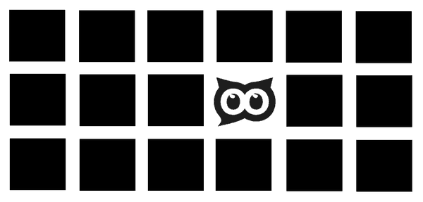
An example of using color and shape contrasts:
Contrast of motion
Moving objects attract more user attention and will never go unnoticed. Use animation effectively to control the user’s attention.
An example is the “bouncing tube” callback that you’ve probably seen on commercial sites, which pushes users to click on it.
Easier to share than to argue in the comments
With these 4 simple techniques, you can control your site visitor’s attention and get them to do the things you want.
Well, now you can take a look at your website too!
… and take a fresh look at the contrast of important elements on your website pages.
…
The article describes simple things, but many site owners, developers and designers do not know about them or forget to use them. If you have such people as friends, please remind them of the importance of observing the rules of contrasts – share with them a link to the article.
Source: Yandex Zen
…

