How I programmatically created 256 new design system components in Figma
Design-system Uber Base offers a set map marker componentswhich are widely used in our products and are displayed whenever we show the card to the user. Recently, we were faced with the need to show additional context and decided to add badges for this – an existing base component.
The problem was that both map markers and badges had several options. Markers can be customized for size, needle length, icon slots, and layout behavior, and badges can have multiple sizes, labels, and icon styles. The final set of card markers that support badges is a combination of all these options for a total of 256 new components.
The designer creates these new components by hand, which is not only inefficient but also highly error prone due to the repetition and amount of work required to create all variations and individually test them in multiple scenarios.
So I decided to take a programmatic approach.

Why did we add badges to markers?
Badges in the interface are usually used to showcase an update or offer of some kind. In our case, the badge is supplemented by a marker.

The design specification of these badges offers four different sizes:

Since Uber operates in different markets, the badges are bidirectional as well.

What is the most efficient process for creating new components?
After we completed the badge design specification, the next step was to “manufacture” the components as part of our workflow. This process entails creating a Figma component for each variation, writing the documentation, and then publishing the components to the company library.
Adding Badges to Map Markerswould magnify number of map marker components almost 5 timesbecause we were essentially adding four new badge options for each existing marker.
For example, the new naming convention for map marker components will change from:
- Map marker / Medium / Icon leading + trailing / Fixed / Needle off
on:
- Map marker / Medium / Icon leading + trailing / Fixed / Needle off / Badge none
- Map marker / Medium / Icon leading + trailing / Fixed / Needle off / Badge x small
- Map marker / Medium / Icon leading + trailing / Fixed / Needle off / Badge small icon
- Map marker / Medium / Icon leading + trailing / Fixed / Needle off / Badge medium icon
- Map marker / Medium / Icon leading + trailing / Fixed / Needle off / Badge medium text
The design system already contains 68 map markers, so repeating this process 68 times will be a rather tedious task.
The situation was further complicated by the fact that:
- Each badge must be in a different position in the upper right corner of the marker, depending on the size of the badge and marker.
- only certain badges could be placed on each marker. It depended on the size of the badge and marker.

Taking into account these restrictions, a 256 new map markers that support badges. Seeing the large number of permutations I would have to create, I knew it would be a complex manual process with a lot of repetitive mouse movements.
Creating these new components by hand will take a significant amount of time and will likely result in human error in the pixel precision required to repeatedly position each badge on the marker hundreds of times.
This type of monotonous task required automation using the Figma plugin API.
Automation via the Figma plugin API
Figma Plugin API allows you to programmatically interact with a Figma document with a near 1: 1 feature ratio compared to normal interactions with a traditional interface. Using the plug-in, you can navigate the document in the form of a tree of nodes, create and modify objects, adjust the viewport settings, access common styles, and much more. For those familiar with DOM (Document Object Model) APIThe Figma plugin API is very similar.

Uber has an extensive internal ecosystem of Figma plugins and tools to improve the design process. Getting started building a new Figma plugin in Uber is relatively easy, as a framework is available to guide you through the initial processes of creating, testing, building, and publishing the plugin.
You can find out more about the Uber plugin ecosystem on the Figma blog.
Setting up the Figma API to create new components
I started writing a step-by-step process for building a map marker that would be implemented in Figma.
Since each badge and marker contained some sort of sizing and positioning logic, I created a configuration object in the code to store this logic. This object contained information about the location of the badge and compatibility with the marker.
The Figma API plugin code will perform the following tasks:
- Request all matching map marker components to add badges. Only certain map marker badges may contain badges
- Browse the requested markers and find matching badge pairs.
- If the marker had a matching pair of badges:
- Find position information for this marker and badge combination.
- Using autolayout, add the badge to the marker in the correct position. This step was the most time consuming as I had to programmatically copy and code many autolayout rules into an object. At this point, a new map marker badge component has been created.
- Carefully place the newly created card marker badge component in the main document of the design system component.
- Repeat for all remaining markers until the process is complete.
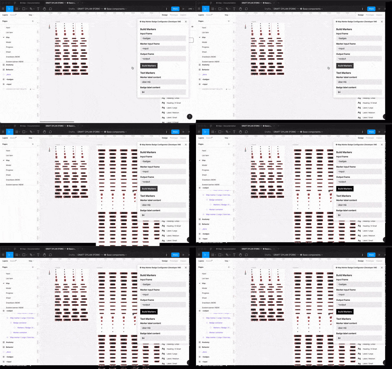
At this point, running the script was straightforward. In the plugin interface window, clicking the button starts the script execution. All I had to do was click Build Markersand the plugin will do everything on its own.

With just one click, I was able to grab a set of markers and badges and automatically link them together to programmatically create hundreds of new Figma objects.
Scripting was definitely an iterative process that went through each stage of component creation. However, the beauty of scripting in this situation is that I could dynamically undo and repeat the process many times until I got the desired result. There was no need to manually go back or discard the document using the cancel button. The entire workflow can be executed immediately or completely canceled.
Testing markers at scale
At this point, new map marker badge components have been created, but the process has not yet been completed. I needed a methodology to test these markers at scale in order to eliminate any potential positioning or sizing issues that might arise. Having a scalable test environment will also be important in case the root components change in the future.
I wanted to test them against two criteria:
UI Test 1: Badge Position
The relative offset of the badge depends on the size of the marker and the badge itself. For example, some badges will be offset -3pxand some -fivepx…

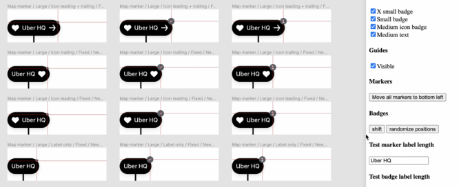
To test this, I decided to automatically create guides placed in the desired position for each badge using the plugin API. With these guides in place, I could run a test to make sure each badge was positioned correctly. Both horizontal and vertical guides will be placed on each new marker.

UI Test 2: Text Length
Next, I tested the correct positioning of the badge based on the length of the marker text and the badge itself. Their length can be different for each custom component instance, depending on its use.
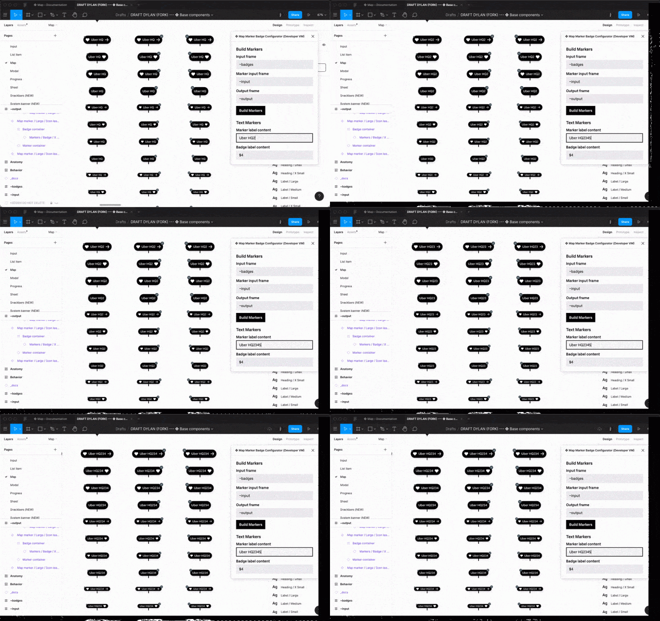
To conduct this test, I created two input fields in the plugin interface to specify custom strings. This way, any text I enter in the input field will propagate to all components of the map marker. This would ensure that the badges stay in the correct position, regardless of the length of the marker or badge text.

Output
As design systems grow and evolve, the complexity of the components increases. This added complexity introduces the risk of human error due to the monotony and large volumes of work, but even without errors, such a manual process is highly inefficient. And with a design system that is used on a large scale, even small mistakes can exacerbate and degrade the user experience. By adding automation to the design system workflow, we can create a high-quality set of well-tested and ready-to-use components.
By automating the creation of markers, I was able to avoid human error and efficiently generate a complete set of variations. Software testing of the components allowed me to thoroughly test them in several scenarios and be confident in their quality.
Try out the ready-made components in the public gallery Figma Base…
Source: UxPub


