

Cool cheat sheet for color combinations
Cool cheat sheet for color combinations
The correct combination of colors is one of the most important components of any work that claims to be “high quality”. That’s why we decided to share a cheat sheet with which you definitely won’t miss when choosing a color palette for your next project.
Scheme No. 1. Complimentary combination
Complementary, or complementary, contrasting colors are colors that are located on opposite sides of Itten’s color wheel. Their combination looks very lively and energetic, especially with maximum color saturation.
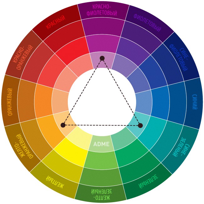
Scheme No. 2. Triad – a combination of 3 colors
A combination of 3 equally spaced colors. Provides high contrast while maintaining harmony. This composition looks quite lively even when using pale and desaturated colors.
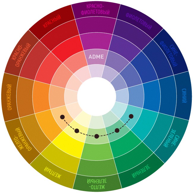
Scheme No. 3. A similar combination
A combination of 2 to 5 colors next to each other on the color wheel (ideally 2-3 colors). Impression: calm, comfortable. An example of a combination of similar muted colors: yellow-orange, yellow, yellow-green, green, blue-green.
Scheme No. 4. Separate-complimentary combination
A variant of a complimentary combination of colors, only the neighboring colors are used instead of the opposite color. A combination of a primary color and two additional ones. This scheme looks almost as contrasting, but not so intense. If you are not sure that you can use complementary combinations correctly, use separate-complementary ones.

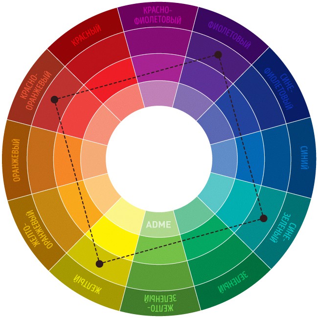
Scheme No. 5. Exercise book – combination of 4 colors
A color scheme where one color is the main one, two are complementary, and one more emphasizes accents. Example: blue-green, blue-violet, red-orange, yellow-orange.
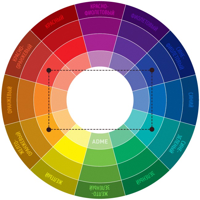
Scheme No. 6. Square
A combination of 4 colors equidistant from each other. The colors here are dissimilar in tone, but also complimentary. Due to this, the image will be dynamic, playful and bright. Example: purple, red-orange, yellow, blue-green.
Combinations of individual colors
- White: goes with everything. Best combination with blue, red and black.
- Beige: with blue, brown, emerald, black, red, white.
- Grey: with fuchsia, red, purple, pink, blue.
- Pink: with brown, white, mint green, olive, gray, turquoise, pale blue.
- Fuchsia (dark pink): with gray, yellow-brown, lime color, mint green, brown.
- Red: with yellow, white, brown, green, blue and black.
- Tomato red: blue, mint green, sandy, creamy white, gray.
- Cherry red: azure, gray, light orange, sandy, pale yellow, beige.
- Raspberry red: white, black, damask rose color.
- Brown: bright blue, cream, pink, fawn, green, beige.
- Light brown: pale yellow, creamy white, blue, green, purple, red.
- Dark brown: lemon yellow, blue, mint green, purplish pink, lime color.
- Reddish brown: pink, dark brown, blue, green, purple.
- Orange: blue, blue, lilac, purple, white, black.
- Light orange: gray, brown, olive.
- Dark orange: pale yellow, olive, brown, cherry.
- Yellow: blue, purple, light blue, purple, gray, black.
- Lemon yellow: cherry red, brown, blue, gray.
- Pale yellow: fuchsia, gray, brown, shades of red, yellowish brown, blue, purple.
- Golden yellow: gray, brown, azure, red, black.
- Olive: orange, light brown, brown.
- Green: golden brown, orange, salad, yellow, brown, gray, cream, black, creamy white.
- Salad color: brown, yellowish brown, fawn, gray, dark blue, red, gray.
- Turquoise: fuchsia, cherry red, yellow, brown, cream, dark purple.
- Electrician beautiful in combination with golden yellow, brown, light brown, gray or silver.
- Blue: red, gray, brown, orange, pink, white, yellow.
- Navy blue: light purple, blue, yellowish green, brown, gray, pale yellow, orange, green, red, white.
- Purple: orange, pink, dark purple, olive, gray, yellow, white.
- Dark purple: golden brown, pale yellow, gray, turquoise, mint green, light orange.
- The black versatile, elegant, looks in all combinations, best with orange, pink, salad, white, red, lilac or yellow.
Source: decor-design
…

