
Color coding
Color coding
The term color coding has been known for a very, very long time to those who communicate at least a little with design. In fact color coding – This is one of the types of information presentation, based on the comparison of one color to one or more objects, terms or forms. Color coding is used when the presented information turns out to be too much, and it still needs to be shown on the timeline (change in time) or the standard means of designating an object (symbolically) are invalid. It is in such cases that color coding is used – so that the eye can easily distinguish only the necessary information that interests the user at a particular moment.
Story
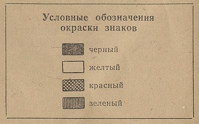
The earliest experiments on color coding were carried out in the compilation of old topographic maps, where shades of green meant different heights of the plains, and shades of brown meant mountains.

Most of the school, for sure, had geography and everyone perfectly understands what it is about 🙂
In his book Envisioning Information, E. Tufty gives an example of a map on which you can clearly see all the houses, industrial zones, important buildings, fields, meadows, forests and water. All this is created using the right color scheme. In this example, the author did not use a separate color to represent the roads: this is why the map retained its ease of reading, since “Roads” are formed by densely standing next to each other buildings (see rule 1 + 1 = 3).

Application in infographics
Naturally, after maps, color coding began to be used in many other areas where it was required to somehow indicate objects or highlight important information. One of the active areas of color coding is infographics, but not all examples of infographics can be found. Let’s look at several options for using color coding.
For example, the ranking of states by population (according to the population census):

This example tells us about the ranking of each of the US states according to the census from 1790, when there were only 13 states, and then every 10 years until 1900, when there were already 52 states. Each state has its own distinctive color (not to mention the color, because how two- and three-color coding is used here). In addition, the position of each state in the ranking can be traced by connecting lines, which makes it easier for the eye of a person who wants to see, for example, how the state of Maryland changed from 1790 to 1860.
Another more modern example is the Formula 1 race statistics:

Each of the riders is assigned a different color, and the line shows the position of the rider in the general list for each lap. There are not so many riders, so there is nothing difficult in tracking their position (only the first eight winners are shown, so there are few lines).
But here’s another example that also uses color coding to represent the University of Cambridge women’s rowing rankings for 12 seasons, each displaying 4 days. In total, statistics include data for more than 66 teams.

In total, there are more than 800 sparklines (article # 1 and article # 2 about sparklines), which slightly complicates the task of quickly and correctly understanding the information. However, color coding saves the situation again. In the picture in the book, you can see everything perfectly well, without even running your finger along the lines. On the lined version, the color is slightly distorted due to scanning, so the quality is not a fountain, and the colors are almost all the same, but it is quite possible to make out some commands and their position.
Another example (of the latter) where the use of color coding is appropriate is visa statistics.

Here the author is the best way to color-code those countries that issue Schengen visas. In addition, from this visualization, we can find out that Lithuania and Slovakia began to issue Schengen visas only after 2008, and before that they issued only internal ones.
Another almost successful example is the interactive map of the population of the countries “past, present, future”.

The main problem is color. Combinations of bright red and bright blue can only be done by scientists or researchers, that’s why I call such combinations and such colors – “scientific colors” 🙂 This term most accurately defines the colors used in this example. However, if you ignore the acid red dots and focus on the presentation of information, you will notice a good picture created by the author: a large, attention-grabbing headline, from which the purpose of the colors on the map immediately becomes clear. Such headers perform several functions at once: the header itself + the legend, and since except for the colors on this card there can be nothing more incomprehensible, then the solution is very successful.
Basic rules of use
The basic rules are very simple:
- use color coding when other types of coding cannot be used or because of them your work becomes too difficult;
- do not use bright, acidic colors that will hurt the eye when viewing;
- use colors, not their names:
- try not to use more than 4 different colors (shades of colors are preferable to use, instead of adding new colors);
The future of color coding
I am sure that this term and its application will never go anywhere (in the foreseeable future). Now there is a growing need around us to visualize large amounts of data on small media: newspaper pages, booklets, etc. … The more information, the more difficult it is to perceive, structure and generally understand. That is why we will more and more often encounter various manifestations of color coding.
What else to read
Artemy Lebedev about coding
E. Tufty Envisioning Information
Color coding
Using coding
…
