Branding of Russian cities
Branding of Russian cities
Back in 2008, against the backdrop of internal political upheavals and another round of weakening of the domestic economy, the Russian government adopted the concept of city branding.
By the end of 2014, every tenth settlement in the country was secretly or openly asking the question of creating his own logo. Few have found the answer.
Permian

According to the studio of Artemy Lebedev, Perm is “the first city in Russia to receive its own logo.” The latter is a red letter “p”, which is not in the Latin alphabet, which, according to the authors’ intention, opens up additional opportunities for the brand for positioning in the international market. Created in 2009, such a logo caused a mixed reaction among the residents of the city.
St. Petersburg
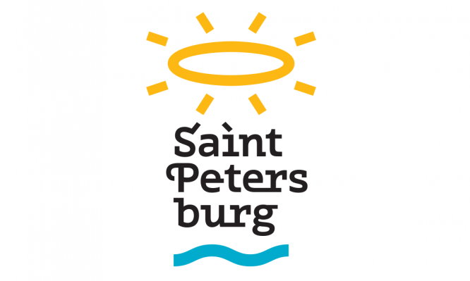
The cultural capital of Russia was also at the forefront of branding. Back in 2005, the government of St. Petersburg approved the concept of the city’s development as a tourist center formulated by the American The Boston Consulting Group. To create the brand, a competition was organized, as a result of which the logo of the local designer Artyom Tamazov won. After 8 years, the city authorities announced the need for rebranding.
In early 2015, Lebedev’s studio took over the development of a tourist logo for St. Petersburg. The result of the labors was a series of oval-based symbols that embody the local flavor, as well as the signature typeface of St. Petersburg.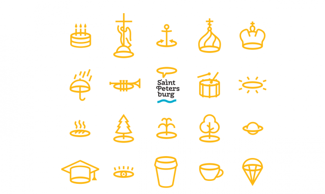
Yaroslavl

The main version of the logo, presented in 2012, is a blue arrow, which, according to the authors from Lebedev’s studio, anatomically consists of the first letter of the city’s name and the pronoun “I”, the confluence of two rivers and Medvezhy Ugol, next to which Yaroslavl was founded.
In the English version of the logo, the Russian I-arrow turns into Y. One of the most controversial examples of branding along with the Perm logo.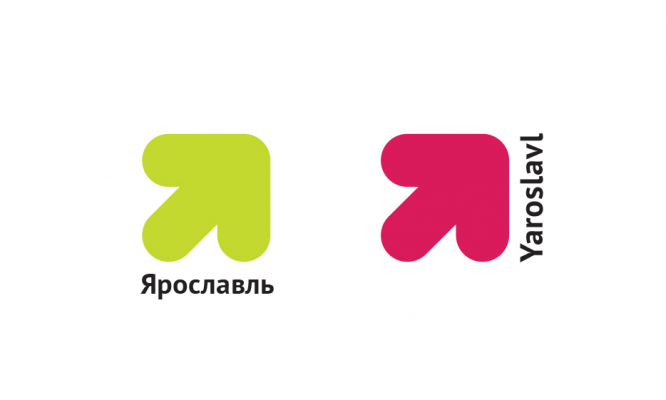
Saratov
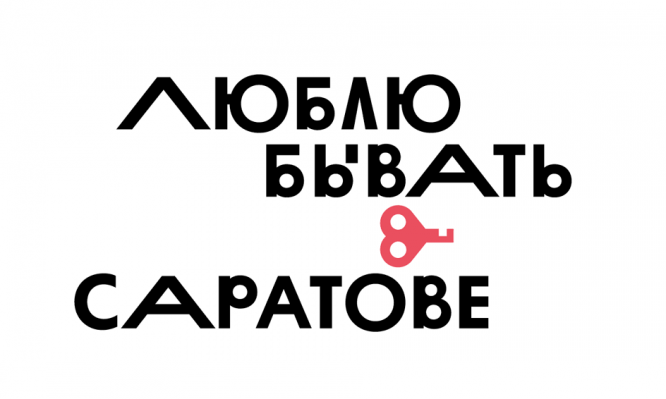
Saratov’s tourist logo appeared in 2014. A recognizable feature of the brand is the letter “v” in the phrase “I love being in Saratov”, stylized in the shape of a heart. As part of branding, a pattern has also been created for the design of advertising products corresponding to the typeface.
Moscow
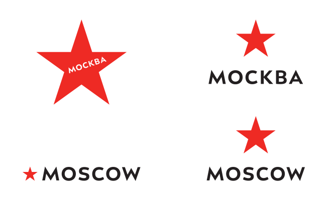
In 2014, Moscow acquired its own logo with the light hand of Lebedev. The universal brand, which includes a red pentagram and black text on a white background, has endowed the capital of Russia with the status of a “city-star”.
Izhevsk
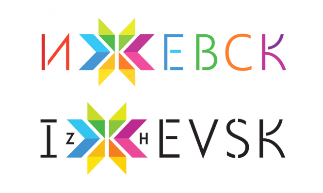
The basis for the 2014 Izhevsk logo was the letter “z”, stylized as a solar amulet symbol. As part of the branding, a stencil font was created, indicating the factory traditions typical for the city, including in the arms industry.
Yekaterinburg
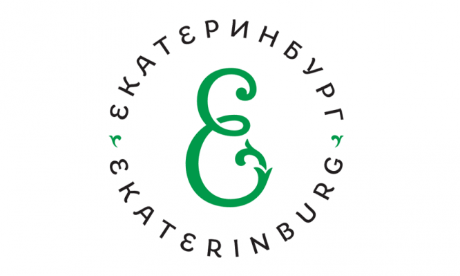
Yekaterinburg was one of the last to acquire the logo – at the end of 2014. The brand represents the emerald letter “e” and is made in a grotesque style. According to the authors’ idea, embodying the ideas of continuity, tradition and innovation, the logo is perfect for decorating souvenirs and city property.
…


