
Boucher bakery typography
Boucher bakery typography
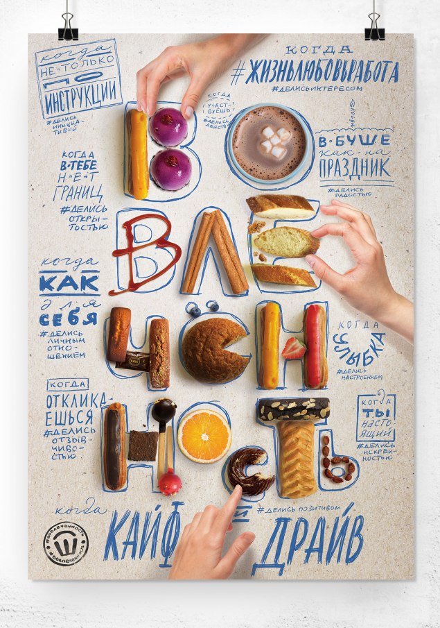
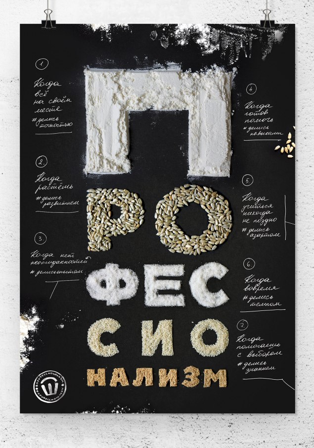
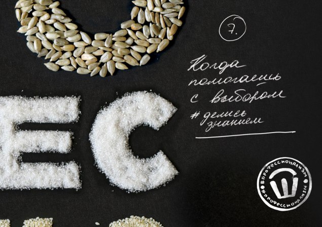
DEZA creative studio has developed a series of posters for the bakery-confectionery “Boucher” (St. Petersburg).
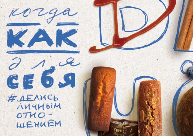
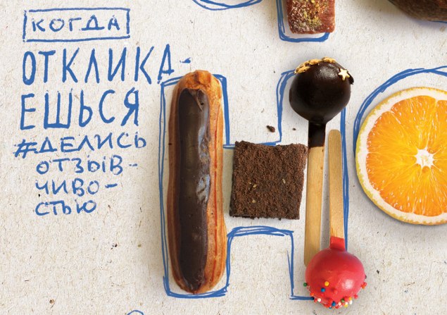
The unifying idea of the campaign is “share”. Indeed, in the process of work, the employees of “Boucher” constantly share with each other (and with visitors): experience, opinions, impressions, mood. This division of values creates a community that the campaign calls for.
In the composition of the posters, the central place is taken by the images of the three values of “Boucher” – respect, engagement and professionalism – assembled from the company’s iconic products symbolizing each value, many of which are associated by the consumer with “Boucher”.
The visual and meaningful context is created by handwritten slogan texts and accompanying hashtags. The hashtag format was not chosen by chance: “Boucher” is active in social networks and uses hashtags in most online and offline communications, this is a familiar and understandable symbol for the company.
Pairs “slogan – hashtag” tell about the components of a particular value, about what stands behind it in the understanding and in the context of the activities of “Bush”.
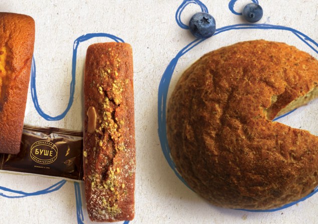
Postcards – replicas of posters also became carriers of the campaign messages.

…

