
Best practices: 9 tips for case design
Best practices: 9 tips for case design
We’ve prepared a checklist with tips to help you put together the perfect case.
1. Cover. Love at first sight
A person decides whether he will scroll the page further or close it, almost instantly. Seriously, it takes 5-7 seconds on average. Therefore, the cover should cling immediately and tightly. A juicy and bright picture that speaks for itself is what you need.

What will be ok?
- A solid-colored background, bright or contrasting with the background, preferably not white.
- A short, readable headline plus a short description if desired.
- The main screen in the mockup of a smartphone or monitor.
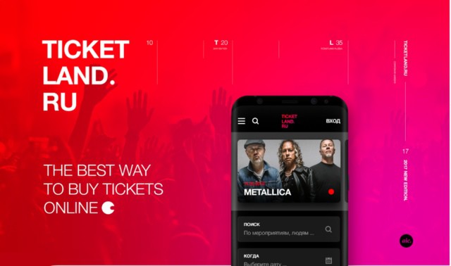
You can evaluate the result from 2-3 meters. If it looks like a movie poster and is catchy, it means a good cover, leave it.
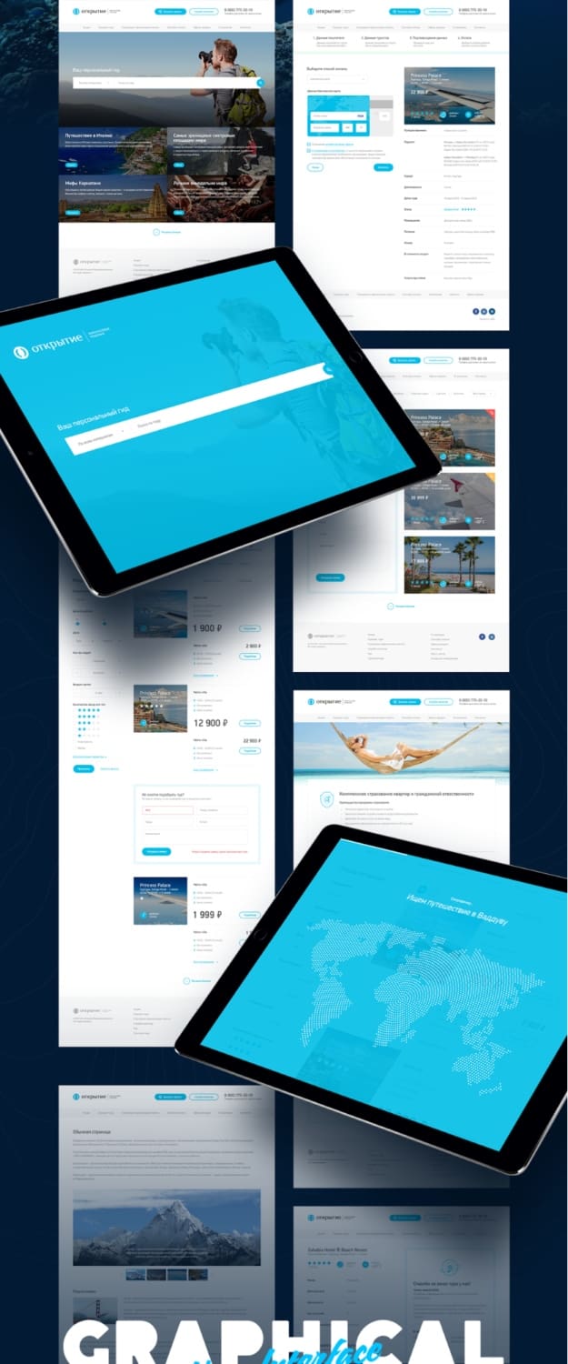
2. Structure: not just pictures plus text
In fact, you have to fight for the reader’s attention every moment. And a vinaigrette of random pictures and pieces of text right after the cool catchy cover won’t help with this. If you want to keep people in good shape, think about the structure. Otherwise, they will get bored and leave.
How to do it? Think about what you want to tell, and jot down the key points in a notebook: first, a prototype will grow out of it, which will then be supplemented with graphic details.
Any story can be put into a case with approximately the following internal structure:
- The purpose of the project (after the cover) – short, 3 paragraphs;
- Home page;
- Designing or finding solutions;
- Key sections;
- Macro plans and details;
- Results in numbers and facts;
- Some kind of vnutryaki;
- Guideline.
3. The golden mean. Longer is not better
The line between when the user is still interested and already bored is very easy to cross without noticing. You can talk about your work for a long time and with love. Therefore, it is not always possible to take it like this and stop in time – it seems that everyone is as interested as you are.
The question is: how much? Answer: based on personal experience – 15-20 thousand pixels.
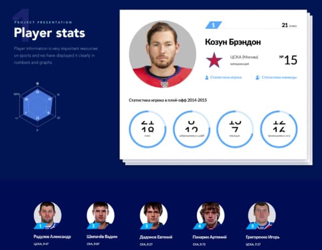
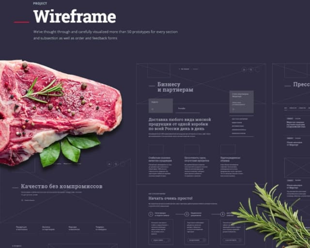
4. Striped case: macro plans and details
It will not be superfluous to repeat the story with the cover inside the case. In other words, to grab attention, shake the reader, prevent him from getting lost in the endless previews of layouts. Close-ups help a lot with this: widgets, charts, icons – anchors and add wow.
To make the case contrast, select several zones in it with isometry, infographics, animation – all the beauty from your project.
5. Less text, more typography
A lot of text in a case will kill the user’s interest, even if you overwhelm him with macro plans in between. Any sheet of letters can be represented in the form of graphs, short facts and videos – so why not do that?
If the text seems to be scarce, make up for it with bold typography. Cool fonts and their combinations will add color to any case – it helps a lot from time to time, because no one is interested in looking at monochromatic interfaces.
What should be the text in the case:
- “Tasty” and to the point;
- with short headings and revealing subscripts;
- in 1-3 paragraphs maximum;
- in the form of small tips and notes.
6. Elements that were not there. Just for beauty
Fake elements or functionality that are not in a real product have a right to exist in the case. If there is a chance to make the visual impact cooler, even if only here, then you need to do it.
Take on board isometric views and unusual mockups – you won’t go wrong.
7. How it was. Inside view
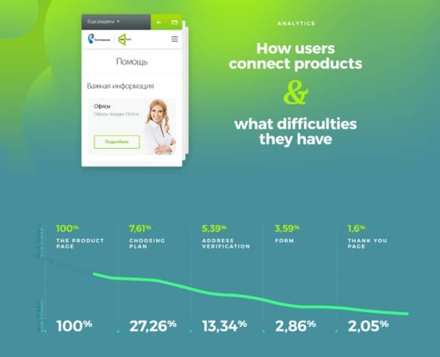
How you moved from problem to product shows how you work and how efficiently you are. It will be interesting for both colleagues and customers: what tasks did you set for yourself, what solutions you came up with – show it through prototypes and analytics.
What will come in handy at this stage:
- prototypes;
- schemes;
- intermediate solutions.
88. More life: add animation
Strange, but despite the popularity of animation in general and the gif format in particular, few people use them. And in vain: small animated elements and whole loop sequences really bring cases to life and turn them into real promo sites.
However, you should not get carried away with animation either – gif, for example, weigh a lot and consume processor resources.
9. What was left for last
It remains to be beautiful, interesting and desirable to summarize with numbers and present a guideline with the main UI elements. This will show how thoroughly you are approaching the work, and will leave the reader with a sense of logical completeness.
Want to wow your visitors with a checklist? Add a little showreel at the end. Usually, after all, either a case or a video – for both, no one has enough patience at once. Another plus sign in your piggy bank.
Source: aic.
…
