A guide for designers and non-designers: 5 steps to the perfect logo
A guide for designers and non-designers: 5 steps to the perfect logo
Today on the net you can find a lot of information about what criteria a quality logo should meet. Most sources on this topic say everything right. But the information in them is vague, incompletely understandable and not underlined in any way, without clear examples and principles of their operation.
We decided to fix this and wrote a vivid and illustrative story about the entrepreneur Dima, who courageously fights against low-quality logos, and at the end we added a conclusion in which we will tell you how this turned out for the belligerent entrepreneur.
The guide uses specific examples to illustrate why criteria for the right logo exist at all.
Wrap yourself up with a blanket and make a delicious tea – we begin.
Logo idea
Once upon a time there was a guy named Dima. One day he woke up with the thought that he wanted to be an entrepreneur. And from that moment on, he burned with desire and made plans about it.
When almost everything had already been planned, Dima thought about the image of his new healthy food delivery company “Delivery of Health” (Well, yes, primitive, but we invented this company for the sake of an example). Dima did not know what the logo should be, and at that moment he remembered that his friend had a freelance designer friend. Dima got inspired and wrote to the designer.

Time passed, and Dima received the coveted logo …

Dima was gripped by doubts: “Well-oo-oo-oo. The idea is not entirely clear to me. Maybe it’s just I don’t understand? You have to ask your friends. “
Dima ran to his acquaintances. He showed everyone, told everything. Friends thought that Dima was opening a new pharmacy. “Ta-a-a-ak,” Dima said confidently, “We need to write to the designer and give him a beat!”
But the whipping did not help with the problem. If Dima wants a new logo, let him pay for the edits. Well, let it go. Dima is serious.
Dima asks to correct the idea, pays, waits …

Finally!
Laconic and memorable logo
Dima’s business went uphill, the new logo came in handy. Business began to bring good money, life improved.
Once, on an ordinary warm evening, his little son ran up to Dima and with the words: “Dad, look, I painted your work!”, Showed him the drawing.

Dima answered his son: “Well, what are you, kid. Papa’s work in the logo does not have leaves, but … “
“Hmm, really, what’s in the logo? Pumpkin? Radish? Cabbage? And how many are in the logo? Three? Four?” – thought Dima and realized that his logo is very difficult to remember even for Dima himself.
This means that he runs the risk of losing recognition among customers. You need to make your logo memorable. A young entrepreneur goes freelance looking for a new designer.
Dima asks to change the logo, makes an advance payment, waits …

Another thing! Now everything is clear, in the logo – broccoli and nothing more.
Logo versatility
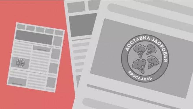
With the new logo, Dima has achieved new successes. His business expanded, even appeared in the local newspaper. The printing house asked for Dima’s logo for printing, Dima dutifully sent and waited for his finest hour. A week later, Dima finally read the long-awaited article in the newspaper about his achievements.

Unfortunately for Dima, the logo was poorly printed in the newspaper due to the large number of small details. Well, nothing, Dima plans to develop in social networks, so you can ignore the newspaper.
Dima, as planned, created the pages of his business on social networks and, naturally, added his logo to his avatar.

“Hmm … – thought Dima, – nothing is visible in the miniature of the avatar. So no one will see the logo in the feed. We need to fix this! “
An assertive entrepreneur turns to a new designer.
Dima asks to change the logo, makes an advance payment, waits …

“It’s already better! – thinks Dima, – Now there should definitely not be any problems. “
Uniqueness and positioning of the logo
Many residents of the city have already learned about “Health Delivery”. Everything became very serious – sales through social networks, mentions in local media, advertising. In general, Dima is doing very well. The young businessman takes the next step in development – he becomes a sponsor of local events.

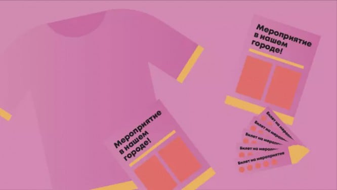
There is a huge mass of ways to advertise a brand – printing a logo on tickets, on posters, on flyers, on organizers’ T-shirts, placing a logo in the event community and in its Instagram account, mentioning the brand in individual posts on social networks and presenters during the event.
Dima’s competitors did not miss such a chance either. But nothing, Dima has a brand new logo.
After the event, it turned out that the audience from the event was roughly evenly divided between Dima’s business and all competitors. “Why is it so? – Dima is indignant, – It is necessary to analyze.
There was nothing to analyze, it was just worth looking at all the competitors at the event.

There is practically no difference: one style, color, stroke, shape, idea, etc.
Business urgently needs to stand out from the competition. They all look like small shops with healthy products. It is high time for Zdorovya Zdorovya to position itself as a serious chain of stores. Dima decides to take the most important and serious step – to contact the design studio.
Dima asks to make such a logo so that he wipes his nose to all competitors, makes an advance payment, waits …
“Ideal,” thought Dima and approved the logo, “Now, finally, there will never be any problems with it again!”
Logo scalability
Dima’s business and income have grown significantly since the moment the businessman finally decided on the logo.
Dima felt that it was worth expanding. For some time now, the decision was made to expand Health Delivery beyond delivery. The business plan, name and positioning were thought out. We needed 2 more logos. In order not to miscalculate, Dima turned to the design studio, which was engaged in his latest logo.
Fortunately, the designers from that studio said that it would not be difficult to complete his order, because the existing logo is very convenient for scaling. Dima did not understand what they meant, but agreed with them.
Dima makes an advance payment, waits …

“Just some miracles,” thought Dima. It turned out that a properly designed logo is able to scale to meet business requirements without any problems.
Harmony and calmness for his business appeared in Dima’s life.
On that good note, we’ll end the story of the belligerent entrepreneur and bring you back to the bottom of the logo fight.
Conclusion
What did the frequent redesigns and constant changes in the visual component of the brand bring in the case of Dima?
- Over the years, brand awareness has fallen;
- Target audience could not clearly define the brand’s character for a long time;
- The entrepreneur has had a negative experience of working with designers;
- The entrepreneur has a distorted understanding of the business value of design;
- Confusion in design work could occur due to frequent and rapid design changes;
- Lost a lot of time and nerves;
- More money was spent than expected because logo changes = change in signage, business cards, branded clothing, etc .;
Naturally, this story is fiction. We assume that some businesses do not require a logo to meet all of these requirements. For some businesses, one of the intermediate options may be suitable.
First of all, we wanted to show that if you immediately develop a logo that meets all the criteria, then in the future the business will not have to go through all the problems and costs of changing the logo.
Sovetik
Share this guide with someone you know who has similar problems. And if you yourself have come across them, then keep them with yourself so as not to lose at an important moment.
And if you’re a designer, then this guide will help you convince clients who don’t approve your correct logo.
Love and appreciate good design. Good luck!
Source: Medium
…


