
A brief history of the hamburger icon
We’ve all seen the hamburger icon. In fact, most people use it every day. It has become the standard in website and app design. Right now, I can see it in the upper-right corner of my Google Chrome.

There has been a lot of debate lately over whether it was a good idea to use the hamburger icon primarily for side menus. But more and more people are wondering where it came from at all and why it has spread so widely.
The creator

It was designed by Norm Cox for the Xerox Star, the world’s first graphical user interface computer. Norm is the co-founder of Cox & Hall and an interactive and user experience design consultant since 1982. For this interface, he also created a document icon.
Geoff Alday, a great software designer, found the creator and got his hands on this video.
He contacted Norm, who was happy to share his story. Here’s what he said:
The image was supposed to be as simple as a road sign, functionally remembered and look like a list that was displayed as a result. There weren’t enough pixels to work with, but the icon had to be simple and clear. To draw the image, we only had 16×16 pixels, or even 13×13, I don’t remember exactly.
…
However, after the Xerox Star, the hamburger icon disappeared for a while.
Revival
For a much smaller smartphone interface, designers had to find ways to fit everything on a 4-inch screen. It’s hard to find the very first app to have a hamburger icon right now, but the first to remember was:
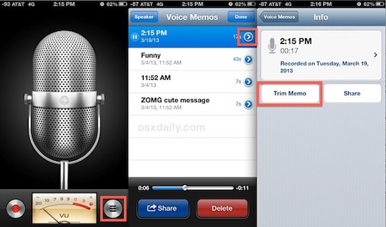
IOS Voice Memos
This appears to be the very first appearance of a hamburger icon (other than Xerox) as a menu button. The app was released on June 17, 2009 and was available on iPhone 3Gs. Clicking on the icon opened a list of entries and options. Apple had already borrowed the mouse and desktop from Xerox when they created the Macintosh, the little icon didn’t mean much.
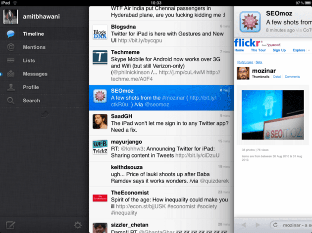
Tweetie for iPad
Tweetie was the first Twitter app. It came out in 2008 and used a hamburger icon for lists. The app was created by Lauren Brichter, who previously worked at Apple (June 2006 – June 2007). That the Apple designer used this icon doesn’t seem like a coincidence.
Facebook sets the trend
Facebook has greatly influenced the distribution of the hamburger icon in conjunction with the side menu. In 2008, they started with a grid icon like this:

Then in 2009 they added another row.
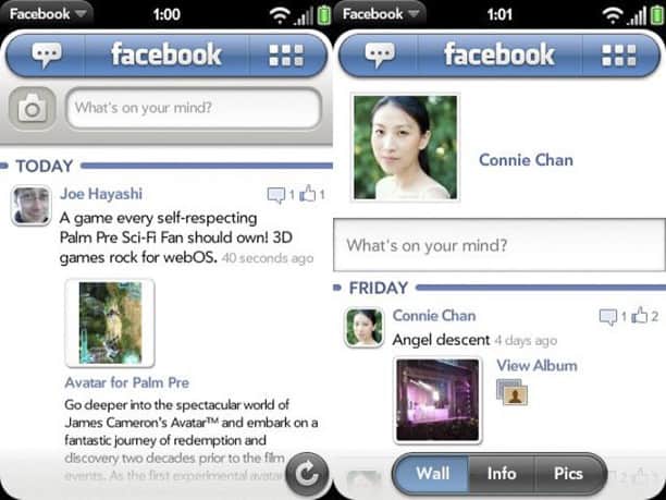
And it all ended with the fact that in 2010 the grid turned into stripes.

The app already had a sidebar, all they did was simply connect it to the grid. This is perhaps the most significant early appearance of the hamburger icon.
So Apple is the main reason behind the revival of the hamburger icon. They reinvented the smartphone and made everyone think of a compact display. Inspired by Xerox ideas, they embodied them in their interfaces. Then the baton was taken over by popular social media applications, and everyone else followed them.
Now the hamburger icon is used on websites and in applications to bring up the side menu, as well as to display lists. It is found in popular applications such as:
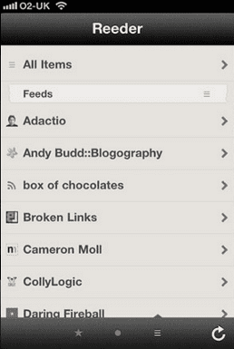
Reeder
The icon opens a list of your subscriptions.
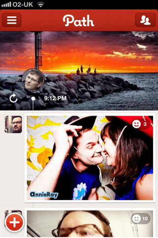
Path
Path was one of the pioneers to use the hamburger icon (and still does) to navigate.
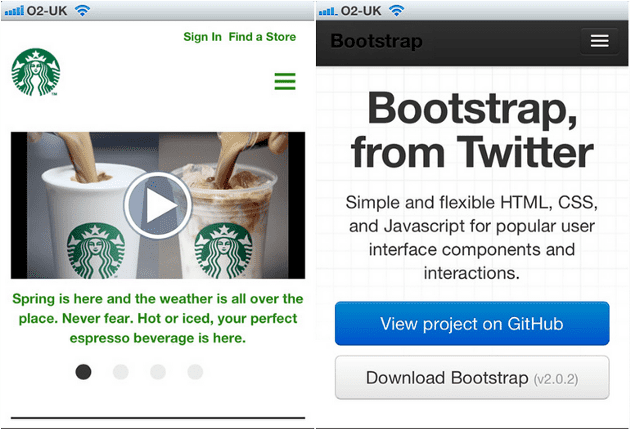
You can also find it in the Twitter Bootstrap navigation and Starbucks app.
It is found in a wide variety of applications and has become the industry standard for displaying additional menus.
Not so long ago, sites adopted it too. Hidden menus work well in minimalist designs and are therefore very popular on designer websites.
Future
The hamburger icon has become a standard in website and app design and seems to have settled here for a long time. She was not well received by the UX / UI design community. Someone says that it is terrible, it needs to be removed from everywhere and replaced with a simple menu or convenient tabs. Someone hates her, someone loves.
Others are compiling a selection of sites that feature a hamburger icon in a beautifully minimalist design. So maybe the point is not in the icon itself, but in where and how it is used?
Source: medium
