How to Choose a Logo Color: A Beginner’s Guide
How to Choose a Logo Color: A Beginner’s Guide
Logo color is one of the key elements of a strong brand. Each color has its own characteristics, associations and psychological impact. When you choose a color or color combination for your logo, you also get these associations. Colors evoke certain emotions and feelings, so it is extremely important to choose a color that effectively represents your personality.
“Understanding the psychology of color is vital when designing an effective logo.” – Martin Christie of Logo Design London.
Research shows that people subconsciously form an opinion about a person, environment, or product in the first 90 seconds, and that 62% to 90% of this assessment is based on color alone.
How important is logo color?
The corporate logo color is very important! Take, for example, the popular McDonald’s logo and play with color (designers forgive us):

Even though we didn’t change the design at all, the color change transformed the famous brand into something completely different. And this is something not entirely appetizing.
We can do the same exercise with the Coca-Cola logo:
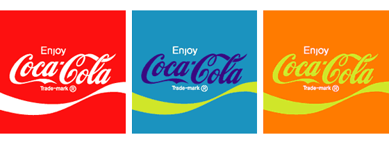
I don’t really want to take such a jar of a delicious drink, right?
The biohazard mark takes on a completely different meaning when shown in Barbie colors or in the colors of sustainable materials:

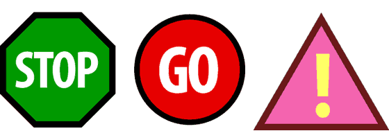
Even when explicit verbal commands are included, conflicting color symbology can be confusing.
Change only the color of the stop signs to green and this will lead to accidents at every intersection. So it’s safe to say that brand colors are very important.
So how do you choose a color for your logo design?
Color value
Let’s take a look at how the world’s 100 most popular brands use color in their logos.
These companies spend millions, if not billions, on marketing and brand development, and they still know a thing or two about the colors they use.
Here are some charts that show the statistics of color usage by well-known companies:
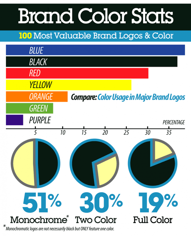
What do we see? Most popular brands are monochrome – they use a single color. The most used color is shades of blue, followed (ironically) by black. The last color purple on the list is a risky decision.
Now that we’ve figured it out a bit, let’s take a look at the psychology of different colors – from the most popular to the least popular – and see how well-known corporations and brands use them.
Blue colour
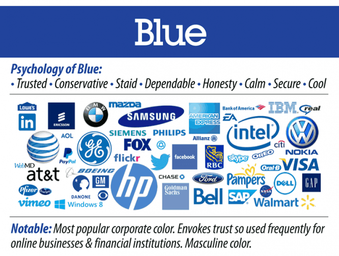
Meaning: Trust, conservatism, reliability, honesty, calmness, strength, coldness.
Notable: The most popular corporate color. Often used for online businesses and financial institutions. Courageous color.
Black color
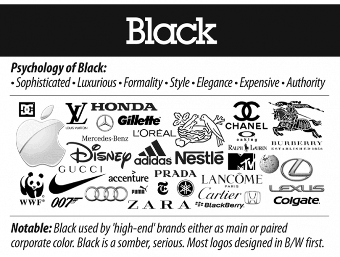
Meaning: Refinement, luxury, formality, style, elegance, high cost, authority.
Notable: Black is used for “high end” brands, either as the main color or paired with another color. Black is gloomy, serious. Most of the logos were originally designed in black and white.
Red color
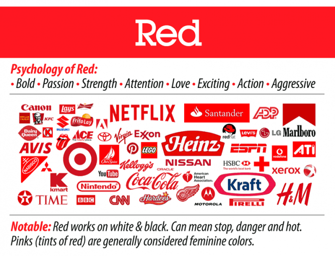
Meaning: Courage, passion, strength, attention, love, delight, action, aggressiveness.
Notable: Red works equally well on black and white backgrounds. It can mean stop, danger and hot. Exclamation color. Pinks (shades of red) are considered feminine colors.
Yellow
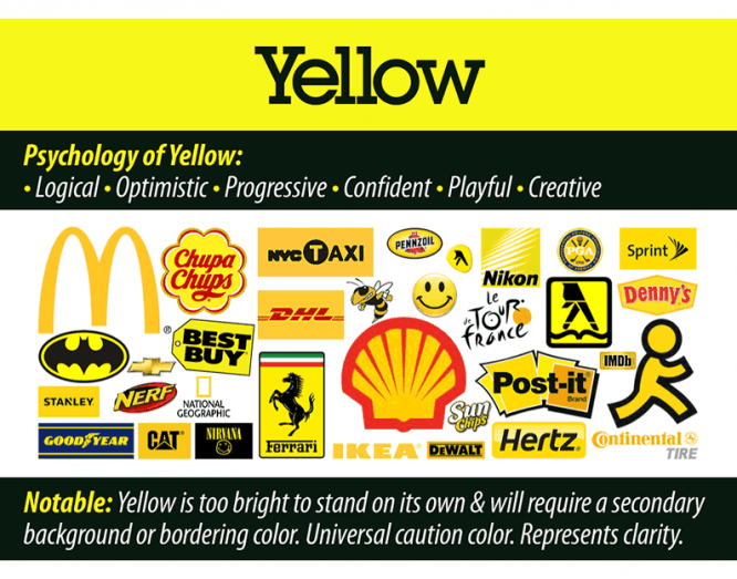
Meaning: Logical, optimistic, progressive, confident, playful, creative.
Notable: Yellow is usually too bright to be used alone and requires the use of an outline, background, or border color. This is the color of caution. Represents clarity.
Orange color
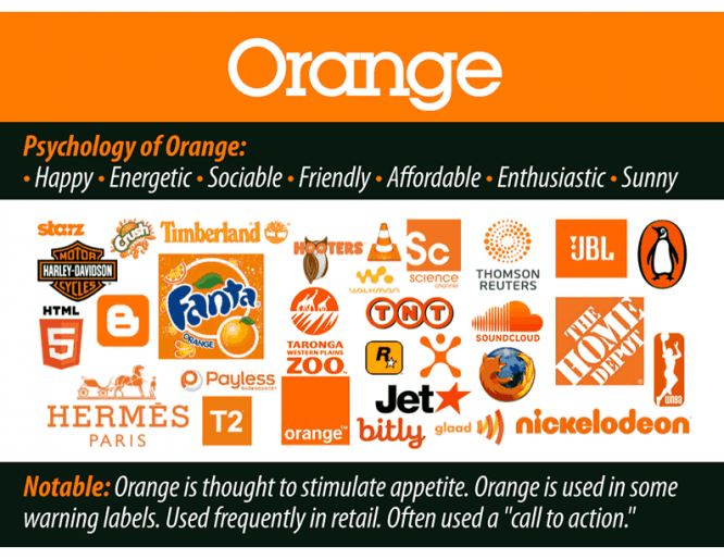
Meaning: Happy, energetic, outgoing, friendly, approachable, enthusiastic, sunny.
Notable: Orange is believed to induce appetite. Orange is used in some warning signs. Often used in retail. Typically, this is a call to action.
Green color
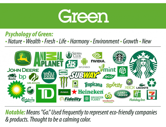
Meaning: Nature, wealth, freshness, life, harmony, environment, growth, novelty.
Remarkable: Green means forward. Often used to represent eco-friendly companies and products. It is considered a soothing color.
Purple
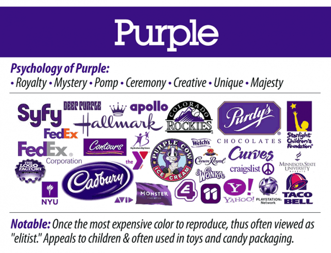
Tarot Card Meaning: royalty, mystery, pomp, ceremoniality, creativity, uniqueness, majesty.
Remarkable: It was once the most expensive color in production, as it was made from rare seaweed. Often seen as elite. Like children, it is often used in the packaging of sweets and toys.
Color combination in the logo
Now that we have dealt with the psychological impact of colors, let’s see how to choose a color for a logo.
We can choose from a range of classic color wheel palettes that artists have used for centuries to create balanced and visually pleasing (or high-contrast and vibrant) compositions. In most design applications, these color schemes should be split into one dominant color (dominant either because of how much it appears in the design, or because it stands out when compared to other colors) and one or more complementary colors.
There are several ways to match the color:
1) Monochrome colors. Various shades, tones of the same color are used, for example, a spectrum of blue, ranging from light to dark. This type of scheme is more sophisticated and conservative (see the picture of the top 100 brands above).
2) Similar colors. Shades that are next to each other on the color wheel. This type of schema is versatile and easy to apply for design development.
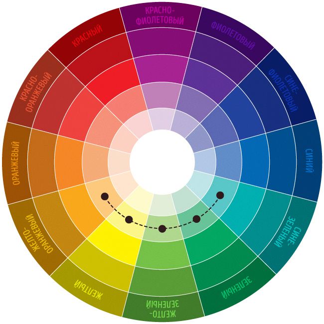
3) Complimentary (additional) colors. Opposites on the color wheel, such as red / green or blue / orange; complementary colors with high contrast and high intensity, but they can be difficult to apply in a balanced and harmonious manner (especially in their pure form, where they can easily conflict in design).

4) Separate complimentary. Any color on the color wheel plus two flank colors. This scheme has a strong visual contrast, but less dramatic than the complementary combination.
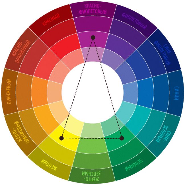
5) Triadic. Any three colors that are equidistant from each other.
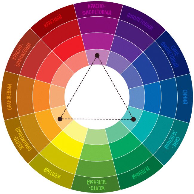
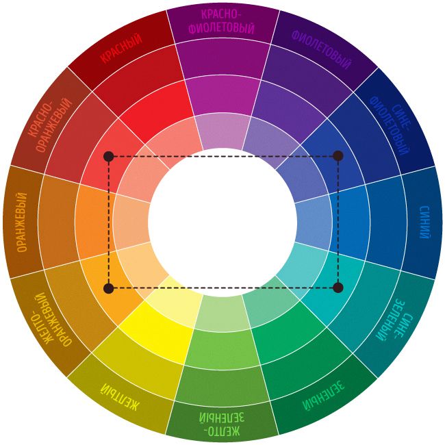
6) Notebook / Twice complimentary. Two pairs complementing each other; this scheme is very attractive, but it can be even more difficult than applying one pair of complementary colors, as more colors are more difficult to balance. If you use this type of scheme, you choose one dominant color out of four, and adjust the saturation / value / etc .. of some or all of the colors so that they work well in different parts of your design, text and background.
How to choose a color
Take a look at this infographic to quickly remember the meaning of each color. Ask yourself the following questions:
What color represents the essence of your brand?
Colors are not tied to a particular area of the economy – although some are more or less appropriate for certain products or services. Your goal should be to choose the color that best suits your business. The color that gives the best impression of your product at first glance.
What color matches the characteristics of your product or service?
What logo color are your competitors using?
Choose a color that is the opposite of your competitor’s. Your opponent’s color is probably the most important thing to consider. If you are a pioneer in your industry or market segment, you can choose first. Choose a color that will represent your product and its uniqueness. If you are the second, then someone has already made the first choice. Instead of choosing the same or similar color, choose the opposite one. Go for blue if your competitor has red, go for purple if it has yellow, etc. A brand’s strength lies in its ability to stand out. Choosing the same color as your main competitor gives the impression of imitating him. You want to separate yourself from the competitor, you want to show that you are different.
Don’t be limited to one color
Some brands, like eBay, choose multiple colors for their logo. You can also choose a pair of colors that work well together, but there is a risk of being wrong. Therefore, it is best to use 1-3 logo colors.
Be aware of the cultural difference in your color
For example, in the Western world, white is considered the color of purity and peace, but in some parts of Asia, white is the color of death. Make sure the color you choose will give the right impression to your target audience.
The psychology of color in marketing
Brand awareness is closely related to color. Just think of Coca-Cola, Facebook or Starbucks and I bet you can name the colors they associate with right away.
The University of Winnipeg study “The Impact of Color on Marketing” found that the first judgment about a product is based on color (60-90%, in the first 90 seconds). This means that in design, color is not only an artistic choice, but also an important business decision that affects everything from consumer perception to product sales.
But when choosing a color scheme for a logo or brand, do not get attached to any traditional, symbolic or stereotypical methods. When it comes to color, there is no simple process or hard and fast rule. The most important thing is the color itself and how it is involved in the design – whether it suits the brand and market context. For inspiration, check out BrandColors, a site that has a visual guide (with hex colors) of color choices made by famous brands around the world.
Series for color matching
Adobe color cc
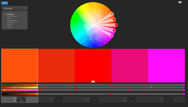
Adobe Color CC lets you try, create, and save a variety of color schemes, each with a set of five colors. It is available in browser and desktop versions. If you’re using the desktop version, you can export the color scheme directly to Photoshop, Illustrator, and InDesign.
Mudcube Color Sphere
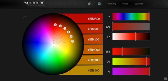
If you’re unsure about your color scheme, Mudcube has a selection of themes to choose from. Mudcube Color Sphere is a handy little color resource for designers because not only does it provide HEX numbers for each color, but it also helps you create a color scheme from one shade of your choice. If you are undecided about which color scheme you should choose, MudCube will provide a theme selection from the drop-down menu.
Other services
Color Palette Generator is a free online service that allows you to generate a color palette based on an uploaded PNG, JPG, or GIF file.
ColorZilla – With Colorzilla, you can take a color from anywhere in your browser with an eyedropper and determine its number. An irreplaceable thing for designers.
Material UI Colors – Material design style color palette for Android, web and iOS.
Brand Colors – colors used by famous brands.
COLOURlovers – The library of this web resource has more than 2 million ready-made color solutions that can be sorted by rating, number of views and creation date.
Colorscheme is a professional online service that allows you to generate a color scheme in accordance with the color rules on the color wheel.
0 to 255 – this service will allow you to view all possible shades and find a suitable one.
Source: logowiks
Cover photo: ShutterStock
…

