Animation Guide
Animation Guide
When it comes to software development, animation is a limitless way to make digital products more real by replacing “telling” with “showing”. Learn how you can use animation to showcase abstract concepts, make products more life-like, and instill more emotion into your digital experience.
Why animation is needed
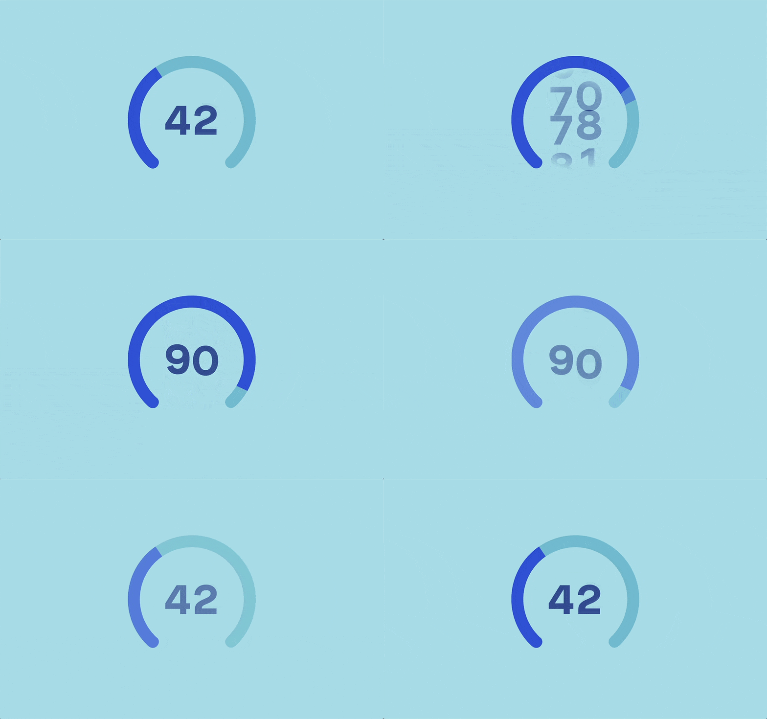
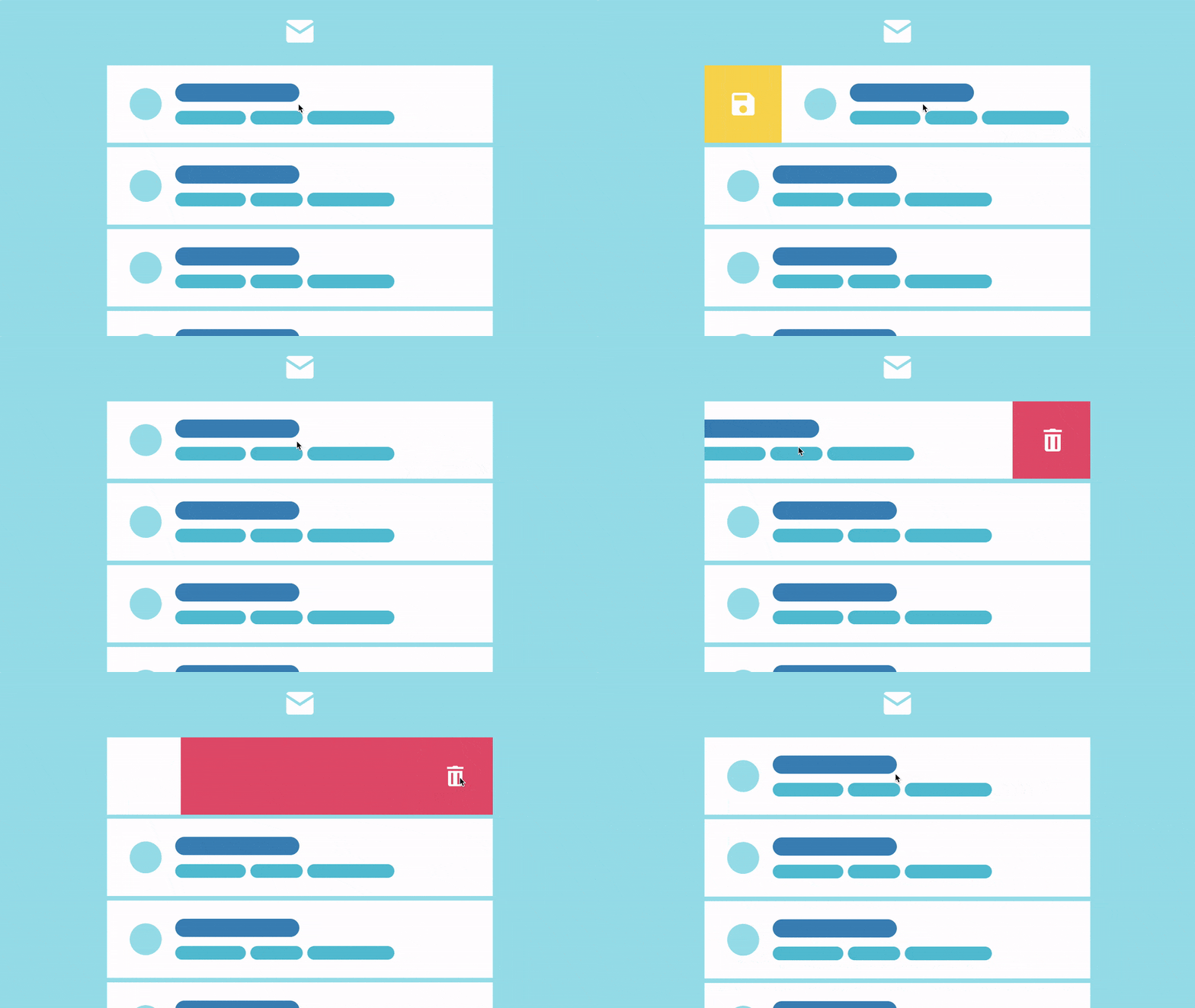
Animations fill in the gaps between action and result. They connect parts of the interface into a coherent whole and help you quickly get used to it.
Show rather than tell – visually explain the causes and consequences of actions.
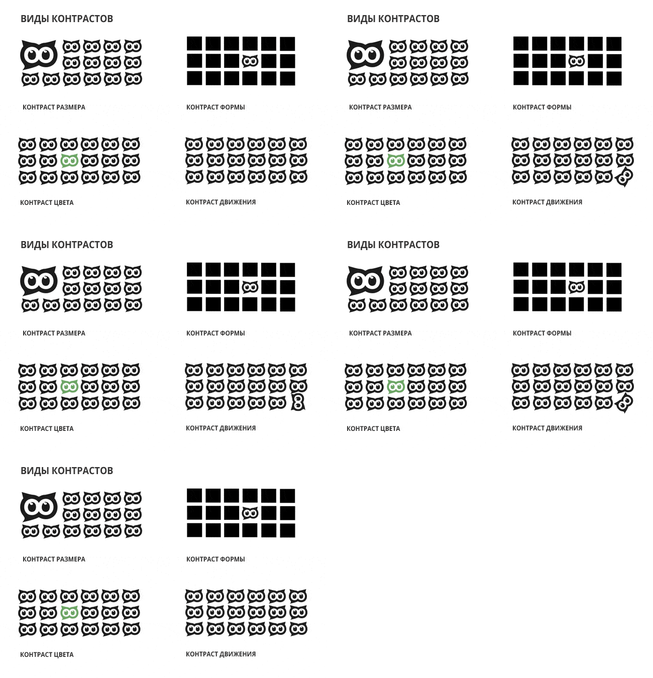
The main elements of the interface should always be in sight, while the secondary ones can be fading into the background and pointed to them with the help of animation.
Basic principles
When designing animations, it is helpful to imagine how what we are animating would behave in the real world.
Staging Is the animation that precedes the main one. Its task is to grab the user’s attention and prepare him for changes.

Follow-through Is a bouncy animation. The object jumps slightly over the point at which it should stop, and then comes back. This effect helps animate animations.
Android has an OvershootInterpolator to help achieve the follow-through effect, but the animation is too harsh. Better to code it manually with a couple of additional animations or write a custom Inerpolator.

Background animation supports basic animation and makes it more human. Such animation can be used when we drag an element across the screen so far that the main action is replaced by another (for example, canceling a voice message in Telegram).

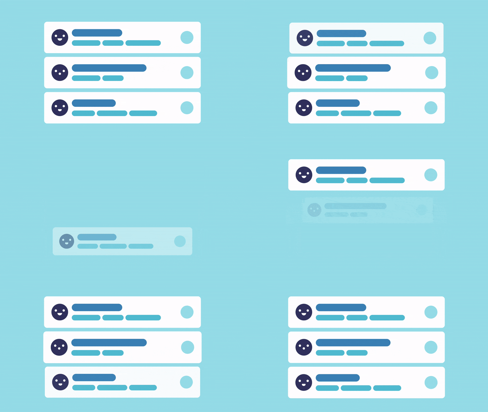
Parallel action Is an animation that happens in parallel with the main one, but with a slight delay. Such animations can sometimes be seen in lists, when each element is pulled up after the rest. They represent the relationship between elements and make the overall picture less stressed. It’s important not to overdo it with animations like this – they should still feel like one movement and be almost invisible.
The delay of each element should be lessthan the previous one, as if they were catching up with each other. For the last element, the animation can be made a little longer and more pronounced to enhance the effect of the picture as a whole.

Some features of animation can be distorted and exaggerated. This will give the animation its own character, which will become part of your brand.
Teamwork
Think over the animation at the very beginning of the design process so that it fits better into the big picture and solves problems that a static layout does not solve. It is also better to negotiate animation with the developers from the very beginning, so that unobvious moments and limitations surfaced as early as possible. The Zova Fitness team creates a separate app screen with an animation prototype to iterate through the code. Only then is the animation added to the application.
Headspaces only start animating after custom research. If a person uses an application for meditation before bedtime, then the animation should be soft and smooth, without elements jumping around the screen. With the help of free animation makers, you can easily create your own animations to enhance your user interfaces and make them more intuitive and user-friendly.
The sooner work on animation starts, the more time the team has to think about its availability for users with limitations.
Taking animation to the next level
Good animation helps you focus on the main task and does not draw attention to yourself.
You always need to look for non-obvious ways to bring humanity to the interface.
Download the complete manual.
Source: Guideline
…

