
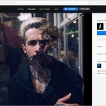
Make a website: What a designer can teach a photographer
Make a website: What a designer can teach a photographer
Web designer Sasha Astron helped to figure out the birdinflight project, how a photographer can add a couple of centimeters of professionalism in the eyes of a client.
Tools
Marty, look, we now have a nice set of online tools with great templates to put together a decent presentation for a photographer, designer, or other visual artist. They differ in the complexity of the constructor and the presence of additional services such as analytics and the ability to establish the sale of their works. Let’s go over the most interesting of them.
Portfoliobox is notable for its extensive functionality and the ability to sell works through the built-in online store. There is a free service package with a limit on templates and number of publications. The Pro account costs $ 6.9 per month. It removes all restrictions, allows you to connect a domain, Google Analytics and other options.
In ALLYOU, the template customization process is even easier. A subscription with a domain and additional options will cost $ 8 per month. There is a stripped-down free version.
Semplice is a very flexible tool. Allows you to create a portfolio with animation, parallax and other visual effects. Designed primarily for designers, but nothing prevents photographers from using it. The issue price is $ 89 for lifetime use.
-
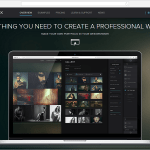
- Screenshot: portfoliobox.net
-
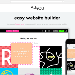
- Screenshot: allyou.net
-
- Screenshot: semplicelabs.com
The next two platforms are social media platforms for creatives, which offer the additional opportunity to customize your presentation on a separate site. Their advantage lies in a large audience of professionals. At least a basic account should be created here for the sake of communication and building a reputation.
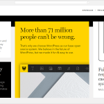
Behance is populated by designers, illustrators, photographers, architects. To start using the Pro Site service, you need to have an Adobe Creative Cloud: Single App or Complete subscription for $ 19 and $ 49 per month. Get a custom website on your own domain and sync your portfolio with your Bihanse profile.
Quality and freshness of creativity are especially appreciated at Сargocollective. There is no “Register” button here. To join Cargo, you need to write a letter to the administration with a short story about yourself and a link to your work. Basic account is free, domain and bonuses cost $ 9 per month or $ 66 per year.
-
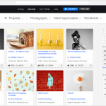
- Screenshot: behance.net
-
- Screenshot: behance.net
-
- Screenshot: cargocollective.com
-
- Screenshot: cargocollective.com
Other options include imcreator.com, dunked.com, carbonmade.com, viewbook.com, but let’s move on to the main problem.
How to interest the viewer with the presentation and content?
Content
If the site is needed not only for the sake of show-off, but also for making money with what you love, then its immediate goal is to attract new customers. Therefore, first of all, it is worth thinking: what are they? The imaginary image of the ideal customer will help you choose the tone and highlight the accents.
To become noticeable in the world of information noise and clip thinking, you need to send a clear, understandable signal. There is no time to explain, we only have 2-3 seconds while the user decides whether to stay a little longer on the site or close the tab. A capacious, easily distinguishable message helps to stand out in the data stream and hook the user for another minute or two.
 Your place in the data stream
Positioning
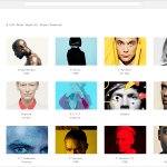
Not all clients are created equal. It is a good idea to publish on the site only those images that best characterize the author’s style and manner. This is how we narrow down the audience and target the relevant audience. Positioning is not only about marketing, but also about higher-order values. Attract clients who are psychologically comfortable to work with. Masterpieces are born when a person comes purposefully for your work. “Set the heat as you can,” is the best a client can want if they want to collaborate with a motivated ninja. Make your niche what is rushing more than anything else, what you are really good at.
Here, for example, is Lasse Floede, the master of fashion portrait. His work is called honest and sincere. Lasse finds inspiration in Scandinavian minimalism, traditional portrait photography and British dampness. The site talks about it without further ado.
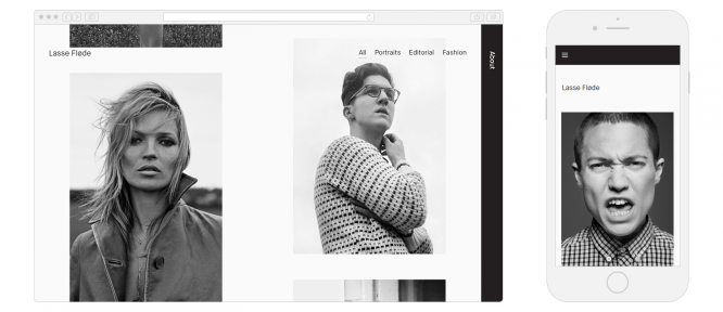 Screenshot: lassefloede.com in desktop and mobile versions
Creative activity requires brain strain and strong internal motivation. There is no substitute for the joy of a favorite activity – it is our fuel and our vulnerability. Creative natures largely depend on their emotional state. If the communication with the client does not work out, most likely the product will turn out to be mediocre.
To maintain a creative erection requires harmony in relationships and an atmosphere of mutually beneficial partnership. Designers scold clients for “make my logo bigger” not because it’s so difficult to make it bigger. The basic quality of a good client is the ability to surrender in the firm hands of a specialist, to relax and have fun. The professional knows how to do it.
When a portfolio resonates with the strings of the client’s soul, the likelihood of rapport increases. You know perfectly well what you are strong at and what brings you pleasure. It remains to turn this into a visual manifest.
-
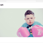
- Screenshot: amandapratt.com
-
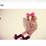
- Screenshot: amandapratt.com
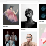
A good example of a laconic presentation is Amanda Pratt’s website. He greets the user with a large photo and introduces the author. That’s it, nothing else is needed. While the guest is looking around, the slideshow shows him the next card. Handwriting is read immediately, combining a selection of pictures into a single style. The drop-down menu gives an idea of what genres Pratt works in.
Good design is as little design as possible
The amount and nature of the data presented on the screen is not typical of human perception. Our species was forged in the wild savannas of Africa – we are used to distinguishing leopards in bushes, not buttons in bushes of design. Therefore, it is always difficult for the user. Interaction with most sites causes a lot of negative emotions, so modern trends suggest the maximum simplification of their design.
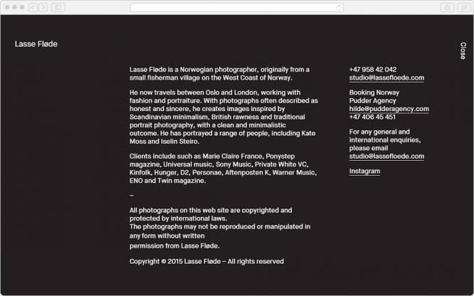 Everything is fine, except for the paragraph with legal information. You don’t have to shout like that. Screenshot: lassefloede.com
When composing a text about yourself, you should not delve into a biography, it is better to concentrate on the main thing: positioning, key achievements and values that you profess. Try to present information in a concentrated form, in small portions.
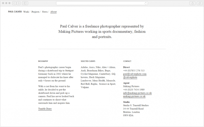 Remove the biography column and it will be ok. Screenshot: paulcalver.cc
Mentioning high-profile clients serves as a good marker of status and helps shape a professional profile. Adidas, Asics and Nike among the customers seem to say that the specialist is good at sports. And Ponystep magazine and Universal Music showcase a talent for portraying pop stars.
Rake
There are several common usability mistakes in photography websites. For example, you should avoid horizontal scrolling. The user usually does not flip through the pages in this way, and the unusual interface is always annoying.
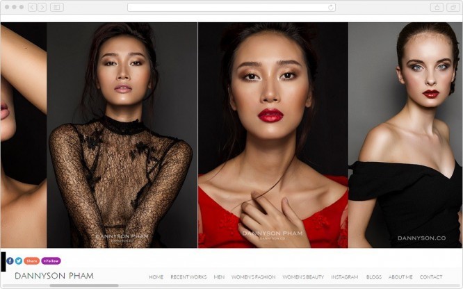 And please don’t have giant logos on top of the photo. Screenshot: dannyson.co/womens-beauty
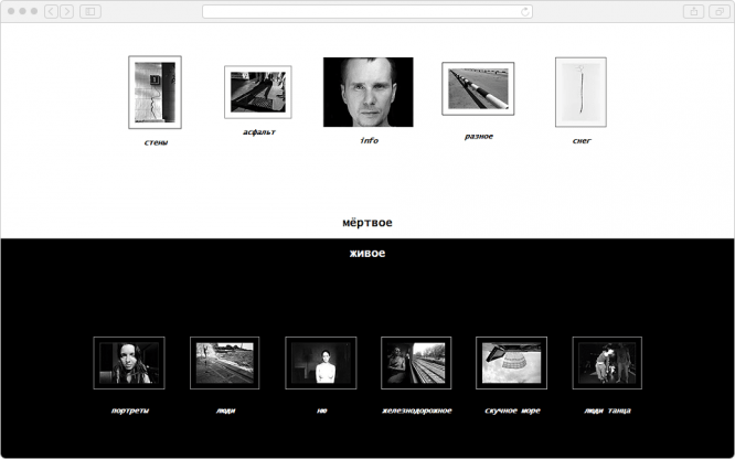
Questions that do not hurt to ask: “Do I need a preview at all?” and “Are they too small?” Here is a classic example of the unsuccessful use of thumbnails, which in this format are not able to interest the viewer.
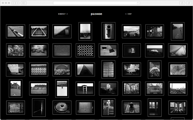 Screenshot: sv1311.hop.ru
And this is the main page, and this is also the trouble. A roulette of equivalent elements does not leave the opportunity to make a choice, you have to close it.
 Screenshot: sv1311.hop.ru
There should be only one emphasis on the screen: on the most important thing. Everything else is a hierarchy of secondary elements. Like primates, the alpha is large and conspicuous; the rest are obscured. The accent should be a verb and be responsible for the primary action, for example, “look at the photo.”
A logical move when a visitor is greeted by one work of the author, shown in full screen size. A common mistake: it is not obvious what action you need to take to look further. Scroll, click, drag, access the menu? It’s good when the site supports navigation using the arrow keys on the keyboard, it’s convenient. But do noticeable clues about what you can do.
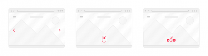 Drawing by the author
Trust your feelings
Comfortable means familiar and natural for the body. Biology is the cornerstone of usability. Try to keep your site’s behavior predictable. The nervous system adapts to the logic of common interfaces and automatically responds to stimuli. When the autopilot doesn’t do the expected result, the brain gets chemical punishment and gets a little nervous.
Every little mistake is accompanied by a deterioration in mood. Test the project on live people and watch the reaction. The user should get what he needs while experiencing the minimum amount of pain. If everything goes smoothly, then piloting your site will evoke positive emotions and stimulate new orders.
…
