
10 landing page design mistakes or how to distract users from their purpose
10 landing page design mistakes or how to distract users from their purpose
With the current level of popularity of landing pages (landing pages), it is not uncommon for a product or service to be sold anywhere other than on this landing page.
The icondesignlab project team has put together 10 of the most common landing page design mistakes that distract potential customers from their main goal.
Landing page design is the face of your project. It will tell the user much more than any words on the page. Like makeup on a girl: neat and tasteful – it looks expensive and beautiful, and too much color or careless war paint – cheap and frivolous.
How do you create a landing page design to produce a “wow” effect without overdoing it? Here are 10 common mistakes your landing page can hide and 10 tips on how to fix them. Forward!
 Landing page that has been overly clever with the design.
1. Overuse of triggers
Triggers are various features on the landing page that grab the user’s attention and make him do useful actions for the site owner. They help you increase your landing page conversions. But, when there are too many of them, they overshadow the main meaning that you wanted to convey, distract the site visitor from the target action.
Here is the most striking example of a landing page where the number of triggers is off the charts. Try to guess what this site lingscars.com is about.
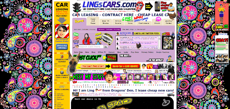 A perfect example of anti-design: the background shimmers with all the colors of the rainbow, a cat jumps out of the box, a chicken runs around the text, and dozens of Ling’s heads sing and dance.
Of course, this does not mean that triggers are generally irrelevant. There just should be few of them. Use them as spices for a dish.
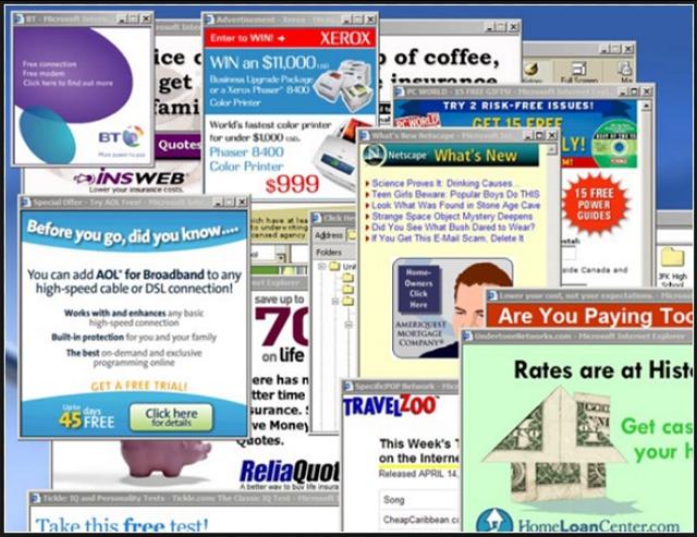
2. Banners (advertising pictures)
Landing page banners are taboo. And if you get carried away, then you can turn your landing page into this:
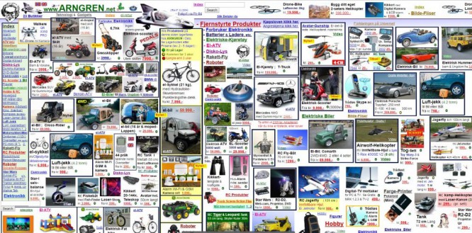 You won’t immediately understand what the site is about, which means that the main meaning is lost – arngren.net
There is only one conclusion – do not use banners on the landing page. Generally. Never.
3. Bricks of text
Do not try to push the entire history of your company into the landing page, including the biography of the first client’s second cousin. Highlight the main thing. The user is now lazy to read. Everyone saves time, which means that the sheet of text will be closed rather than read.
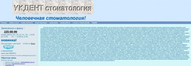 A dental clinic services website and a brick of text on it.
Divide the text into paragraphs and blocks, dilute with pictures. Briefly communicate the point.
Watch the business titans do it: google.com/drive/. There are no more than ten sentences on the Google Drive landing page!
4. Unreadable text
Do not overuse “inversion” (white text on a dark background) and Caps Lock in the text. Do not capitalize words anywhere other than the title. So the user does not want to read, and you complicate his task even more.

White text on a black background will quickly tire your eyes.
White text on a black background, and even bricks – all you need to make your text impossible to read.
Make your text easy to read. Black and white is a win-win classic. And if you want originality, do not forget about color combinations so that the letters do not merge with the background and do not ripple in the eyes.
5. Petrosyanism (a lot of humor)
Everyone loves to laugh. But when there is too much humor, it distracts the user’s attention from the main goal. Here is an example of a landing page that you can laugh at for a long time – roltrol.by. But what did you learn about the product from it?

Many jokes distract the user from the target action.
Or here’s another example:

These guys have a sense of humor. But would you “buy” from them? rafik.viplanding24.ru
Joke less is more.
6. Color enumeration
This is the mistake of all rainbow lovers. They want more colors, create a mood, but the result is a “vinaigrette”, the design of the landing page is dazzling in the eyes, the attention is scattered. On such a site, it is impossible to create a contrasting button, highlight the main idea with color.
And sometimes color also kills the whole perception of the text.

– I want bright text on a bright background!
– But the text will not be visible!
– So let’s add a white stroke!
You’ve noticed that many successful businesses only use a few primary colors on their landing pages.
They place additional colors on the capture points to focus attention on them.
If your entire landing page is a paint factory explosion, then don’t expect high conversions. Choose a clean design with no unnecessary colors.
7. Abrupt beginnings of videos, unexpected sounds
Have you had this? You are sitting quietly in the office at your laptop, not bothering anyone – and suddenly there is some disgusting sharp sound. You frantically try to get into this little ill-fated cross in order to close the tab as soon as possible. Finally found it! But then you sit for a long time, red as a tomato, and catch the sidelong glances of the employees on yourself.
Caution! Looking at the following example of a landing page, you just might find yourself in such a situation – gordon24ever.com:
 An example of a site with a sharp sound.
An unexpected sound causes office workers to close the landing page without even reading it. For you, this is a decrease in conversion. In addition, everyone has different musical tastes, downloading sounds takes away speed, and in the mobile version, music is completely out of place. So it turns out that this is just another irritant for the user.
Landing page sounds are justified only in two cases:
1. When the concept cannot be conveyed without them:
Here is the site itself about music – yearinmusic.spotify.com
And here the melody on the site creates the mood for viewing pictures – monet2010.com
2. When the user can turn on the sound at will
Here’s a good example of when you even want to turn on the sound yourself:
paris.kharkov.ua (click on the icon in the upper right corner)
8. Intrusive pop-ups

It happens that you go to the landing page and have not yet read what it is about, and then bang – a pop-up: “You were on the site for half a second. Why didn’t you choose anything? Can I help you? ” and a button.
You close the pop-up window, after 2 seconds – a new one: “Download our new book for free”, you start filling out the form, and then: “Why haven’t you filled out the form yet?”. And sometimes they don’t even let go quietly. Here’s another control pop-up in your head: “Why are you leaving? ”So that you don’t definitely come back to this landing page.
What’s worse than an intrusive pop-up that distracts you from your work? Probably just one more pop-up that will definitely force you to close the site.
Of course, this does not mean that you need to give up on pop-ups. They just need to be used wisely, to give the visitor an opportunity to become interested and encourage him to take action at the right time.
9. Preloaders (site loading indicators)
A user who gets to an unknown site waits for it to load no more than 3-4 seconds. We’ve already covered how the Mozilla site’s only 2.2-second reduction in download speed generated 10.28 million additional downloads per year. If at the 5th second there is still a white screen in front of your eyes, the tab will be mercilessly closed. Knowing this fact, some site owners use preloaders – light animation, which, in their opinion, should entertain the site visitor, or at least inform him that the content is loading.
 An example of a preloader from c945.com
But the preloader on the landing page is not appropriate in principle. Landing page is a page created in order to quickly grab the user’s attention and direct it in the right direction. No one will wait for you to grab their attention. Make your landing pages fast.
Your preloader will not be watched unless you are a global brand and your content is super coveted.
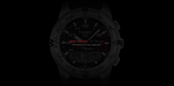 Preloader on the landing page of the famous Tissot brand
Spend your time and money making your landing page load faster, not installing a preloader.
10. Stock or low-quality photos
Sometimes even a good quality product can be presented in an unfavorable light, and in the photo it will look unattractive. Here is an example of an unsuccessful photo of a tooth decorating service with rhinestones from one dental clinic.
 The jewelry is not really visible, and the white background treacherously emphasizes the yellowness of the model’s teeth.
Stock photos are generally a conversation for a separate article.
The only thing worse than a bad photo for a landing page is the absence of a photo. It is better to immediately spend money on the services of a professional photographer who will highlight the merits of your product or service.
What conclusions can be drawn?
1. Always remember the main message you want to convey.
2. Highlight the main thing and do not distract the user from the desired action.
3. Cleanliness and minimalism, simple colors and a clear concept will always be in trend.
4. When choosing a design, be guided by the user, not yourself.
5. Are afraid to become hostage to your taste, then seek help from professionals who can create not only a beautiful picture, but also make it “sell”.
PS And finally, the most terrible landing page, a specially created hyperbolized anti-example of design that will make you smile and once again draw attention to mistakes: texterra.biz
Source: blog.icondesignlab.com
…

