
Design in business – a tool or an end in itself
Design in business – a tool or an end in itself
Many aspiring designers who follow the aesthetics of the works of the country’s leading studios dream of creating designs that can win the hearts of people. Everyone wants to come up with ideas that no one else has come up with.
The guys are chasing aesthetics, looking for unusual shapes, trying to go against the established system. These aspirations are laudable, but unfortunately, what newcomers dream of is being shattered on the monolithic rocks of the real business world. We show with a real example.

What is corporate identity or identity
A corporate identity is a collection of graphic style elements that identify the belonging of everything on which these elements are placed to a particular company.
Corporate identity content
– logo;
– company colors;
– patterns / backgrounds and other graphic elements;
– branded fonts;
– a guide to using a corporate identity or a guideline.
Note that a corporate identity is necessary for a business to compete in the market. It helps an enterprise to differentiate itself and establish a positioning that influences how customers feel about a brand.
Corporate identity is one of the business tools. The task of the designer is to develop it with the greatest efficiency for the business. Let’s see how you can measure this efficiency.
What are the criteria for assessing the benefits of corporate identity
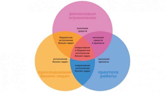
The corporate identity with all its components should bring the maximum benefit to the business, namely, to leave certain ideas and feelings about the brand in the minds of people, distinguishing it from competitors in the framework of:
– real tasks and needs of the business;
– funds allocated for the implementation of the style;
– ease of working with it.
/
Probably, it’s very clever to define it, but don’t worry, everything is simple here. Let’s break it down into several semantic parts.
“Leave in the minds of people certain ideas and feelings about the brand, distinguishing it from competitors …”
With this, everything should be clear. This means that we are graphically trying to give the brand a style that will characterize the brand and distinguish it from competitors. This is a fundamental element that everyone is well aware of, so let’s move on.
“… within the framework of real tasks and business needs …”
This means that if a business has a task to make a conservative corporate style that should not attract too much attention, but should simply be present at the company for the sake of identification, the designer has no right to involve all his “creative resources” in the work.
It is unacceptable to make a bomb style with a brilliant bright metaphor and the complexity of the design of corporate media. Yes, designers are creative people, they see some things differently, but imagine the surprise of a client who asked to do everything in a simple and conservative way for his factory, but received a ripped-eyed fashion project.
“… funds allocated for the implementation of the style …”

ut everything is extremely simple. For example, a customer is a small business that counts every penny. He needs one-sided business cards with one color printing to save money.
The designer understands that such business cards may look unattractive, but he wants to make his work aesthetically pleasing. There is no point in arguing with a client and persuading them to make color double-sided embossed business cards. A businessman sees business cards as a way to spread contacts, while a designer sees a work of art.
The main goal: to satisfy the business within all restrictions. Roughly speaking, in this case, the designer is obliged to make the most beautiful business cards, but one-sided and in one color.
“… the ease of working with it.”
Manual
Imagine that a client ordered a corporate identity, received all the corporate identity elements from a designer, but did not receive a guide on how to use them. And now, the moment has come when he needs to issue new advertising posts in social networks. Lo and behold, the manager Natasha just knows how to work in graphic editors!
Do you think Natasha, with a basic knowledge of graphic editors, can do everything correctly within this style?
Obviously not.
Natasha will not be able to bring design ideas to life without style guidance. If you create beautiful posts, you will have to hire a designer who will have to pay for the work.
It is much more convenient when a user-friendly manual is added to the corporate identity. Together with him, Natasha has a much better chance of saving the company money and getting attractive posts.
Templating

For example, as part of the corporate identity, the company created the design of posts of various sizes for social networks and a cover for the community. Let’s say posts are 1000 × 1000 px, 1200 × 800 px, 1400 × 1000 px, and the cover is 1590 × 400 px. A single color and a developed pattern are used against the background of each of them.
At the same time, the designer in the program implemented this in separate layers – a layer of color, and a layer of a pattern above it. It turns out that two separate elements of the corporate identity are used: the corporate color and the pattern.
What’s the catch?
Imagine how the same poor Natasha will have to suffer with these two layers. Yes, she knows how to implement this, but look at the time: she will create 30 new posts within a month, and at the same time, she will separately select the desired color and pattern for each. Multiply this torment 30 times a month and 12 months a year.
The designer’s goal: to make life easier for Natasha and create patterns for using patterns. Combine all possible pattern + color variations into one layer and create a universal size for all the above sizes.
It turns out that we will have all the variations of the pattern + color in a universal size that is suitable for each post and cover: 1590 × 1000 px. Ideally, look to the future: make all patterns 3000 × 3000 px, add them to one folder and write about it in the manual.
So Natasha will only have to select one of these files and insert it into the background in the post or cover.
What does it give to business
A simple diagram to help:
Source: Dima Lookin
…
